One of the fabulous things about visiting TFQ is the plethora of books and magazines in which I can indulge and explore. This trip is no exception. She had a bunch of magazines and books for me toperuse. I already talked about some of the books and look for a review of Pat Sloan‘s color book, which was new to me. By the way, Pat has some Aurifil thread boxes shown on one of her recent blog posts. Really cool looking.
I tried to resist reviewing the magazines, but was unsuccessful. I am so disappointed in the recent quilts and projects and COLORS shown in fall and winter issues of some magazines.
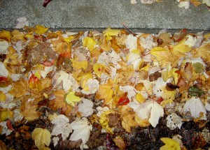
One thing is the colors that dominant the issues. Grim. Grim. Grim. I love Fall. When I was out and about yesterday and the day before I noticed the GORGEOUS colors of the leaves on the ground.

Does this look grim to you? Not to me. Look at all that yellow! Look at those dashes of red. Yes, there is black moldy yuck on the bottom, but imagine a cool black and white print for that bit of a quilt.
The first magazine I looked at was the Quilt Sampler. This magazine has an interesting concept, because they introduce readers to quilt shops all over the country. You probably knew that. Using this magazine, I found a great shop in Virginia I could visit while I was back east last year.
This issue, however, is grim… lots of brown, taupe, beige, olive green. Bleah. Not what I need as the sky turns grey and the days get shorter. Yes, there is a pink project and a cool blue quilt pattern as well as color options with lime and yellow. The overall feeling of the issue is brown.
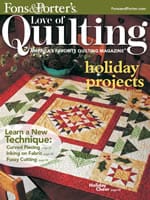
The cover of the new Fons and Porter magazine has a very interesting block. The center block below is rich and complex.

The color option on the inside is even better: black setting triangles with a combination of white, lime and pink.
The rest of the magazine, barring two redeeming articles, has grim colors and uninspiring projects. TFQ made some good points when we were discussing the issue of ‘grim’:
1. There are people who find these projects inspiring (if you are out there, I want you to let me know why you love these colors and projects, because I want to learn!)
2. If a magazine publishes a simple project, they cannot add a more complex variation without giving the impression that the simpler option is lesser. If they suggest that a reader is not up to the challenge of the harder version, they will lose readers. Another excellent point.
3. There are lots of projects for beginning quiltmakers and not much in the magazine arena for more advanced people. We are a hard lot to pin down, because of our experience. The magazines are in the business of selling magazines, fabric, tools and kits. They are not in the business of making me happy.
4. It is hard for some people, and I have to catch myself at this, to imagine a quilt pattern in different color ways.
The two articles in the Nov/Dec issue of Fons and Porter that I liked were Gerald Roy’s column discussing antique quilts. This issue has a discussion of a few 9patches. One of them is yellow and blue with neon oranges centers and background set in a Streak of Lightning type set. FABULOUS! I would buy a book of his columns from this magazine. I think they are great!
There is also a column called Art of Quilting by Kirsten Rohrs Schmitt called Vintage Vehicles. No patterns, just a discussion of a variety of different quilts depicting vintage cars and motor cycles. One quilt, by Tracey Pereira called the Mini Job (click on the link and see it on her website). It is done on a longarm with thread and then colored with Derwent Inktense coloring pencils. I was really interested to read about that process!
There is a pattern in this issue for an 8 pointed star quilt in Coral Gables Christmas colors (aqua and pink). Not grim.
Reader question: what quilt magazines do you like and why?
Finally, TFQ had the Fall 2009 issue of Quilts & More. The first time I saw this magazine, a few years ago, I found the colors fresh and cheerful. Since that first experience I have picked it up at the store to make the bags pictured and to be inspired by the quilts and colors. This particular issue: grim.
Granted, Q&M is less grim than the others and it has some interesting things to look at such as the yo-yo pillow and the Triple Play pillow article, but, again, the colors are just not me. TFQ bought it because of the Daisy Dazzler tote bag pattern, which I also like.
Reader question #2: OK, readers, I, obviously, need an attitude adjustment about the lumpy colors, so tell me what you enjoy about browns and their cousins, beige, taupe, olive, natural, tan, etc. Do these colors make you feel cheerful and if so, why?