
I saw this color study in my most recent issue of House Beautiful. One reason I like that magazine is the color. They report on a lot of great color combinations in interior design. I follow them on Instagram so I can get a quick dose of color when I need it.
They often have very energetic color combinations similar to Anna Maria Horner, Jennifer Paganelli and some Amy Butler, but in furniture, wallpaper and dishes. I really love the over the top combinations and would do soemthing similar in my vacation house, if I had a vacation house, 😉 and were starting from scratch with decorating.
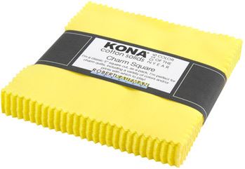
This caught my eye because of QuiltCon. Remember Highlight? The Robert Kaufman Color of the Year? I don’t think the values are quite the same, but the sentiment is definitely the same!
I am really intrigued with the circumstance that brings these two companies to the same color. Actually, there are more companies and House Beautiful saw the similarities and brought them together. I am sure somehow there is some overlap. Furnishings companies need fabric, right? Still I am intrigued by why this particular color?
I have heard many people profess to dislike yellow, even easy to use sunshiney and golden yellows. This neon would be difficult to use if it weren’t the main color in a quilt. The quilts made for the challenge and displayed at the QuiltCon booth were great. (QuiltingMod displayed some in her blog post about Quilt Market). Still, I like yellow in a quilt as it helps the eye move around the surface.
What are your theories about highlight cropping up?
It’s hard to find a good yellow. Fall and Christmas projects are easier because they trend to gold. But just a plain sunny yellow – that’s hard!
I like a little beach yellow in r/w/b Summertime projects.
Yes, it is. I can remember searching for a variety of fabrics in an exact shade of yellow for my Cheerful Baskets project.
I’m completely smitten with that Kona charm pack. I think my heart skipped a beat. I don’t consider myself a yellow person as I gravitate toward blue but something about that yellow intrigues me.
Is that inspiration talking? Get one! Kona Highlight!
I know you don’t like gray too much, but I love yellow and gray together. There’s just something about that combination. And I have to confess my stash is mostly golden yellow 🙂 Although they are several years old, I have not looked for that color recently.
Oh I agree! I have been using grey quite a lot recently, though I have to be careful since I live in the fog.