
Since we have been obsessing over the Peacock, I decided to use the Peacock piece, as is, for ColorPlay this week. Ok, I have been obsessing
I would have cropped out more of my design wall, but decided just to leave it in and see what happened.
Since the colors are all cool colors, I thought I might finally develop the calm palette I have been seeking.
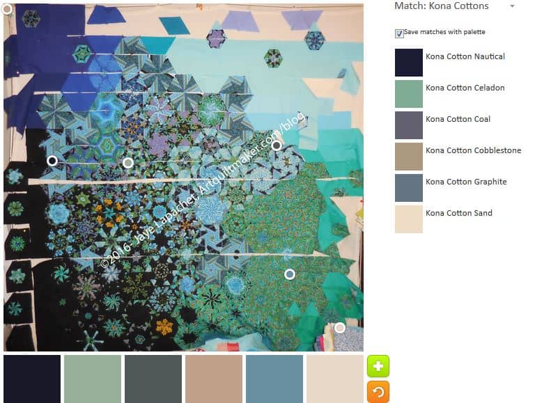
Using the Palette builder tool is always interesting. I am fascinated by the tool’s initial selections of locations on the photo. There are always circles on the edge. The choices the tool made tends towards darks and neutrals, in my opinion. If I were given the palette and then shown this quilt and asked if it was the palette for the quilt I am not sure I would say yes. There are only 1 each of green and blue.
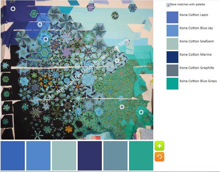
Fortunately, we can move the circles around. This palette is almost the perfect palette. It might actually be the perfect palette. While not complete, I do think it reflects the colors of the piece. I particularly like the addition of the green – Kona Blue Grass on the bottom of the list. The fabric I used was not that manufacturer, but it is a good match. I might need to use Kona Blue Grass if I run out of the solid that I have been using.

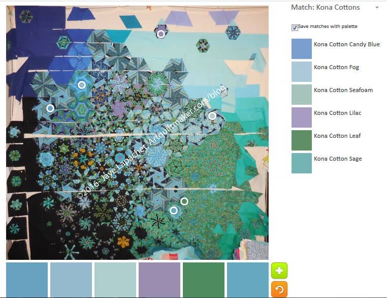
Of course, it is impossible for me to leave well enough alone. I moved the circles around again.
This is similar to the number 2 above, but tending more to the neutrals again. I wanted to get the lavender in the palette to see what that would add. Despite the Kona Blue Grass, I don’t like this palette as much.
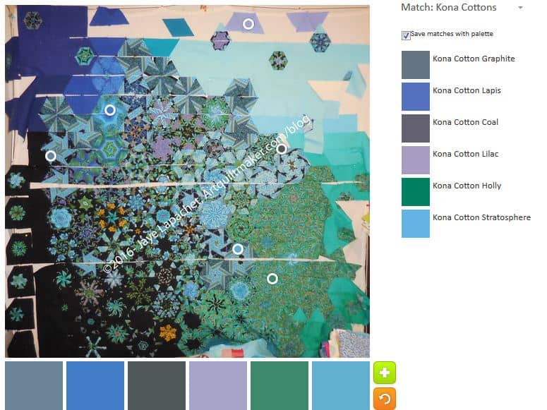
I had to fix it, try to make it less depressing, so I tried again. The palette is still somewhat tending towards neutrals, but the Lapis, Holly and Stratosphere balance out the Kona Coal and Graphite.
It isn’t the perfect palette, but I am rather partial to Stratosphere and Lapis. They make great additions to almost any palette.
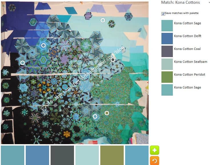
There is a gold color in some parts of the fabric and I wanted to try and get that into the palette and see what it did sitting alongside the other colors. I worked on trying to get it from the area with the greens. It shows up there in the original panel. The closest I could get with that strategy was Kona Peridot (second from the right on the bottom). Between the Peridot and Coal, the palette is starting to look depressing again.
Distracted from the gold for a minute, I moved more circles to try and get back to the first palette.
The palette I came up with is different than the first palette, but still quite pleasing. The addition of Kona Leaf (second from the right bottom) and Candy Blue (far left bottom) are wonderful. This looks like a very restful palette.

I got back to trying to capture that gold. It was a lot easier when I realized there was a gold center in one of the hexies towards the bottom. The fabric chosen by the tool is Kona Gold. It is fairly brown and I am not sure I like it.
It occurred to me, as I assessed these different palettes that each palette is very limited. I always use many more fabrics when making a quilt. The Peacock is actually one of the most limited in terms of fabrics, but I still have 7-10 different fabrics. It looks like more because of the way I cut up the Peacock panels. Combining all the different colors from the various palettes might be the way to go in making a quilt.
Let me know what you do with the Palette Builder.
Happy Birthday!!!
Thank you!