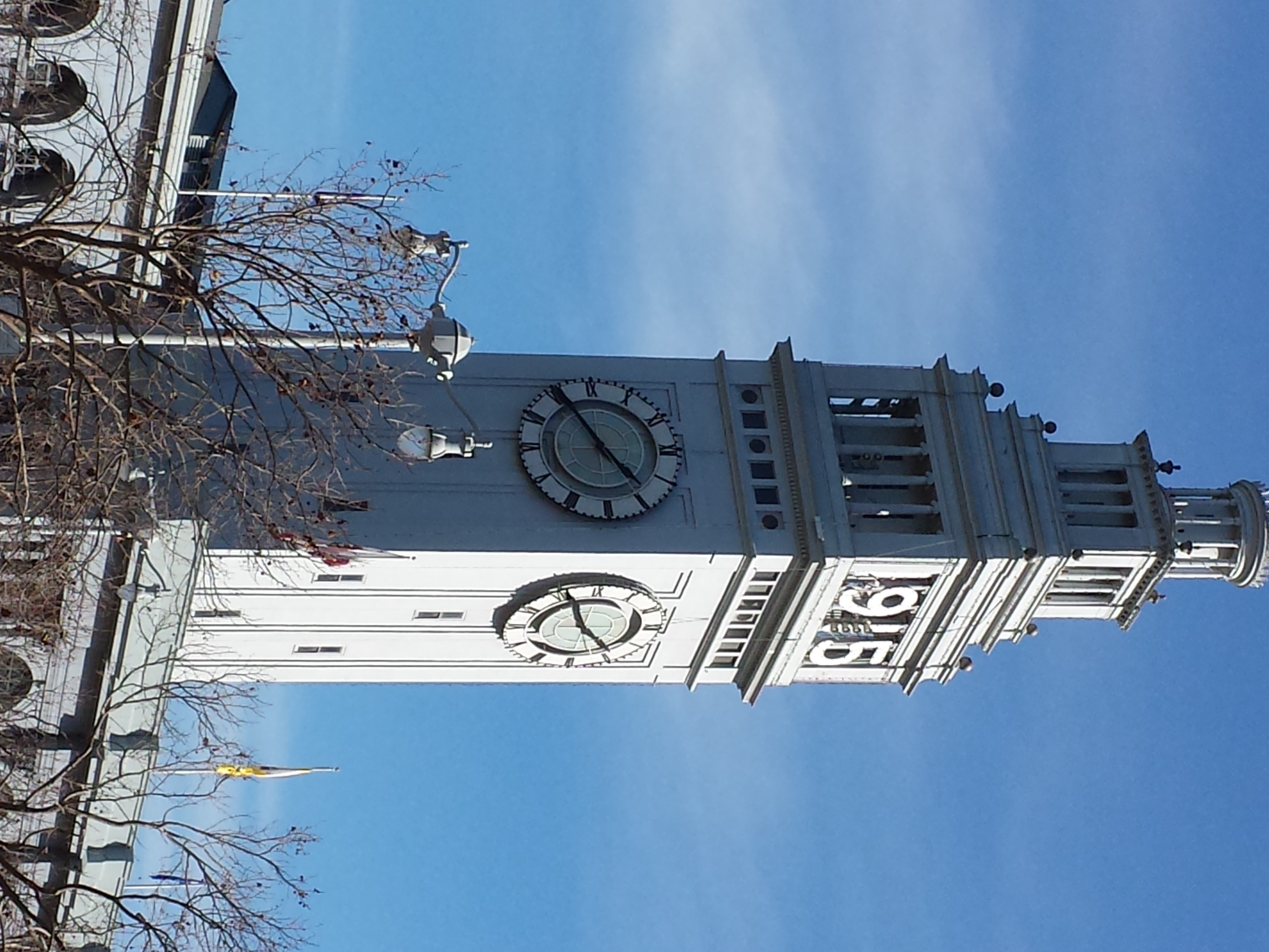
For a number of years (3-4), I took a picture of the Ferry Building in SF every day as I went to work. I had read an article about a guy who took a photograph of the same NY shop every day around the same time. Somewhere in the article the author (or, perhaps, the photographer) commented on the subtle differences that can me seen in such a project.
This sort of subtle project appealed to me. While I took photos from different angles, there are still differences. Periodically, when I am downtown near the Ferry Building, I will take a new photo for old times sake. Photos to use for my ColoPlay posts are getting thin so it seemed like a good time to dig out a Ferry Building photo.
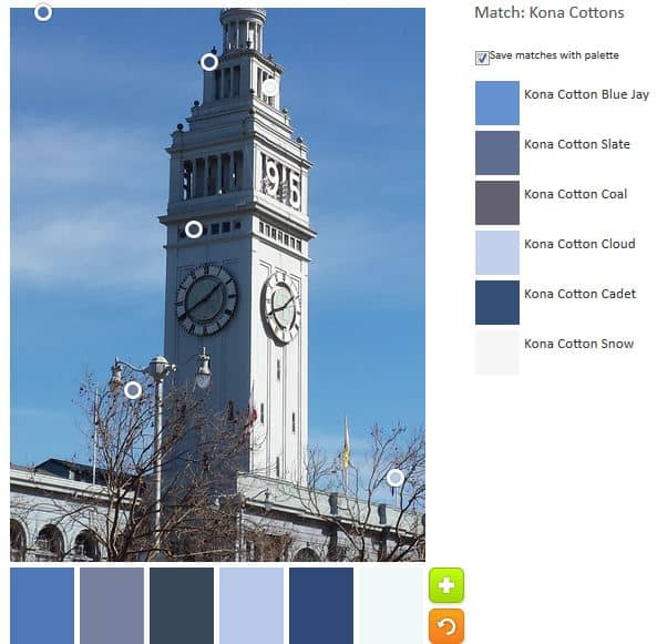
The default effort actually turned out quite nicely. No nasty or ugly neutrals. I got a palette that would look great for a boy. I like the addition of Kona Blue Jay. Not because of the same, but because I think it reflects the color of the sky almost perfectly.
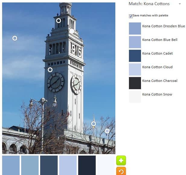
I do like the lighter blues shown in the example above.
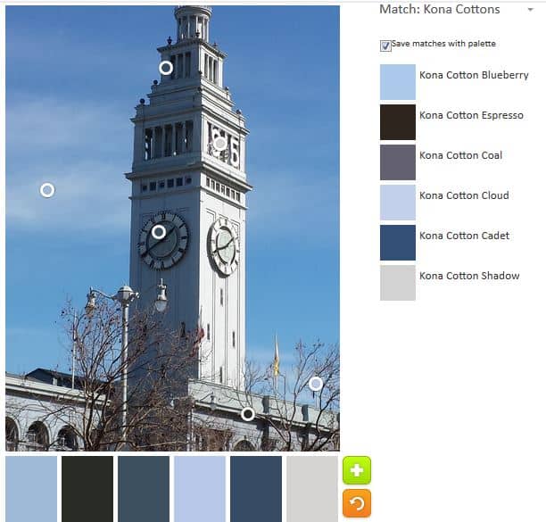
The above palette tends more towards the greys and is very San Francisco-like. The Kona Shadow is particularly good for representing fog.
The photo really doesn’t have enough color data points to get very many palettes. All of them seem to have a variation on the same group of hues.
Try out the Palette Builder by Play-Crafts to make your own palettes.