A few weeks ago, I went to a conference in Monterey. For many reasons, Monterey is one of my favorite places and October is a great time to visit. I was fortunate that the weather was fantastic and I took some beautiful photos. You might see more from this trip later.
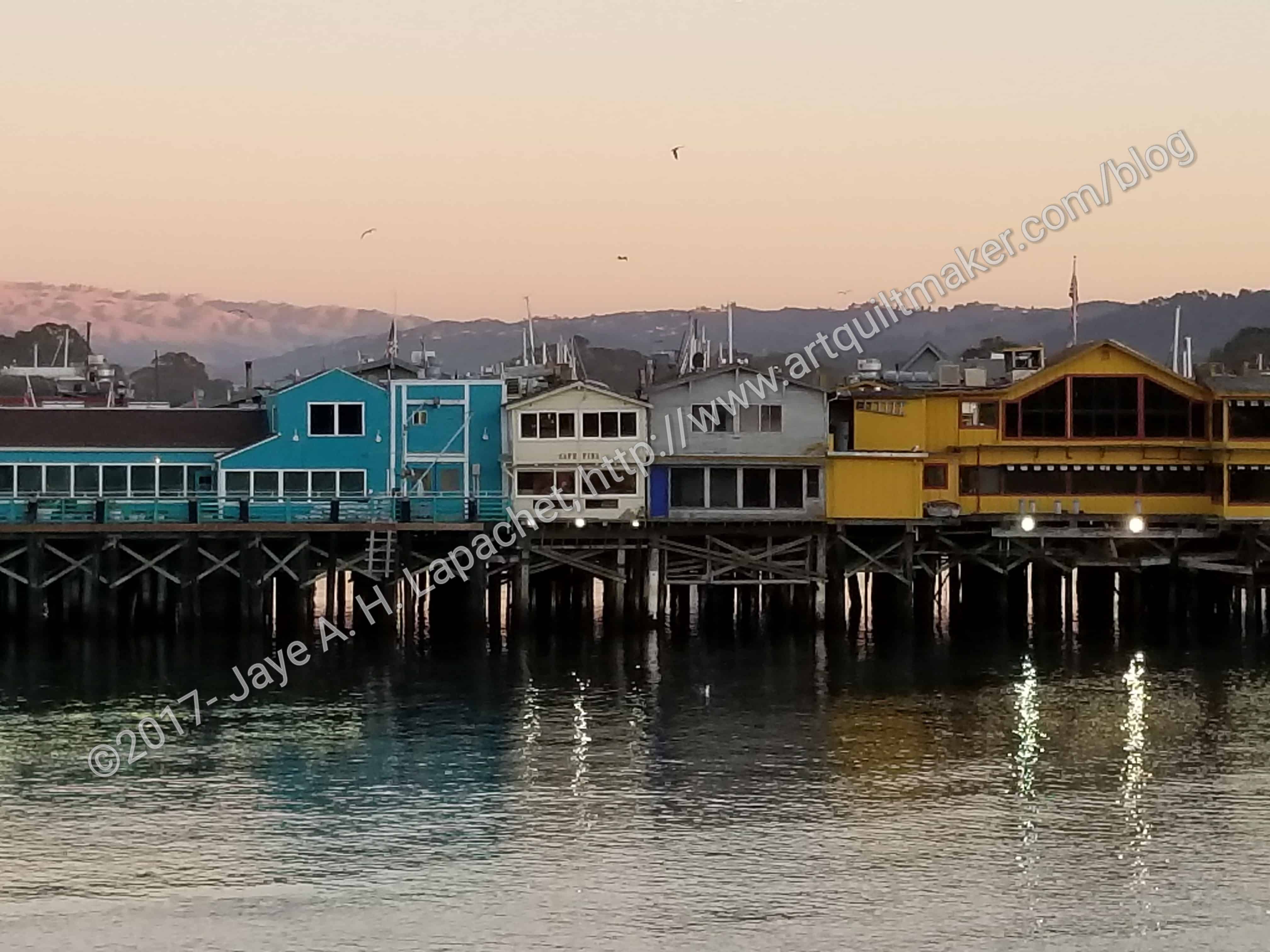
I walk a lot and a path I was on gave me a great view of the pier and the Bay. I decided to use this for my next ColorPlay. What I expected was bright colorful palette.
As usual, the default palette was neutral. Might be a nice palette for a new house.
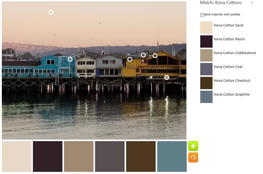
This one got a little better with the addition of the Cobblestone. I tried to doctor the palette with the addition of a more turquoise-y. Couldn’t do it. My photo just didn’t have the turquoise.
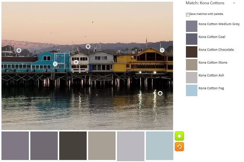
I decided to embrace the neutrals. This one is almost all grey with a blue-grey thrown in to liven things up.
The next neutral palette is a darker one. The Kona Spruce and Kona Stone is a really nice combination in the palette above.
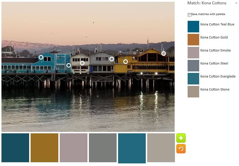
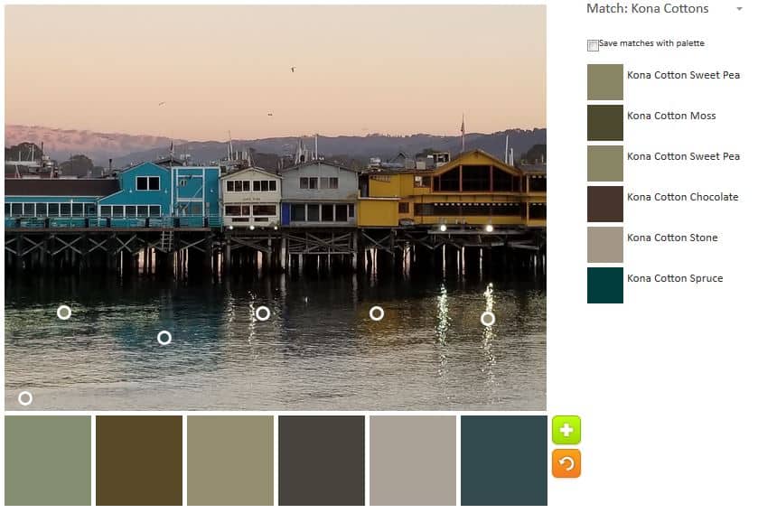
The Kona Teal and Kona Everglade look similar, but are just a little bit different. Everglade is a tiny bit lighter. The gold adds a slightly different look. More like the day right after sunset.
I felt like I exhausted the options of this picture despite the promise, so I left the number of palettes at five.
To start with, that’s a great pic. I’m intrigued with the variety of matches in the midfield “purple mountains.” Pier 2 provided 3 great choices, but I think the last one, Smoke, is ideal, and it’s one I never would have found on own. Awesome, thanks!
That is one of the reasons I like this exercise! It makes me think about the selections of the tool and makes me look harder at inspirational images.