Magazine Indulgence

Last week I went to Borders to buy some magazines for the Wellness program at work. I couldn’t help stopping by the hobbies section and picking up a few bits of inspiration.
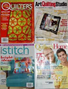
Magazines, May 2009
Magazines, May 2009

Yes, you do see an issue of  Quilter’s Newsletter Magazine in the batch. It had an article on pineapples. Despite my hiatus from my pineapple project, I still love them and couldn’t resist. One issue purchase doesn’t, however, mitigate my annoyance at their abrupt and sneaky change in publishing schedule.

In addition to the pineapples, QNM packs a lot into their issues. This issue has a lot of pictures of quilts. There is an exhibit of President Obama quilts, an article about quilting vintage tops (to quilt or not to quilt), which mostly interest me because of the wonderful photos included. There is a fun batik basket quilt as well as a Jewel Box that includes a self bordering technique. Luana Rubin also wrote an article on colors she developed for the quilting industry for the coming year and some paper piecing patterns of a bride and groom. Kaffe Fassett and Liza Prior Lucy have ‘designed’ a quilt that is included. It is a large-ish rectangle surrounded by borders.  The fabrics are, of course, fabulous, but I don’t see the need for a pattern. I also didn’t read the pattern, so there must be something special I am missing. There is an interesting Christmas tree quilt pattern with some Liberated Quiltmaking type stars in one border.  I, also, have to say that I do like the cheerful layout that QNM is using.

Stampington & Company has a new magazine called Art Quilting Studio. The words “premier issue’ caught my eye and I grabbed it. I haven’t been happy with Quilting Arts lately as they have mostly scrapped the techniques section and are providing only projects. Art Quilting Studio shows some avant garde pieces, has an interview with Denyse Schmidt and lots of detail shots. The colors appeal to me, though the layout colors are more subdued that the issue of QNM mentioned above. I liked the Layered Collages of Art article by DJ Pettitt, because the faces in her pieces are very appealing.

I also bought a copy of Stitch magazine. This is a product of the Quilting Arts family of magazines. I only bought it because I fell in love with the pillow on the cover. I glanced through it quickly and thought that was the only thing I would like in it. Later, I sat down at a cafe and looked through it page by page and found a few other things I liked.

There is an article about thread. I find thread to be completely mystifying so the more information the better, as far as I am concerned. That article talks about different types of stitching as well as the qualities of different threads.

The article with the log cabin pillow also has a round pillow called the Pi Pillow and a pillow called the Fabulous Floor Pillow. I think I might try one of those as well. I also saw a tote bag, which has possibilities without the fog grey bottom and an apron which might make a nice gift. There is a glossary of sewing terms, which I might dismiss quickly, except the stitch glossary which shows the reader how to make arious stitches.

Quilter’s Home also came in the mail recently. Mark is on the cover, as usual, with his son, Evan, which is not usual. I have enjoyed Mark’s story of his son in previous issues. The patterns in this issue are very ordinary. He recommends buying all the books he reviews so he must be getting pressure not to pan quilt books. He has the decorating section, which I can take or leave. I think the edge is wearing off of Mark’s style. It could be that CK Media is making him tone it down.

Fortunately, there is still thr3fold journal! This journal really makes me happy when I read it. It makes me really happy when the package comes! I know it sounds dumb to say that, but I feel an actual uplifting of my spirit when I read the articles.  The style is quietly confident. The colors are cheerful and interesting. The articles are well written. While I may not want to make every project or try every technique, I enjoy reading about their process. I also feel that I can try their projects if I follow their directions. I have written about this journal before and think that I will stop liking it, but having received issue 4 I still feel excited when I open an issue. I am looking forward to issue 5 already!

Quilting Arts says: 10 Ways to Rev Up Your Studio

This is the Quilting Arts email newsletter, Embellishments. It often one big come-on to buy something from their store, but this time has great ideas for updating your studio or workroom space.

Having problems viewing this email? View in a browser window

space holder

Embellishmenets
QA home subscribe stitch quilting arts gifts other  magazines shop

space holder

December 30, 2008
space holder    
space holder

In This Issue

Easy, Inexpensive Ways to Redo Your Studio

Learn new techniques with Pokey Bolton & Friends!

space holder
Calendar
gifts
join mailing list
Subscribe to qa
Renew your subscription
give a gift
 

space holder

Greetings !
In this issue of Quilting Arts Embellishments we offer you 10 tips for giving your studio a new look, plus tell you how you can learn new techniques at home from Pokey Bolton and friends.

Easy, Inexpensive Ways to Redo Your Studio

A new year, the lack of light, and cabin fever (for those of us in cold climates) often moves us to mix things up and make a change in our surroundings. Here are 10 ways you can rev up your studio or other creative space (even if it’s just a desk) quickly and inexpensively.

  1. Rearrange the furniture. Saying, “What if I put the desk over there?” and doing so, can give you a fresh perspective on your room and your art.
  2. Let in the light. Remove the window treatments or, if privacy is an issue, install blinds or shades that will let in maximum light during the day and can be closed at night. Not only will this help more light shine on your artwork and your psyche, it will give the room a cleaner, airier look.
  3. Put light on the subject. Those fancy “natural light” lamps are great, but even a small but powerful desk lamp will help you see things in a better light and avoid eye strain.
  4. Get “new” furniture. Do like the furniture re-arrangers do on those home dec shows and “shop” for furniture in other rooms of your house. Is there a funky old desk in the garage? An extra chair in the guest room that would make a cozy place to embroider in? Sweep out the old and swap in the “new.”
  5. Paint. A can of paint costs very little yet it can transform a room, warming it up, making it cheery, or conjuring up calm.
  6. Floor it. Hard floors are usually best for sewing-oriented rooms—the better to sweep up threads and find dropped needles. But to give your floor some added oomph, put a colorful throw rug here or there away from the sewing machine or pick up an inexpensive piece of patterned linoleum to put down like a rug under your work area.
  7. Find fresh inspiration. If you have an inspiration board, change the pictures or swatches. Find a new quote or quotes to create by and pin or staple them to the board. Cover the board with fresh fabric or paper. StudiosOr use something unusual for your “board,” like a large, lightweight metal tray, and attach your pictures and notes with magnets.
  8. Change the scenery. Creative people need to stare out windows. If the space where you create has no windows or small, high ones (like in a basement), create your own “view.” Hang a large, framed photo of your favorite vacation spot or other vista where you’d like your window to be. Or, if you have the talent, paint a mural of your favorite view on a wall.
  9. Trade spaces. So, you’ve been working in a corner of the dining room while a guest room upstairs goes unused 50 weeks of the year? Maybe it’s time to turn the “inn” into a studio with a fold-out sofa bed.
  10. Get some new goodies. A couple of fat quarters, a new sketch pad, some dyes you’ve been longing to try, even a new pair of scissors—a small splurge goes a long way to upping your energy level and igniting the creative spark.

Looking for more ways to organize and spruce up your studio? Get the Fall/Winter issue of Cloth Paper Scissors Studios now.

space holderline

space holder

Learn new techniques with Pokey Bolton & Friends!

 Quiling Arts bookOn “Quilting Arts TV” and in The Quilting Arts Book, Pokey Bolton brings together some of the best creative minds in the art quilting world to bring you techniquesqatv300, tricks, and inspiration. With the “QATV” DVD sets, you can watch and enjoy each of the three seasons at your own pace. The Quilting Arts Book shows you much of the best artwork and tutorials from Quilting Arts Magazine. Whether you are an experienced art quilter or just learning the basics, Pokey’s book and DVDs will help you take your art to the next level—and beyond!

Get the “QATV” DVDs now.
Get The Quilting Arts Book now.


space holderline

space holder

To our customers: Please allow 10 days to process your order, due to the fact that our offices will be closed between Christmas and New Year’s. We thank you for your patience. Happy holidays from Quilting Arts.

space holderline

space holder


Watch the Quilting Arts Holiday Video!

space holder

space holder


©2008 Interweave Press, LLC. All rights reserved.
Interweave Press, 201 E 4th St., Loveland, CO 80537

Thr3fold Journal Articles Review Part 4

The last part of the journal is what I would call the how-to section. I can accept this section as it does not tell me how to do a certain project. I don’t want to do someone else’s project. I want to learn how they achieved a certain look and then use it to make my own project. Thr3fold has respect for their readers; thank yo for not treating me like a moron!

There are five parts to this section:

  1. One Hit Wonders: Monoprinting, pg.30-33
  2. Shadow Play, pg. 34-37
  3. Working on the Edge, pg.38-41
  4. Drawn to Pen and Ink, pg.42-45
  5. Dyeing for Color, pg.46-51

And the journal ends up with the The Last Word, pg.52.

I began reading the One Hit Wonders: Monoprinting, pg.30-33 article and my eyes started to glaze over. I put Thr3fold down and went and did something else for awhile. When I came back to it, I was in a better frame of mind and really became intrigued by the process, because the article shows you how to get words onto your quilt in your own handwriting!

The article tells you very clearly what a monoprint is and the different ways that it can be used in fiber arts. I also liked the way, once the basics were taken care of, that they suggested variations on the theme.

Just a note about supplies: I think they forgot to mention the brayer in the supply list.

Shadow Play, pg. 34-37 has absolutely gorgeous pictures associated with the article. Shadow applique’ is the technique they teach in this article, which is a combination of digital printing and applique’. Linda starts the article by saying that this technique is a way of building up layers in a quilt. You can clearly see in the examples, the layering of fabric, embroidery stitches, embellishments and quilting to achieve a rich look.

One section talks about digital printing in fairly specific detail. Once that hurdle is crossed, Linda moves on to designing the piece and discusses auditioning fabrics as well as rummaging through her scrapbasket.

The final piece is gorgeous. I love the quilting pattern and have seen it enough in this journal to attempt it next time I have a small piece to quilt.

While I can’t imagine ever having enough time to work on the binding in a way that would make the Thr3fold girls proud, I love the ideas espoused in Working on the Edge, pg.38-41. The article discusses embellishing your binding. They touch ever so briefly on attaching the binding (no step by step details – HOORAY!), but spend most of the article on choosing the right color for the binding and embellishing it. These are seriously creative women. I would never have thought of continuing a line of beading out into the binding, but it makes perfect sense. A few beads and a little blanket stitching would add some interest that might take judges’ eyes away from less that stellar sections of the binding. The article discusses it all. It is really a catalog of ways to dress up your binding.

Drawn to Pen and Ink, pg.42-45 really stuck in my mind because of one of the photographs. They use a maple leaf as an example of drawing with pen and ink on your fabric (or paper). The photo that got me thinking was the one where they had traced around the leaf on a light table and cut it out of white paper or cardstock. Since leaves can be fragile, this is an excellent way to use the leaf over and over to try new ways of embellishing it. It also mitigates the whining of “I can’t draw that!”

The article talks about implements and makes me want to try one of those Koh-i-noor pens. They look carefully at the actual leaf to find areas that need to be a little darker. They also use the leaf to find the veins. I think that this idea combined with the idea of tracing over designs to get the major lines that we discussed in the Liz Berg class in January of 2006. BTW, Liz Berg discusses keeping a sketchbook as well. I really need to get to an art store!

As I may have mentioned, dyeing fabric is not my thing, but the Dyeing for Color, pg.46-51 article has such gorgeous illustrations and pictures of the gorgeous fabric they produce that it makes me want to take up a new hobby. They discuss the various ways you can dye and what to do when you are just starting out. All of the supplies and safety requirements are touched on. The authors also point out what dyeing you can do when you don’t have a dye studio. The article discusses the various products and different types of dyes. I also liked the sections on how to achieve different results, e.g. bag dyeing and layered dyeing.

Finally, the Last Word got me excited about the next issue by telling me what to look for (more challenges with slight variations on the theme, which made me think about a house quilt) and what they believe about their work.

My overall take: the photos in this journal alone are worth the price of admission.

Yes, I’ll look at the CD and review that as well…later.

Thr3fold Journal Articles Review Part 3

Food for Thought p17

“…if you are anything like me you never have everything that’s listed in the recipe but you’re so impatient to start that very minute you decide to go ahead and do it anyway.”

The article is about finding inspiration in Thr3fold and their hopes for the mag. It is basically a mini-ad where Linda compares finding inspiration in cooking to finding inspiration in quiltmaking.

I like it that she used the word impatient rather than excited or some other word. I think it describes the way I feel about starting a new project exactly.

My first thought after reading the article was: is Linda in my head?
______________________________

Twisted Knits p18-21
Remember the fiber cupcakes from the fair? Friend Claudia, with whom I had lunch on Wednesday, is knitting some like them and I am delirious over them. Hers sound so gorgeous. Knitting is something that I have had to give up 🙁 because of my hands, but I long to make 15 or 20 of these cupcakes to decorate and give as gifts and amuse (imagine them on a tray in the living room or dining room!). I long to try out the fabulous yarns available and decorate them with beads just to get a little taste of knitting and beading.

LLC must have sensed my lust for yarn, because they give the pattern and tips for this easy twisted scarf. One tip is to make the tassels first, so you don’t have to worry about running out of tassel yarn. What a great idea! I wonder how this could be translated to quiltmaking? Make the border first?
__________________________________________
Diary of a Quilt p22-25

Diaries are nice because they get you into the head of the writer, which is a bit of self serving comment as I am writing a blog here! I am a journal junkie. I love reading people’s journals (with permission!), because of the … rawness, though I am not sure if that is the right word. Still journals, diaries and blogs are all about process, not about product. Sometimes exhaustively so. This article is, I assume, a much edited, fairly sanitized version of Catherine’s journal of her quiltmaking process. I would expect nothing less from a publication. In a way, it is too edited. I would have liked a bit more detail, but the editing doesn’t detract from the description of the process. It also accurately depicts, without whining, the frenzied feeling of having quilt deadlines to meet while trying to enjoy part of the process that she finds fun.

This is the fine line that I desperately try to avoid; wanting recognition via quilt shows and events/exhibits while trying not to imbue quiltmaking with the hated aspects of a job.

The quilt that is the center of the article is one of seals (or maybe sea otters – I have no idea what the difference is and only a passing interest) and it is wonderful. There is such a sense of peace in the quilt when I look at it. She talks about missing her seals and a Sedna quilt, which I haven’t seen and wasn’t able to find on the web. I hope it is on the CD, but it is a reference I would have liked to have seen as a picture in the article.

This brings up a tangential point about multimedia journals. What exactly does that mean? Are they truly multimedia if I can’t click on a link like “Sedna” in the actual text of the print journal and be taken to the image or description on my cell phone or PDA or a screen that is projected form my glasses and pops up in front of my face? Or is it just multimedia because they include a CD? What about weblinks in magazines? If QNM includes a URL, does that make it a multimedia magazine? I guess this is a new frontier.

Anyway, the seals look playful and happy. The brown part on the right of the quilt is not something I would have thought to add, but it really adds to the quilt. It could be cliffs or an undersea ridge. I am not sure how I feel about the quilting. There is a delicacy about the quilt that the quilting doesn’t fit with. However, it does give the idea of swirling water. The shell (abalone?) buttons that she used for the bubbles are great. They add a little texture and shine to the quilt without overpowering it.

I liked the pictures of painting the faces. Until I looked carefully at the detail of one face I didn’t realize they were painted. I though that the faces had been fussy cut out of some hand dyed fabric to take advantage of the coloring. Looking at the whole quilt (not the detail) more closely, I can see the delicacy in the coloration that certainly cannot be achieved with a dye process (that I know of – being such an expert on dyeing and all NOT) JulieZS will have to weigh in here and set me straight.

Big annoyance: the article basically stops in the middle and tells me to go to the CD to see the rest. I guess they are forcing me to look at the CD on their timeframe rather than my own, which leads me to believe that they want the CD to be considered an integral part of the package. Not necessarily a bad thing. They are teaching me in more ways than one.

Thr3fold Journal Articles Review Part 2

The Associated Press is reporting that the restoration of the frescoes in the Pope’s apartments (called Stanze of Raphael), done by Raphael, are almost complete after 30 years of work. Hooray!

I have spent a remarkable amount of time writing notes for Thr3fold reviews during the past couple of days. As a result, you do get a part 2.* Amazing!

Challenges: thr3 and 3/4, p.6-11

This article is lavishly/lushly illustrated. The first picture is a quilt of 3 trees. The photo is so clear that the detail of the quilting is clearly visible. The article is about challenges that “stretch us…stretch to rise to the creative challenge. We challenge each other to think in new ways, we challenge each other to go beyond our personal comfort levels, we challenge each other to experiment with a new art material or a new technique.” p.6.

Catherine writes the main text, but each artist puts in her 2 cents in adjunct kind of journal entries interspersed throughout the main text. In the course of the article, the artists talk about different types of challenges: particular techniques, limited colors and/or fabrics. Catherine uses a particular challenge with the theme of ‘home’ to illustrate challenges in general. She incorporates LLC’s philosophy of challenges as well. One interesting part of the article discusses historical challenges between famous artists. Picasso and Matisse as well as Hemingway and Fitzgerald provided creative stimulus and support to each other. “The benefits of challenging a ‘like-minded’ friend brings out the best in each of you, you become both a sounding board and a ‘net’ for each other, a safe place to land.”

LLC, through this article, are challenging me (us) “to think about challenges and what can be gained in stretching a little further than you are comfortable.” pg.11 I have done round robin challenges, Carousel and Starry, Starry Night, in the past and I have been fortunate to be in good groups. St.JCN and I collaborate quite frequently. She Had to Have her Latte is one of the first, but Ocean Avenue, Get the Red Out and the Punk Rock Quilt are all examples.

Leaving my challenges with St. JCN aside for a moment, the other challenges I have done have been great, but they have not been the day to day support group that Catherine describes. I don’t think that you can have a growth experience through a challenge without working with people you know very well and who know you. In reading the article, it made me think wistfully about an art quilt group that would provide a supportive environment. Obviously, such a group would take time to develop since relationships don’t just happen. No time for that now and I am quite happy working alone in my workroom for the time being.

“How Can You Resist” pg.11-12

This article talks about watercolor. I almost skipped it, because I am not interested in watercolor, but I ended up reading it and came away with some interesting information and thoughts (interesting to me anyway). The article seems to start to go in a direction of talking about a variety of media, including oil pastels, but the watercolors really take center stage and the discussion of watercolors was the text that drew me in.

Linda spends some time going over materials: paper, paint and brushes. The bottom line: you get what you pay for. You know that if you buy cheap materials, there is a higher probability you will fail. However, if you buy expensive materials, succeed and don’t enjoy the experiment, you will be stuck with a lot of expensive stuff that will clutter up your workroom (see Melody Johnson’s blog about moving two states away). Solution? Find a friend (or iSoldIt or eBay or Freecycle) with whom you can trade or give those materials.

I liked the description of what watercolor paper is and what all of the cryptic descriptions mean. However, I just want to sew and work with fabric, but this article makes me think about how other media can integrate with/help with my quiltmaking.

I had some particular thoughts about watercolor:

  • Would it work?
  • Would it be inspirational only or would I do sketch-paintings an try to replicate them?
  • How would it work?

In a strange twist of my brain, this article brought up the failings in my workspace. I have a large room that is still suffering the effects of the remodel (I am going to work on this today, maybe), but the actual space in which I work is quite small and usually, embarrassingly, messy.
I also use the floor, when I am laying things out, and the ironing board. It is a flat surface, after all. This article, however, makes me think that it would be lovely to have a long desk/table in my workroom, where I could set up paints, pastels, oil pastels, and sketchbooks, collages and just pop in to work on one or the other for a few minutes, let it dry while continuing to be able to to eat dinner at the dining room table and walk across the floor of the garage. More space for creativity.

In the journal, Linda has posted a fabulous picture of a watercolor paintbox. I love the texture on pages (from background photos) is another asset to this journal. The non-completely white pages really appeal to me and make the journal much more interesting to look at. The background draws you in and made me look at the details more closely.

The article is finished with a video on the CD.

* Of course, creating a part 2 in no way implies that there will be a part 3. 😉

Thr3fold Journal Articles Review Part 1

Note that I put ‘part 1’ at the top. This is not intended to imply that there will be a part 2, but I will endeavor to review the entire journal. 😉

Thr3fold Journal is a multimedia journal written by Linda and Laura Kemshall and their friend/colleague Catherine Nicholls (hereafter LLC). It is 53 pages long and comes with a CD. The front cover is interesting (and a bit of a pain, but I hope they don’t change it), because it opens like a double door from the middle rather than the way regular magazines open from the right. It is also small – just 8.5″ x 8.5″ (21.5cm x 21.5cm). It is a good size to tuck into your handbag. The journal is packed with color and pictures and details. In fact, the introductory section, called Why?, shows a fantastic detail shot of machine quilting.

For the moment, I wanted to write about the article called “Inspired by Landscape”

“Inspired by Landscape” is all about inspiration that can be found in daily life. This is right up my alley, because I live in a city and don’t get these gorgeous landscapes that you see on Deirdre’s blog, on a daily basis. I do see interesting things that can be used for inspiration, which is the point that I took away from the article. LLC write “… the view we see every day on our way to work, the scene from the kitchen window as we do the dishes, any vista we see on a regular basis”- p.3. I like this, because it is makes quiltmaking accessible. You don’t have to live in Hawaii and see unbelievably gorgeous scenes every day (though, wouldn’t that be nice!?!) in order to be inspired. The smallest things can be the basis of a quilt or a scribble in your sketchbook or a machine quilting design. The point is to look around you and SEE.

The girls say “You can take a look in the early morning, pop outside with your sketchbook on a warm summer’s evening or make a few quick notes from the bus as you travel through town” -p.4, which they follow with “All landscapes change, the view from the kitchen window will be different from day to day and month to month. A cityscape will change with the seasons in a different way than a countryside landscape”-p.4. If you travel the city along the same paths and street every day, there is still an opportunity for inspiration. Look at the patterns cast by shadows. Notice the change in paint colors of the houses. Even the cracks in the sidewalk can become ideas for quilting designs. This is the wonderful thing about using what scenes you have: they are easily accessible and never the same.

“If you move house or when you travel, you will surround yourself with new scenes” -p.5. LLC do not discount vacation inspiration. Have you gone on vacation and taken 500 photos (aren’t digital cameras wonderful?!?!?). One reason is that everything looks new and different, but the other reason is that you are drinking in a new landscape and, by default, new inspiration.

Finally, the writing style is upbeat, not relentlessly positive, but upbeat. I felt good after reading the articles. Not good in a way that makes me want to go out and buy a bunch of new materials in order to do exactly what LLC are doing, but good in a confident way; good in a way that makes sitting down with a sketchbook tantalizing. Thr3fold journal is expensive and a bit of a pain to get hold of, but I am finding this issue wonderful.

Thanks for reading!