After reading comments from Sherri and Laume last night, I decided that I needed to do my due diligence and try out green and purple/violet as bindings as well.
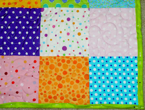 So I got up and applied some green to part of the quilt. The green is really good; I like it a lot. It works really well with the blues, pinks and the darker blue. This wasn’t the corner that I used for the other samples, so I removed the green and put it on the corner I was using for the sample.
 I put the green on the ‘common’ corner and I think it looks just as good on this corner.
 As a nod to Deirdre, I found a violet with some wavy stripes (with dots inside the stripes). I like the violet a lot, but I think the green is better. What do you think?
As an aside, in looking through my purple bins, I found that there were not really very many good violets in my bin. I don’t know if that is a product of my buying habits or the availability of violet. I’ll have to see as I see what fabric is available.
I like the green too! I still think the red works as well but I’m siding a bit more with the green because it’s a bit more unexpected and cheerful. Red is so good at framing just about anything I think, which comes in handy, but why not branch out if you get a chance. The purple sounds good but I think that the purple you show is too dark and acts sort of like the black did. I really wanted to like it though because it’s a really cute stripe. Another idea, you could use both the green and the red, maybe use the red on the corners like old fashioned photograph corners. Or make two sides red and two sides green.
The red is still more dramatic and works very well. I too, like the green though. And the blue as well.
You COULD make binding from leftover dots perhaps too. Tho you may go blind doing it. But if you matched up or alternated or shifted one square down with matching fabrics, you would have something cool too. However, it WOULD be a LOT of work!
Laume’s idea of red corners like photograph corners, with green along the sides is interesting too.
I bet the right shade of deep blue would work as well as red if for some reason you did not want to use red.
Thanks so much for your comments. I appreciate you checking in during your busy weekends so that you can offer your assistance.
LOL – Jaye – you’re just too cute. You’re probably going “Huh? What brought that on? Did I miss something?” Yeah, you did. I’m in the middle of a…. not a flame war, just one of those conversations that can’t possibly work within the constraints of the internet and I’m really frustrated. So I wandered off into blogland and checked in here and you’re always so polite, even when you’re angry (the library issue on my behalf earlier this year – which I never did get to finish talking to you about) and on top of that we’ve known each other online for such a long time and even had the pleasure of meeting in person several times and …. well, it just made me feel better again.
Okay, I’m done being weird. Weirder than usual. You can go back to whatever you were doing now.
i’m sorry i’ve been so bad and haven’t been here – i have an rss feed thing and it didn’t show me that you’d updated – it was a big fat liar!
anyway, my fave bindings are the green and the blue. i didn’t like the red as much as the red and blue, myself.
the quilting really is lovely on this quilt and it’s SO incredibly cheery and happy and delightful!
Laume: you are sweet! Thanks for reading. I am trying to set a good example for the world by being polite.
Kristen: thanks for reading when you have time. Thanks for checking in and weighing in on the binding, I appreciate it.
Now, Sherri, I have to think of a quilt that will work with a read binding to make up to you. 😉
Nope, you don’t! I already have one with red binding and that is probably why it appealed to me. lol I really DO like that green that you went with in the end though. If a cheery quilt is what you went for, you DID IT! 🙂
WHEW! That is a relief. I will probably make a quilt that needs red binding someday. I am glad you like the green binding. I did want a cheerful quilt. These days, I am all about cheerful.