Another teacher to add to your ‘must take’ list. This woman knows how to teach! She knows her stuff, has confidence in her teaching and has an opinion, which I like. I don’t have to agree with the opinion, but wishy-washy “well, what do you think, dear?” kind of comments from a teacher, make me crazy.
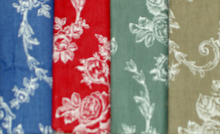
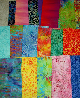
Above are the fabrics that I brought to class. Not being a hand-dyed girl, I chose batiks in a palette that I like. Her suggestion of 3 yards was a wild shot in the dark, IMO. I would improve the supply list by asking for 20-30 FQs evenly divided among all the colors. In this case, I was able to find some fabrics out of my small batch to work with, but other people were having a really hard time. Even people who had brought a lot of fabric with them.
The first part of the class was all about design. No sewing. Some people were completely mortified. I was thrilled. I actually got to spend time on my design and try out a couple of different things. One thing that Swain said, which resonated with me, was that people find their materials first and then try to find a design to fit the fabrics. I Think it is true in a lot of cases, but I don’t think it is true, mostly, for me. It is definitely something to consider and keep in mind.
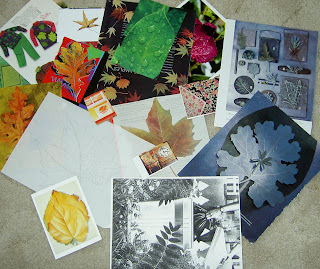
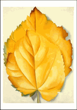
The theme of the class was leaves. Mom went through my inspiration file and pulled out many of the pictures containing leaves. Talk about a hero! I went through the pictures a few times before I started the design and whittled down the group. I finally settled on a Georgia O’Keeffe postcard of a painting called Yellow Leaves (bottom left). Apparently the real painting is at the Brooklyn Museum of Art. In surfing the web, I found an image of another of her leaf works that has to be in the same series called Pattern of Leaves.
Swain gave us large format patterns, which we could have also used, but I don’t think anyone did.
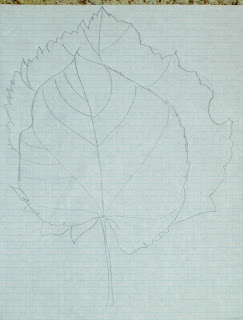
This was my first attempt and , frankly, it is pretty much a copy of the O’Keeffe work. Swain said to add another leaf (rule of odds) and turn the leaves so they were going in different directions. I had a hard time understanding what she was suggesting. She ended up explaining it by saying to align the leaves so they hit various points on the letter C. Finally, I got it and set to work.
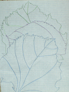 This was my second attempt. After finishing the draft, I was concerned that not enough of the two upper leaves were showing.
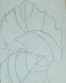 I traced my second attempt, but shifted the paper slightly to modify the spacing. It ended up with too much spacing.
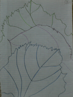
Above is my fourth attempt, which I liked. Again, I modified the spacing.
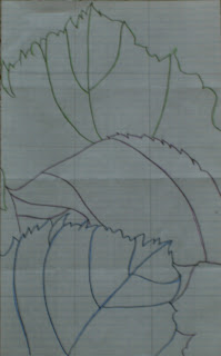 This is the final design for my project. It is the third drawing, which Swain thought was better than the fourth.
I think the above process is a good example of why spending the time on the design is worthwhile.
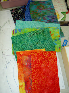 My first thought was hat I would make each of the leaves out of a variety of different fabrics. Above is my first pass at fabric selection. I was thinking that more fabrics would add interest.
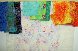 Here are my choices with the background.
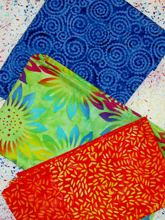 This group is good, but Swain was concerned about the strong print on the middle fabric. She thought, when cut up, the petals of the sunflower would draw the viewer’s eye in an unintended direction. She is very much about careful choices in both fabric and seam lines. There were a lot of things she said that reminded me of Ruth McDowell’s work with seam allowances.
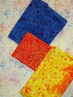 Here is my final selection. I guess it is ok. I may work on it a bit more later just to make sure I am happy with it. I like the fabrics, but the combination as leaves is a bit of a stretch. I am, however, willing to work with the colors to see how Swain’s advice works.
 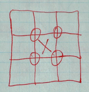 Here is one example Swain had for a design principle. Think of a tic-tac-toe board. Put an x in the middle, because you don’t want to put anything exactly in the middle. The Os at the intersection of the squares are where she suggested we place our images, if doing this kind of a design.
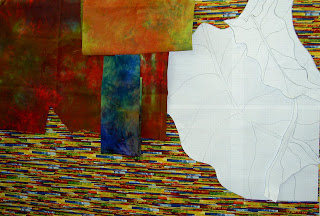 Julie’s fabric selections and pattern. Julie is Swain’s star student as Julie took her 6 month creativity class earlier this year. Sadly, none of the glow is rubbing off on me. 😉
