I have, as you know, been thinking about turquoise A LOT lately. I have, at the same I think about colors in and for quilts, been thinking about what color to paint my bedroom. So far I have been leaning towards some type of periwinkle. Truly I am actually thinking of painting my bedroom the same color TFQ painted her bedroom. Partially, because it is a very restful color and partially because the decision is already made.
Yesterday, however, all that changed. I am thinking that all the trouble I have had for years identifying my very favorite color is because I haven’t wanted to acknowledge that my favorite color is blue. I am still not willing to acknowledge the humble blue as my favorite color, but progress on self improvement is always slow.
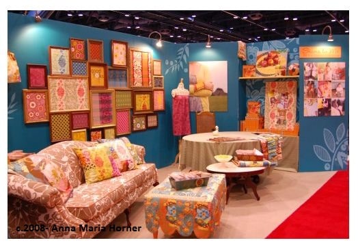
When I saw this picture on Anna Maria Horner’s blog yesterday, it occurred to me that I need to rethink my thoughts on color. I like the whole look that Anna Maria has created here. And part of the issue for me is the whole look. I can just plop that lovely (if a bit dark) blue onto my bedroom walls and call it good. However, there is a look here and I will be disappointed if I don’t do something about the rest of the parts. I would have to think about what could realistically translate from here into my bedroom.
Anyway, Anna Maria has a bunch of photos of her Houston booth so go take a look. All the photos I saw on her blog are wonderful. Sigh. I have a ways to go in that department.
Any suggestions on dealing with a look, especially on a budget, are welcome.
