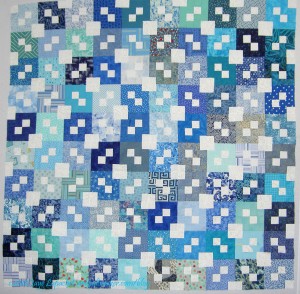
Infinity Quilt

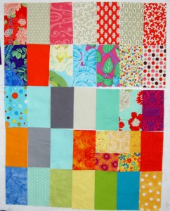
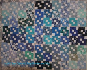
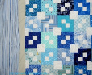
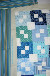
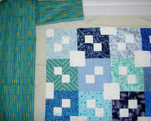
Finished Infinity Top

This photo is old news for you, but I thought it should be shown, so I could tell you that I have finished the back and you would know that the two of them go together.

I still have not decided what to do about the border. It is possible that I will leave the grey border and just bind it with the striped fabric that every liked best. I have time to decide; it is not at the quitlter yet.

Some time ago (years, perhaps), I bought some Harry Potter fabric. I bought it make something for the Young Man when he was in the throes of his Harry Potter mania, but then never made it. Renditions of beloved characters are never as imagined, though  the Young Man didn’t seem to care. As this quilt will go to one of the nephews, I thought it would be a good opportunity to finally use it. He is just about to start reading the books, so I hope he will like the back. I spent Sunday (a week ago) making the back.
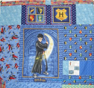
Infinity Quilt back
Infinity Quilt back

While I made the back, I tried to be calm about it. I didn’t want to make another back, but I also did not want to be angry about making the back. Angry when I am sewing? Odd, I know, but as I mentioned, performing the same parts of the quiltmaking process over and over gets tedious after awhile. I could have put this quilt away again and waited to do the back, but, instead, I decided to just making it and move forward. I really do see benefit in making up backs and bindings as soon as I am done with the top. It makes the finishing process so much easier.

Also, the pieces were large, so I didn’t have to fiddle too much. I was able to sew quite a lot of donation squares together in between sewing the back. That was gratifying.
Swoon #10

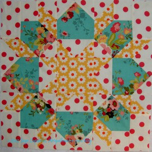
Swoon #10
Swoon #10

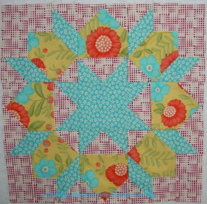
I like this one and I was able to do a little adjusting of the colors. I really like the blue print in this piece. Again, it is from the Sophie line by Moda.

I didn’t, however, want to have part of the block drop out because the pink flowers would blend with the dots. What I did was, where possible, I would put the pink flowers in the part of the block that would get cut off. For example, there are many places where I place a square over a corner, sew on the diagonal and then cut off the remaining triangle. I made a big effort to place the flower part of the blue fabric in the location that would be cut off. I think that the effect is of more blue in this block than pink. The larger dots really give these blocks a different look.

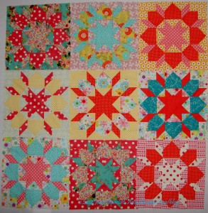
Nine Swoon
Nine Swoon

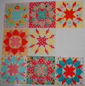
I think the blocks are starting to look like a group. There are some fabrics I need to use a second or third time, but I am getting to the point where I might want to stop making blocks.

FOTY – Mid July

FOTY mid- July
FOTY mid- July

I know the name of this post has mid July in the title and the date of the post is late July. I didn’t have a chance to post it until now.

These are a lot of fabrics that I was able to iron. Also, I finally patches from a few of the QuiltCon solids that I hadn’t cut yet.

Some of the yellows are from the Yellow donation quilt that is in process.

There are a few of the Vintage Modern fabrics I bought recently. I plan to use them for another Stepping Stones (Underground Railroad block) quilt.

Cat Bed #1

Cat Bed #1
Cat Bed #1

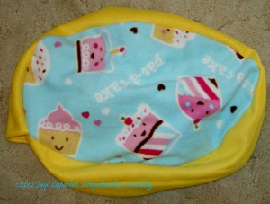
This is the cat bed that I made from the kit I got at the last BAMQG meeting. I didn’t think that I would enjoy it, but it went very quickly and in no time I had the thing done.

I had some schnibbles so I put as many as I could inside to stuff it. Amanda will have to stuff the rest of it with all the schnibbles she has collected.

The polar fleece only caused me a bit of pain and suffering, but not much. I am quite pleased with how it came out.

I have to admit that I enjoyed making this. I find satisfaction in making the donation quilts and also in making this cat bed. If you want to make one, Amanda has kindly allowed me to post the revised, simpler Cat Bed Pattern .

Swoon #8

Swoon #8
Swoon #8

It took me awhile to get back to the Swoon blocks. I keep the latest one on the design to remind me to do it. It has been awhile since I made the last one. I think, after reading Landscape Lady’s comment from last week, I am in transition. I am trying to be in transition.

I spent last Saturday making blocks. It is kind of meditative work, but also clean up work in a way. I made some blocks for the A-B-C Challenge. I also made the Swoon block.

It is funny when I make Swoon blocks. I make one and then I want to make another, but I put it off, because there is so much cutting. Then I have to learn to make the block all over again. I made some notes when I made the last one and it was easier this time. I hope not to put it off so long until I make the next one.

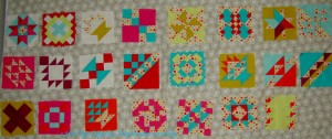
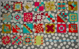
8 Swoon Blocks
8 Swoon Blocks

Since I had cleared the design wall, I put all the blocks up and took another picture of them all.

One thing is that I think I will add sashing. Yay! I get to go through the drama of picking sashing fabric all over again. Perhaps I should take my time making more blocks? 😉

I think the look is pretty good. I will make more and then see how I want to proceed.

Creative Prompt #167: Solitaire

card game

Desert Solitaire by Edward Abbey

Solitaire is a Big Finish Productions audiobook based on the long-running British science fiction television series Doctor Who.

Solitaire is an album by American pop singer Andy Williams that was released in the fall of 1973 by Columbia Records.


Solitaire, A Rose

The morning rose you touched still stands.
And see how sweet, how sweet this one,
this single one it smells when in the sun?

And each petal falls,
once full when open is now gone.
Each single one by they are young,
like all the rest now gone.

Rare such flowers once were loved,
when blind are cast aside.
To see each loved each every one.
But one not loved by any one.

And loved is this a single one.
Solitaire,
is played by hand then picked,
by wind and gone.

Jane Seymour played Solitaire in Live and Let Die

Definition: Solitaire is any tabletop game which one can play by oneself or with other people. In the USA, it may refer to any card game played by oneself; the British use the term Patience to refer to solitaire with cards. The term “solitaire” is also used for single-player games of concentration and skill using a set layout of tiles, pegs or stones rather than cards. These games include Peg solitaire and Mahjong solitaire. Most solitaire games function as a puzzle which, due to a different starting position, may (or may not) be solved in a different fashion each time.

kind of diamond ring

Neil Sedaka album

Ski movie

“The Way”/”Solitaire” is the second commercial double A-side CD single by Clay Aiken released on March 16, 2004, on the RCA label.

a pipelaying vessel

a superhero comic book created by Gerard Jones and Jeff Johnson in 1993 for Malibu Comics.

Solitaire Unraveling” is a song by the American industrial metal band Mushroomhead and the lead single from their first major label album XX, released in 2001


Solitaire

Silently I stepped around
not to disturb anyone with a sound.
Just to enjoy the morning silence
where my mind could wander around.

Enjoy the peace in the air
without intruding voices everywhere
and enjoy the solitaire
that the morning held there.

17 September 2010

David Harris

Make your response simple. It doesn’t need to be a masterpiece. Take 5 minutes. Just respond and create a creative habit.

Please post the direct URL (link) where your drawing, doodle, artwork is posted (e.g. your blog, Flickr) in the comments area of this post. I would really like to keep all the artwork together and provide a way for others to see your work and/or your blog, and how your work relates to the other responses.

The Creative Prompt Project has a Flickr group, which you can join to post your responses. Are you already a member? I created that spot so those of you without blogs or websites would have a place to post your responses. Please join and look at all of the great artwork that people have posted.

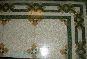
Tile as Inspiration

Tile Floor - full
Tile Floor – full

I walked down S. Michigan Street in Chicago towards the Art Institute of Chicago one day. I am a sucker for architectural details and saw tons. I was in a rush, though, because I only had a little while to check out the AIC.

On my way back, I ducked into vestibules and lobbies to take photos. I was rewarded by this tile floor. I want to make this border. I need to figure out how to make this border!

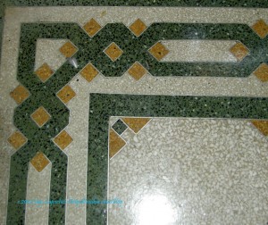
Border detail
Border detail

I think that the border could be divided up into blocks to make the piecing easier and more straightforward to piece.

Notice the little corner treatment inside the straight green inside border.

I even kind of like the green and gold, though I wouldn’t do all that piecing, then create a green and gold quilt with such an elaborate border.

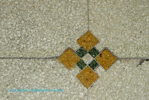
Nine Patch Reimagined

Several of these blocks are spread over the center of floor that has the border above. I glanced at it and thought “nine patch,” then I looked at it again and was intrigued because of the way the middle squares (green in this rendition) are smaller and part of the space disappears into the background. I really like the way the yellow squares are much larger. I’ll have to try making one of these.


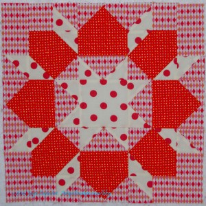
Swoon #9

Swoon #9
Swoon #9

I quickly made up this next Swoon block on Monday night.  I was blatantly avoiding my regular household tasks. I found it to be an intellectual challenge to keep the background lined up so that it didn’t look strange.

I am pretty happy that I did such a good job. I am also pleased that I was still able to use Deb Tucker’s technique to make the Flying Geese and the Triangle Technique to make the Triangle Squares.

Now I have to decide if I am going to make more blocks or if I am going to stop and put these together. I have an interest in using the pink dot on white for the background in another block.

We’ll see.

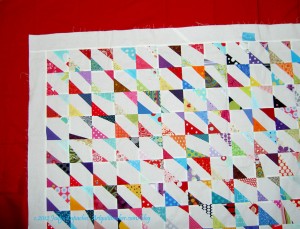
Corner Store Once More

Corner Store Red Border

Apparently, I am still thinking about this quilt and you are, too.

Rhonda wrote in a comment “I’ve been thinking a lot about this quilt. Probably because the whole idea of a “souless quilt” is so sad! If this were my souless quilt, here’s what I would do. I would keep it as is, including the white border that is the same width as the squares. Then I would add a 6- or 8-inch wide border in a warm solid color, maybe red, or orange, or magenta. The border would need to be wide enough to balance out the white with color. I would probably do the binding in the same solid as the wide border. Maybe then it would look like the border was trying to contain/constrain all those active little triangles that are dying to get out of the box, and create some tension. Some applique on the border of escaping/leaking triangles would be fun, too. That’s it. That’s all I’ve got.”

When she wrote that I thought I would see how the quilt would look with a red border. I’m not sure, though I do see an improvement. I bought the red for something else, but it does add something to the quilt. I would have to make the back larger, if I decided to add another border.

Infinity Alternate Layouts

CLW's Infinity Layout
CLW’s Infinity Layout

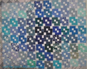
My SIL kindly sent me some photos of the layouts she tested before putting her Infinity blocks together. It is interesting to see the use of color to create the layout. This type of layout did not even occur to me. I was thinking more about the wreath effect of the piecing.

CLW's Infinity Layout #2
CLW’s Infinity Layout #2

I am really glad my SIL sent me these photos so I could be reminded of the other ways to layout blocks.


A-B-C Challenge Sashing

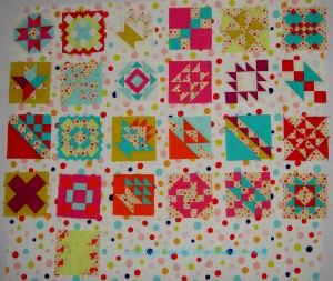
Light grey sashing
Light grey sashing

This is a fabric I bought at Quiltology. I didn’t have the blocks with me, but I thought it might work. In the end, a person has make visually decisions visually. Looking at it with the blocks on the design wall, I am not so sure. I think the grey has too much beige or brown in it, but it isn’t terrible.

Grey circles sashing

I have to make a few more blocks, but the more important thing I need to figure out is this sashing thing.

I thought the grey Half Moon Dot would work, but looking at in the photo makes me think that the dots are too large and it makes the piece look too busy. It’s too bad. I do like those dots, but not for this piece. I do have to think of something to do with the Half Moon Street Collection, though. Soon.

Large dot sashing
Large dot sashing

The dots were a good idea, though, so I looked at some other dots I had. No shortage of dots, of course.

I have to use a fabric of which I have enough (one of the bad things about stashing fabric is that you might have the perfect fabric, but not have enough of it: design challenge, I think, yes.)

I like the large dot a lot. I like it because it looks cheerful. I also like it because it showcases the blocks better than the grey does. I do worry that the white will run into the white of some of the backgrounds I used. I also worry about the colors of the dots not being the same, but I think the colors of the dots are similar enough, so that is not so much of a worry. I don’t think the Zoe Pearns Sweet Nothings dots don’t conflict too much with these large dots.

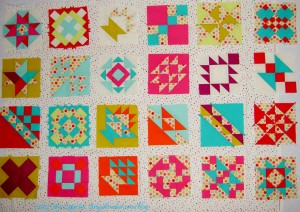
Small dot sashing
Small dot sashing

This small dot works, I think, but the dot might be too small.

Click to make the last photo larger to see how the small dots look against the blocks. The small dot works well with the Zoe Pearns Sweet Nothings in the blocks. It is also bright enough, but the white doesn’t seem to suck the life out of this piece.

What do you think?


Infinity Quilt Border

Light Stripes
Light Stripes

This is the fabric I thought I would use for a border first. I have it in my fabric closet already, but I only have a yard, so I don’t think I would be able to add it lengthwise (the stripes running parallel to the edge of the quilt). I guess I should have taken a picture of the fabric oriented in the way I was thinking of using it.

Oh well, use your imagination.

I do like the color of it – actually the color feel of it. It has the right feel to go with the rest of the quilt. It is a very restful border. I am concerned that I don’t have enough yardage and I don’t want to be fumbling around trying to make it work. I usually buy enough of a striped fabric for bindings and not borders. A yard is usually enough for a bias binding and if it isn’t, I have no business making a quilt that big.

Blue & Yellow Stripes

I bought this piece at Quiltology. I tried to drape it so that you could see how it would look if I added it to the quilt as a border. How did I do? The colors aren’t quite right, but I do like adding a bit of yellow. One thing about adding these types of colors brings out some of the fabrics in the blocks that tend towards green.

I have to say that I am bit concerned about the grey border I added. I thought it would be the final border of the quilt, but then decided that the quilt needed to be finished off with something a bit darker.

My concern lies with the grey. It is very different from the white in the blocks, which is why I added it.  I wonder, though, if it isn’t so different that it doesn’t work. I kind of like it, but I don’t want people snickering behind their hands at my poor judgment.

Blue & Green Stripes

This piece, also purchased at Quiltology, has much more green it. I didn’t realize that it had so much green until I got it home. I think that this is an issue of the type of light I live in. When I saw it in my workroom, I thought it had much too much green, but seeing it in the photo makes me think that it also brings out the blocks with green in them.

Frankly, in the end, I don’t care that much. I would like to be done with this project and I don’t want to spend much more time agonizing about border fabric. alternatively, I don’t want to look at it after it is finished and wish I had done something different.

Again with the artistic angst! I hope this isn’t becoming a habit.

Quiltology

Quiltology
Quiltology

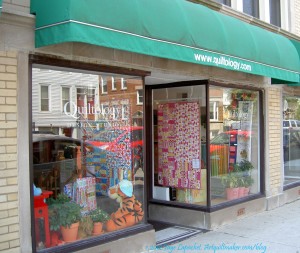
I went to a quilt shop while in Chicago called Quiltology. I got myself there via the El, which was fun, though, I thought it was a bit noisy. I was able to get myself there by reading the shop’s website. They have a nice page detailing how to get to the shop via a variety of modes of transportation.

The shop can be found at:

1221 W Diversey Pkwy
Chicago, IL 60614
Tel: 773-549-6628
Email: info@quiltology.com

You might recognize this shop from the Quilty show. They film the show at this shop. I was shocked when I walked in, because the shop is very small. Much smaller than it looks on TV.

I had to admit that I was disappointed and made a snap judgment that I would escape with my wallet intact.

Oh, how wrong I was.

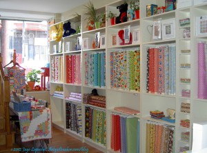
Colette, the owner, is a delightful person, but also seemed strong and a good business owner. She has filled the shop with a good variety of fabrics. Not only does she have many modern fabrics, there are plenty of solids and dots as well. I was surprised, and delighted, to see that she also had a good collection of batiks and 1930s prints. Quiltology also had a number of Minkee fabrics, which she said she suggested for backs, especially of baby quilts. The modern prints are more of the medium-large prints than the really large prints. I think they are easier to use. I thought the batiks and 1930s prints were a bold choice for a modern quilt shop (my assumption). Though she didn’t say, I think they were added to appeal to different types of quiltmakers and expand the horizons of some of the young mothers that patronize the shop.

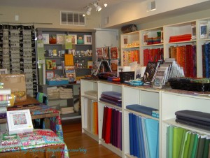
Right side of shop
Right side of shop

Colette seems to be the type of person who I would invite to be in a mini group. She learned to quilt before me and we have some of the same sensibilities about how quiltmaking should be taught and the problems with learning via pattern rather than by sampler quilt. We also discussed the lack of interest in drafting quilt blocks.

The second photo to the right shows some of the batiks and many of the solids available in the shop. The photo also shows the selection of books and notions.  The  black and white quilt to the left of the quilt. Colette is using this as a cover for the doorway to the back. You can see a corner of the cutting table, middle left.

Front left of shop
Front left of shop

The shop is bright and filled with light. The shelves are white and the wooden floor is a lovely honey color (Kastanianhonig – chestnut honey, specifically).

I would highly recommend visiting this shop if you are in Chicago. You won’t be disappointed.

Clocks

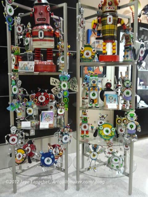
Robot Clocks in SFO
Robot Clocks in SFO

It was sort of a clock week last week. I went to Chicago for work. I don’t like sleeping in hotels as I never sleep very well. I do love looking at the sights and sounds and details of new cities. I tend to take lots of photos of details. I saw several displays of clocks on this trip, which was very interesting to me. I really liked the angles and colors of the display at SFO.

One appealing aspect was the repetition. There are so many of the robot clocks that the arrangement is interesting because of the repetition.

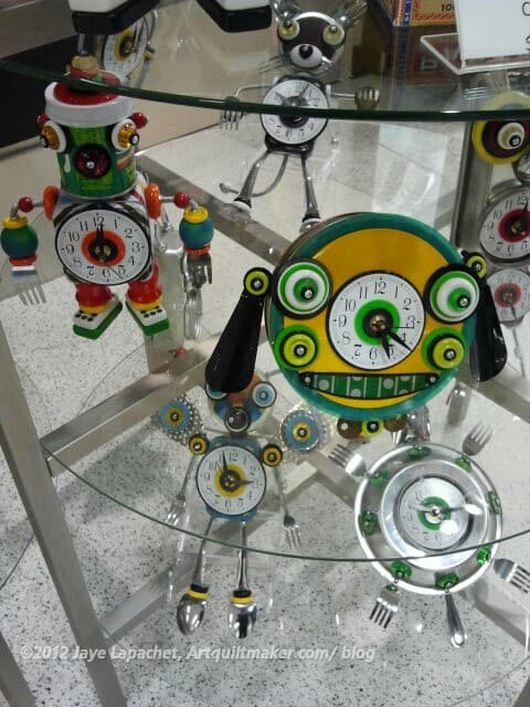
Robot Clocks in SFO detail

I became more interested in the design of clocks when my son was small. He was fascinated with clocks and always pointed them out to me. He also dragged one around for a year that just fell apart in his 2 year old hands.

Clocks are, to me, the epitome of something that can be useful and beautiful. Because of the way we live, we all need clocks. They also can be small, so they are easy to buy or make and the design possibilities are endless, as shown in the detail photo, right.

While in Chicago, I visited the Art Institute of Chicago. Regardless, I was determined to do that. I didn’t have a lot of time, so I kind of wandered through and I found my creative juices start to flow. At the Art Institute, they had a lot of clocks, which was interesting to me. I love looking at items from Decorative Arts collections and don’t remember seeing so many clocks in other displays.

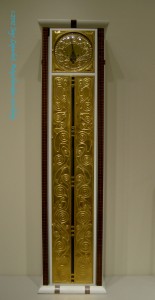
Tall Case Clock, c.1906, Vienna

The gold is quite a lot in this piece, but I really liked it. It reminds me of the Klimt painting the Kiss. Klimt was Austrian, or worked in Austria, too. The AIC has more information about the clock online. I wish all museums did this.

I always wanted a tall clock like this in my house, but we don’t have the appropriate scale of house. Perhaps in my mansion when I win the lottery? 😉

Art Deco Clock (?)
Art Deco Clock (?)

I cannot guarantee that this last photo is actually an Art Deco clock. I forgot to take a photo of the description. It has a kind of 50s look to it, too.


Creative Prompt #166: Growth

plant growth

period of rapid growth

economic growth

Definition: Growth refers to an increase in some quantity over time. The quantity can be:

  • Physical (e.g., growth in height, growth in an amount of money)
  • Abstract (e.g., a system becoming more complex, an organism becoming more mature).

It can also refer to the mode of growth, i.e. numeric models for describing how much a particular quantity grows over time. (Wikipedia)

tumor

development from a simpler to more complex form (freedictionary.com)

growth of a city

trade growth

personal growth

growth economy

exponential growth

cell growth

smart growth

growth hormone

Growth chart

Make your response simple. It doesn’t need to be a masterpiece. Take 5 minutes. Just respond and create a creative habit.

Please post the direct URL (link) where your drawing, doodle, artwork is posted (e.g. your blog, Flickr) in the comments area of this post. I would really like to keep all the artwork together and provide a way for others to see your work and/or your blog, and how your work relates to the other responses.

The Creative Prompt Project has a Flickr group, which you can join to post your responses. Are you already a member? I created that spot so those of you without blogs or websites would have a place to post your responses. Please join and look at all of the great artwork that people have posted.