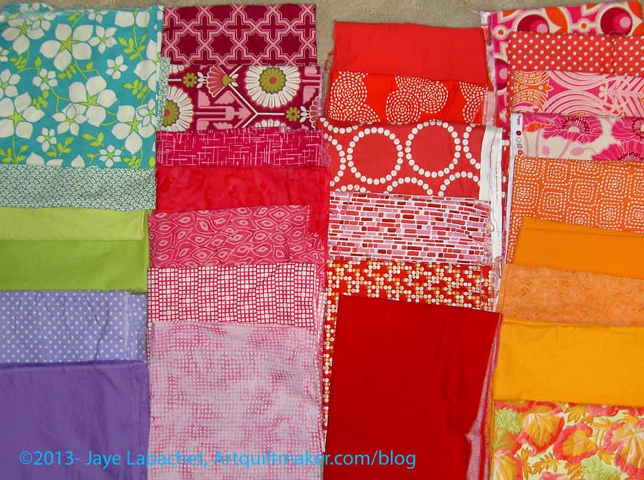
You might remember a couple of posts I wrote about choosing colors. I am still choosing colors for the Super Secret Project #3. As I said, I want to create my own roll of 2.5″ strips.
After I wrote the last post, I got a recent issue, (Summer 2013) of Bancroftiana, the Newsletter of the Friends of the Bancroft Library. The Bancroft Library is the “primary special collections library at the University of California, Berkeley. One of the largest and most heavily used libraries of manuscripts, rare books, and unique materials in the United States, Bancroft supports major research and instructional activities and plays a leading role in the development of the University’s research collections”. Periodically I give money and, periodically, they send me an issue.
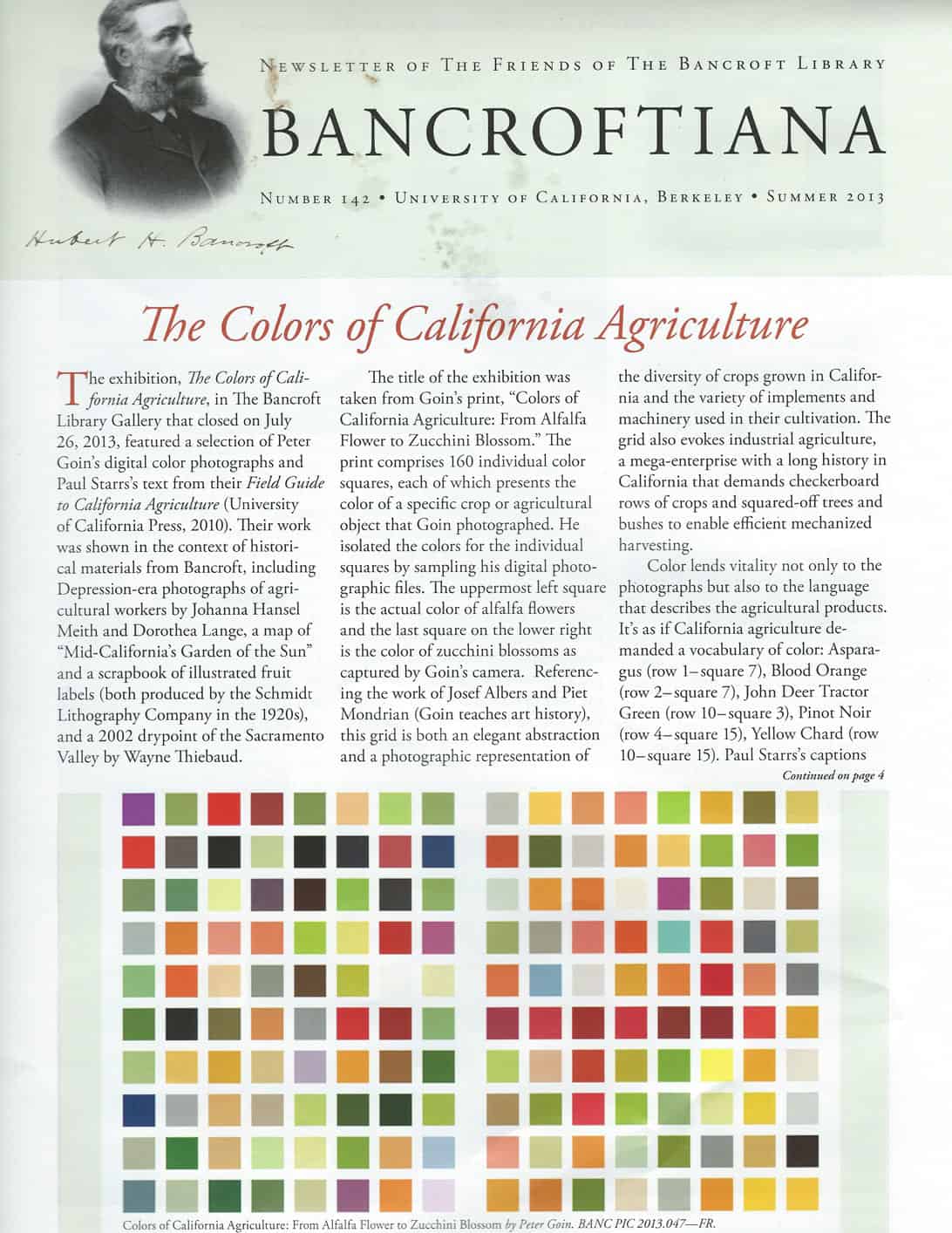
It is amazing that this came right when I was working on color choices. The article discusses an exhibit that recently closed that “featured a selection of Peter Goin’s digital color photographs and Paul Starr’s text from their Field Guide to California Agriculture (University of California Press, 2010).” The color grid “comprises 160 individual color squares, each of which presents the color of a specific crop or agricultural object that Goin photographed. He isolated the colors for the individual squares by sampling his digital photographic files. The upper most left square is the actual color of alfalfa flowers and the last square on the lower right is the color of zucchini blossoms as captured by Goin’s camera. Referencing the work of Josef Albers and Piet Mondrian (Goin teaches art history), this grid is both an elegant abstraction and a photographic representation of the diversity of the crops grown in California…” I looked at the cover and that color grid and thought how much the colors resembled the color choices I was working with. Some of the colors are very similar to the colors I started to choose in the previous two posts. It also made me wonder if I am simply reflecting the colors I see in my every day life spanning all the years I have been alive?
Also, the reason the article was written was about California agriculture. Could that be my color story? I don’t know much about California agriculture and California agriculture wasn’t my intention, but it isn’t a bad color story. It is kind of an interesting story.
I was kind of shocked at how I was on the same page as the magazine. The photo really helps me figure out what colors I am missing. From the photo, for example, I can see that I need some lighter yellows – like butter yellow, but a little lighter. According to the photo I could add beiges, some blacks and very dark blues as well as a variety of different greens. Thinking about the hues and the fabrics I have already chosen, make me think about what fruits and vegetables and implements are the color of each of those squares. There are 160 different hues in the magazine photo. I don’t need, nor will I choose 160 different fabrics, but the grid gives me a lot of options.
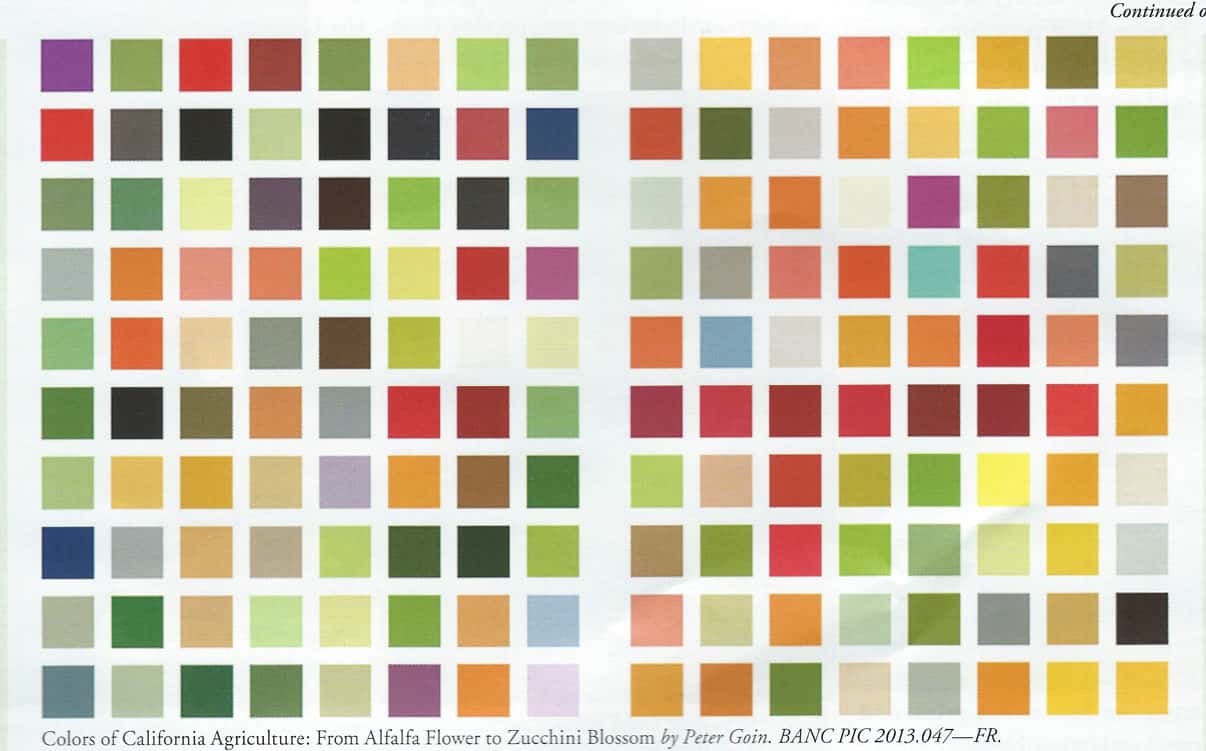
The way they named the colors in the exhibit is interesting. They named them after the colors of the plants they photographed. Asparagus (row 1-square 7), Blood Orange (row 2-square 7), John Deer Tractor Green (row 10- square 3), Pinot Noir (row 4-square 15), and Yellow Chard (row 10-square 15).
It kind of makes me warm and fuzzy to think that someone saw the beauty in something that we put on our plates and eat for dinner.
I was thinking that I was off base with the violet, but according to the color grid and this color story, the purples work. The blues in the color grid are a little more grey than I was thinking I would like to add (turquoise, of course). I will look at the color grid and see what I need to add. I still need about 15 more fabrics.
The thing I wonder about is whether I would be cheating.
Cheating?
Yes, cheating on the Bill Kerr system of choosing colors. Would I be cheating if I took some hints from the photo in the magazine? I don’t know. I’ll have to think about that, but I don’t think a little help is a bad thing.
Related Posts:
July 1, 2013 – Choosing Colors
August 20, 2013 – Continuing to Choose Colors