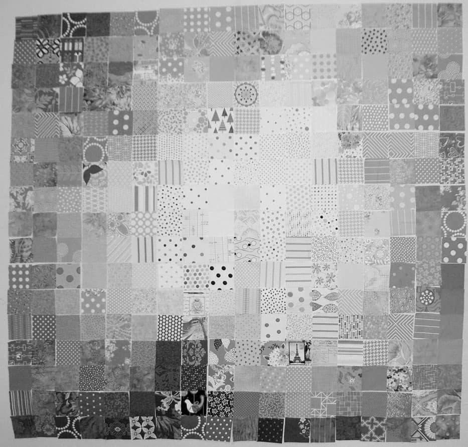
I am slowly, painfully, making my way through the FOTY 2013 piece. I am nearing the end of the arranging.
Nearing the end.
Not there yet.
I have been looking at the quilt project through the green and red films that come with the Ultimate 3-in-1 Color tool (if you don’t have this, click on the link and buy it RIGHT NOW**). It hasn’t been working out that well for me, so I decided to switch a photo to black and white to see areas that could use improvement. This was a great idea, because 1) it shows me that I am doing pretty well and 2) it shows me areas that I might be able to improve.
I am trying to stick to the idea that the darkest fabrics will go on the bottom because they have a heavier feeling.
I also want the like colors to be mostly together and there to be a smooth-ish gradation between colors.
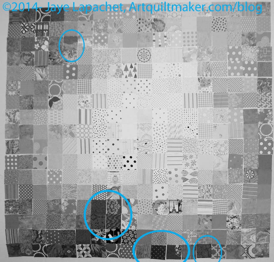
I thought I would share with you areas that jumped out at me and see what you think.
The areas I have indicated are too dark or too light for where they are currently placed OR do not make a smooth transition. I have not moved anything yet, because identifying a problem creates another problem: where to put the problem fabrics and what to put in their place.
This is where you have to look at the piece and at the colors to make sure that if you move it to the ‘obvious’ location, it doesn’t ruin the smooth transitions between colors.
Once I make the changes, I have to go start the process over.
**You should buy the Ultimate 3-in-1 color tool because it is a quick reference for color work. You can look at the relevant page see the complement, the analogous colors, triadic and split complementary. There is also a long list of colors that would work in a monochromatic quilt. It is a sampling of tints, shades and tones.
Previous Posts that Might be of Interest:
- The Start of it All: Coalescing Ideas
- Falling Water Version of FOTY 2013
- First Version of TFQ’s Fabric of the Year Quilt