
I am working on the next Creative Spark, but am not quite finished. I thought I would give you a preview with today’s ColorPlay Inspiration photo.
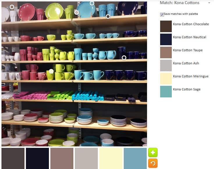
Once again the default was a disappointment. More neutrals. This is a colorful photo and all I get are neutrals.
I wonder what the algorithm has against colors? Of course, it could be that the algorithm clusters together towards the top automatically. I noticed that the circles don’t go towards the bottom in the default.
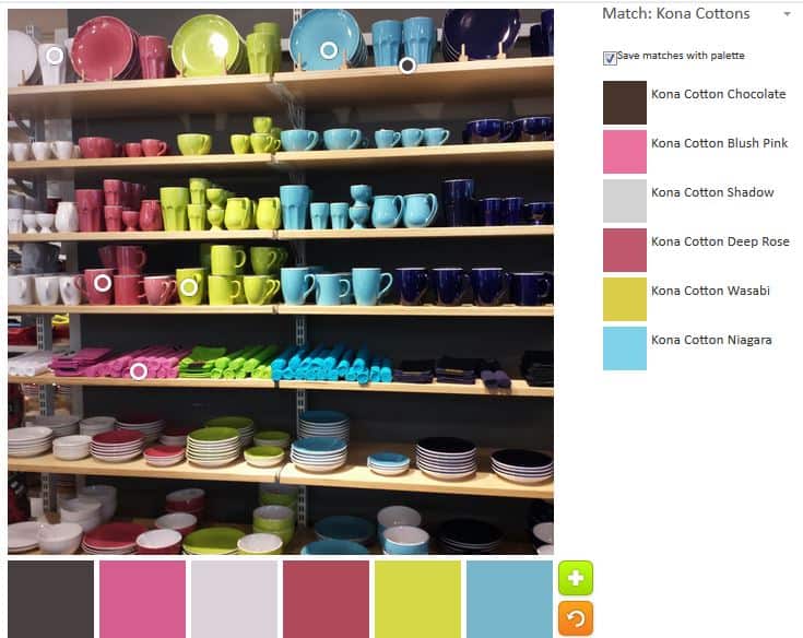
The second option was much better. Of course, I moved the circles around and picked the colors that I like and moved the circles around and came up with a very nice palette. I want to just stop and rest on my laurels.
Look at those pinks and the turquoise! The Kona Wasabi is an added bonus.
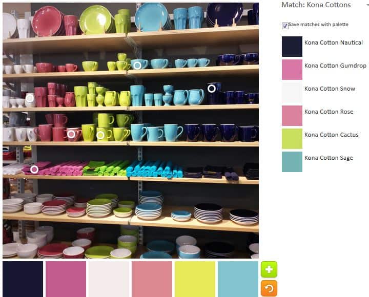
With the third palette, I tried to get different shades and tones of the same hues as in the second palette. I was moderately successful.
The Sage and Cactus are a good combination, though the Cactus looks a bit yellow in the lower part of the picture. I also like the combination of Deep Rose, shadow and Blush Pink. I like the three of them together.

I made some minor adjustments to the fourth palette. The colors are a little dustier than I normally like, but I think this might be my favorite palette. the Regatta blue is a very good addition.
It occurs to me that I could make a palette out of many or all of the colors from all of these palettes.
The Palette Builder is a great and fun tool. Try it out! Let me know if you make anything with any of these palettes.