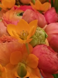
This week’s photo was a bad choice. It is a gorgeous group of flowers and I really like the image, but there isn’t enough diversity in the colors to make interesting palettes.
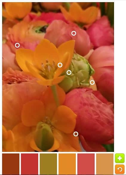
As a result, after the default palette, I stuck to monochromatic palettes.
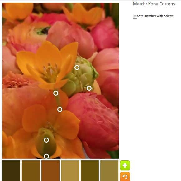
Green: the green looks really brown – or yellowish brown- in the palette.
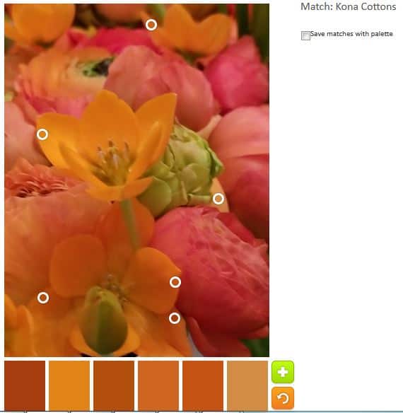
Orange: I thought the orange would be great, but, again, the colors look very brown. This groups would make a great Thanksgiving quilt.
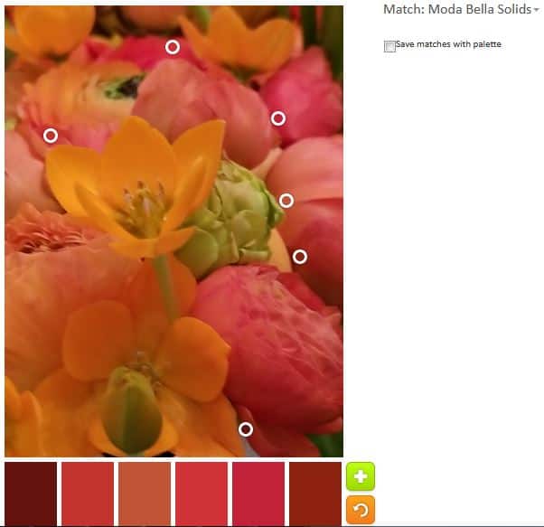
Pink: these colors aren’t bad. They do have a pink tinge to them, but I wouldn’t call them pink.
The tool was acting strange as well. The colors with names were not displaying on the side. It might be time to think up a new creativity/inspiration project.
Let me know if you use a palette to make something.
I love all these ranges! But yes, I have always been partial to brown. I see what you mean; they would all be great with a brown border or binding.
A great pic, is that your Mother’s Day flowers?
No, the deYoung has a exhibit every year where floral artists create bouquets to go with a piece of art. I was fortunate enough to have a friend give me a ticket.