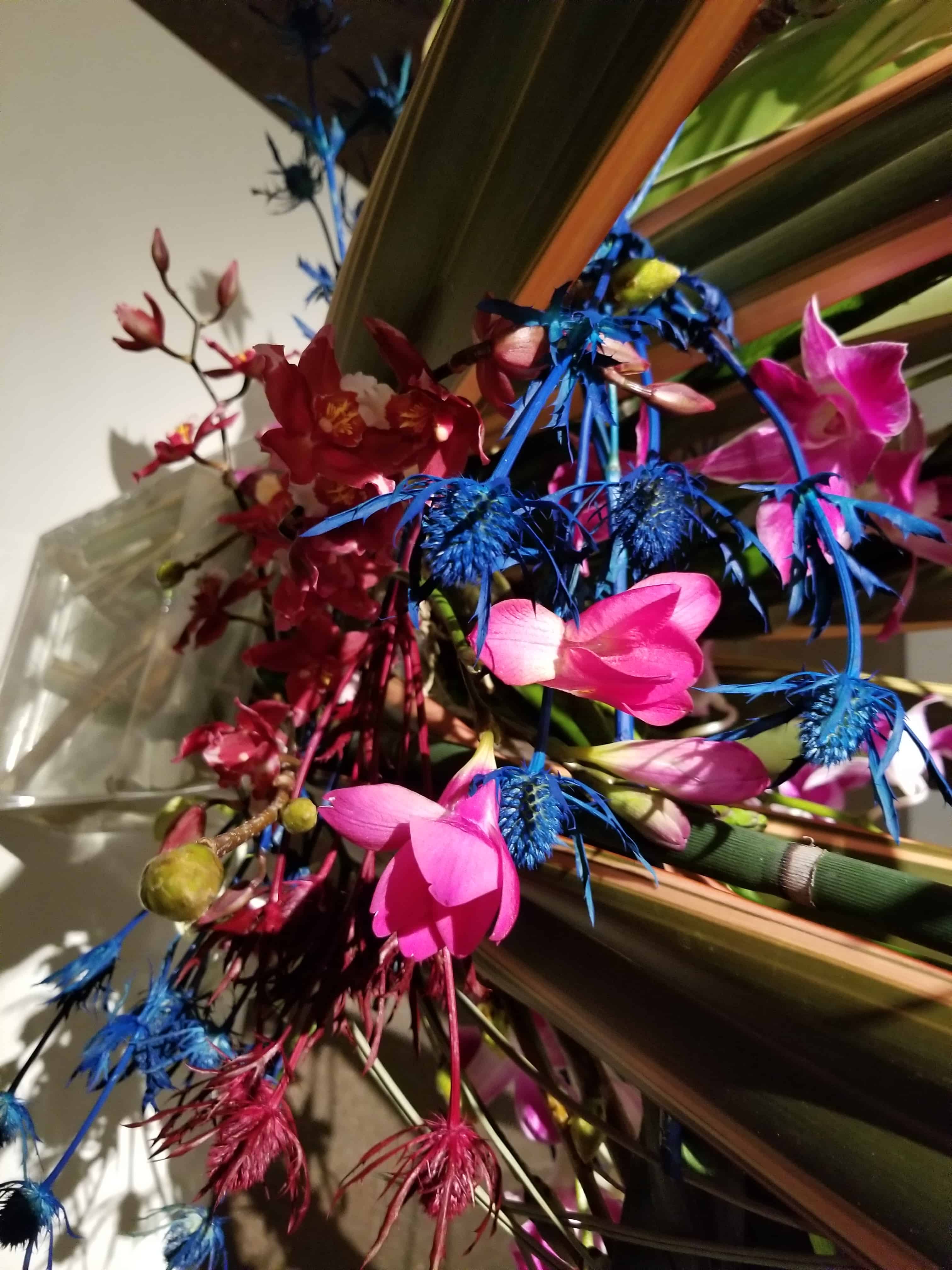
I took a few photos at a special exhibit held at the deYoung in late March.
I can’t remember the name of the exhibit. They do it every year and it is up for a very short time. Someone chooses artworks and matches them up with floral designers who create a floral arrangement that matches, reflects, goes with – or something – the artworks. I had a hard time seeing how the floral designs went with the artwork. You never know what the artist sees. I find that with my own work.
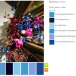
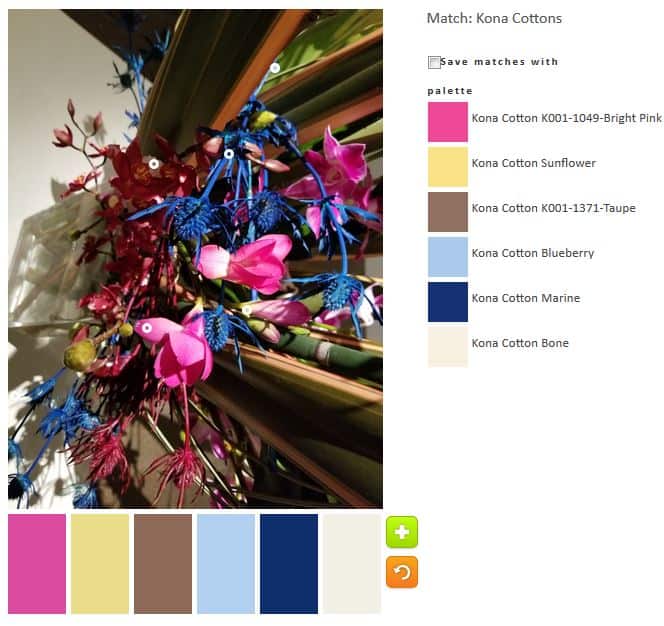
I have many pictures from the show, but the pink in this one intrigued me. I really created a lot of palettes and could have created more. There is a lot of scope for color in that arrangements. I had to stop because I knew you wouldn’t read about 50 palettes. I also didn’t want to write that much.
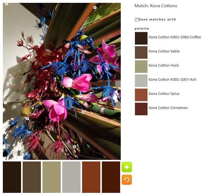
The first palette, as usual is the default palette. This one is seriously neutral and somewhat depressing considering the vibrant colors in the bouquet. I noticed that the circles tend to be placed towards the edges.
I made sure my first palette included some brights, or at least cheerful solids. I kept in some of the neutral feel as I was trying to show progression. I don’t like that Kona Cotton Latte much. It sticks out like a sore thumb.
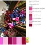
I have up on progression when making my first monochromatic palette, the pink. I was able to make two (yes, TWO) monochromatic palettes this time: a blue and a pink. I went for broke since that Kona Latte fabric really bugged me.
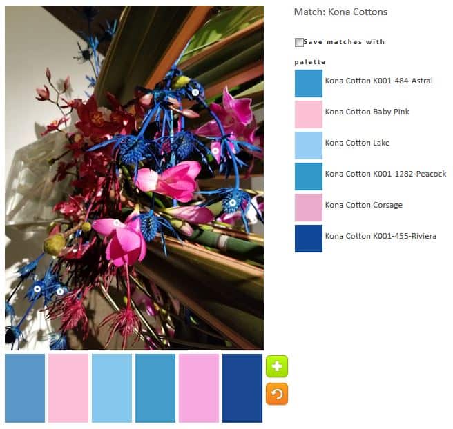
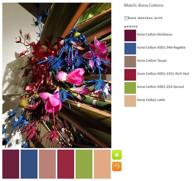
I went back to progression when I made palette n.3. I thought blue would look great with pink, so I kept some of the pinks and added some blues. I put more blues in as I didn’t want to make the palette exactly equal. I probably couldn’t have done another one that had more pinks than blues, too.
This one led to the monochromatic blue palette pictured above.
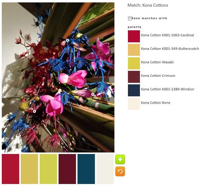
I tried to get away from my default blues and do something different. I think the anchor fabric in this palette is the Kona Cardinal. I didn’t completely succeed with this effort, because the Wasabi and Butterscotch are very similar. I am not sure the arrangement has need of that much of those tones.

I wanted to improve on the palette above, so I made minor adjustments. Chestnut Palm and Spice are not favorites. This is not my kind of palette.
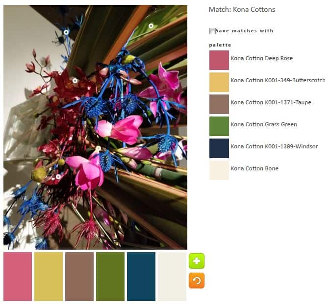
I tried to improve the palette above again. I think I did a better job. The Grass Green and Deep Rose are much better.
I think n.8 is the best iteration of the last few. The palette reflects my personality. The pink brings out the best in the Sunflower. I think Taupe is a supporting actor and I wouldn’t put a lot of that in a quilt.
You may see other arrangements from this show in the future.
Wow that was a hard one, you really stuck with it and tried everything. good job:)
Thanks!