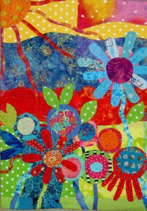
I did most of the work on The Garden in 2012. I nearly finished this before the New Year turned, but I didn’t have enough time.
As a result, this is my second finish of 2013. I am very pleased.
Commentary about works in progress, design & creativity
I did most of the work on The Garden in 2012. I nearly finished this before the New Year turned, but I didn’t have enough time.
As a result, this is my second finish of 2013. I am very pleased.
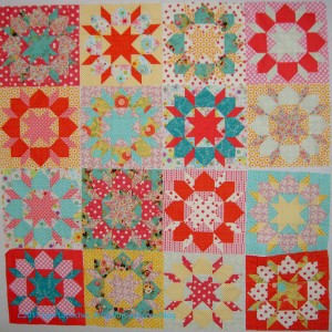
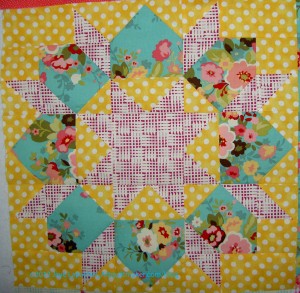
I pretended for a long time that I was just playing around with blocks, but after posting Swoon Block #13, I had to admit that this was a project.
I decided that I would finish up the last few blocks, put them together, make a back and see what would come next.
I am pretty pleased with the way the blocks have come out. I don’t know if this will be the permanent arrangement. I am considering and will have to see.
I am hard on the heels of bordering this quilt top. I had hoped to have the border, the back as well as the back for the Spiderweb done by the time I go back to work tomorrow, but I can see that isn’t going to happen. Life interferes. I have to eat, play chauffeur, spend time with DH. I am fortunate that life interferes. It is work I could really do without, as long as they would pay me not to show up. 😉
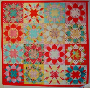
The first thing I did was put a framing border on the top. The variety of colors needed to be contained and the pinky orange did a good job.
Next on the agenda, which I know is going to cause me problems is the larger outside border. I am taking elements from the Swoon blocks (the corner piece, the house shape, or as Sarah calls it: the Turkey Butt) and making them to insert in the corners and middle of the borders. I am pretty sure I don’t have enough of the border fabric, so we will see how that works out.
Lack of planning with rending of garments or design challenge?
You can read about preventing sickly sweetness in the last post about this project.
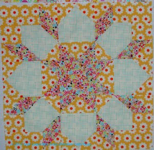
I sewed the last two blocks. They look great, I think. I did have some challenges picking the fabrics for the last two blocks.
I had picked out a certain crop of fabrics for these blocks. I didn’t want to add in any new ones that I didn’t have to add, because they wouldn’t be in the rest of the quilt.
If you zoom in you might see that I pieced some of the fabrics to make sure I had enough. That odd piecing doesn’t really show even in person, so I am happy.
Block #16 was a bit of a challenge, because I couldn’t decide if I wanted to use more of the blue Sophia fabric that kind of started me on this journey.I finally decided that I liked it enough to use it. I also decided that it wouldn’t scream out of the quilt that I had used too much of it. The blues are relatively strong in this piece, but I don’t think they overwhelm it. I think the blues keep it from being too sickly sweet with pink.
Now I am done with these blocks. I have decided that 16 is enough.
The last post was about the other Swoon block I made recently.
Since it is the first week of the year, I feel like I should use ‘New’ as the prompt, but I already used it. You can see ‘new,’ which may inspire your response to ‘old’ in a previous post dated 12/3/2010. It is prompt #96.
Old Man River
vintage
antique
the good old days
2 year old, 3 year old 4 year old, etc
Definition: Adjective, 1. Having lived for a long time; no longer young; 2. Made or built long ago: “the old quarter of the town”. (from Google definitions)
Definition/ Etymology #2: From Old English ald, eald, from Proto-Germanic *aldaz (“grown-up”), originally a participle form from Proto-Indo-European *altós, corresponding to Latin altus. Cognate with Dutch oud, Low German old, German alt, West Frisian âld, Scots auld. (Click on the link at this beginning of this part; lots of great ways to think about ‘old’.)
Old Testament
Old Sacramento
Old Town
older model
Can’t teach an old dog new tricks
Old Spice
Old Town San Diego
the old ways
Old Yeller (movie)
Old Kingdom of Egypt
Gorm the Old (Danish)
Old Man Winter
Old Order Amish
Post the direct URL (link) where your drawing, doodle, artwork is posted (e.g. your blog, Flickr) in the comments area of this post. I would really like to keep all the artwork together and provide a way for others to see your work and/or your blog.
The Creative Prompt Project, also, has a Flickr group, which you can join to post your responses. I created this spot so those of you without blogs and websites would have a place to post your responses.
I am on a roll. I want to try more color combinations. I think I get more wild each time. I also have a certain number of fabrics I designated for use and don’t want to expand very much before I finish.
Yes, I am thinking about finishing, but how can I finish when a project isn’t really a project?
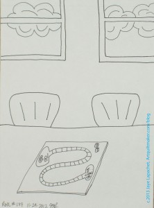
I really couldn’t get my mind off of bread rolls, bread in a basket, sourdough rolls, etc. This is not helpful when a person eats a gluten free diet, so I tried to think of something else that would work and came up with “roll of the dice.”
The track on the game board looks a bit snake-y, but I think you can get the idea.
Check out the original prompt and create your own drawing.
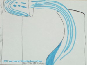
I was trying for the effect of pouring water, but it seems like that look is something I need to work on.
You can see the original prompt and create your own response such as a drawing, poem or painting.
This is a post that I have written a little differently from most of the posts I write. I am going to write and then post it right away. Normally, I write a few days ahead and schedule my posts so I am not in a rush to get something posted at the last second.
We had a nice New Year’s Eve and also a nice New Year’s Day. We went and saw Skyfall last night after going to dinner. Today we watched the Rose Parade, did some stuff around the house and then went to our BIL and SIL’s house for a potluck-football watching-socializing kind of day.
I planned on being at the machine a good portion of the day, but didn’t want to seem anti-social, so I worked on the Corner Store while watching the Rose Parade and on the Garden while over at SIL’s.
Why is this all relevant? Because I finished the Corner Store this morning! I wasn’t looking for such a big finish, but I do like to finish something on New Year’s Day as a way of setting the tone for the New Year. I suppose it is my version of a resolution since I don’t make the normal kind of resolutions.
I had a little bit of binding left and two repairs (don’t ask). Just stitching away for half an hour got the job done.
This quilt will go to my brother-in-law, who is ill. I hope he wraps up in it and feels people hugging him all the time.
Take a look at the last post about quilting this piece. It might be a long time until you read about me quilting again! 😉
Good-bye 2012! I really enjoyed you! Nothing really bad happened and one of my dearest dreams (that has nothing to do with quilting) came true.
Here I am again telling you all about my accomplishments. Here are the finishes:
Quilts
Blocks
Journals
Journal Covers
Pillowcases
Merit Badges and Scout Patches
Crafty Projects
I still have a few UFOs waiting for my attention, but due to the 26 Projects List, I made a lot of progress clearing out old projects.
Still WIPs
I still have a few more WIPs than I do finished projects. I am pleased with the progress I have made.
Ready for Quilting, at the Quilter
Welcome, 2013! Let’s have an even better year!
Negative space is part of Design, but neither an element or principle. It could be included in the lesson on Form or Space, but Sandy and I have chosen to talk about it separately. Be sure to listen to the Episode 114 of Sandy’s podcast, Quilting… for the Rest of Us. where we discuss this topic.
Definitions:
In many basic drawing classes, students learn that there are three basic elements of a composition: the frame, the positive and the negative space. The positive space is easiest to understand. Generally, it is the space occupied by your subject. Conversely, negative space is the space that is not your subject. (Artinspired wiki, Positive & Negative Space page)
If you have 4 identical white rectangles and 4 identical black squares and place the white rectangles horizontally in front of you and put the black squares on the white rectangles in different places on top, you will: (Pentak & Lauer, pg.150)
Notan
“Notan is a Japanese word meaning dark-light. The word, however, means more than that. The principle of Notan as used here must further defined as the interaction between positive (light) and negative (dark) space. The idea of this interaction in Notan is embodied in the ancient Eastern symbol of the Yang and the Yin, which consists of mirror images, one white and one black, revolving around a point of equilibrium. Here the positive and negative areas together make a whole reality. In the Yang and the Yin symbol…opposites complement, they do not conflict. Neither seeks to negate or dominate the other, only to relate in harmony. It is the interaction of the light and the dark, therefore, that is most essential.” (Notan, pg.6)

We, as Westerners, have issues understanding the harmonious relationship of the light and the dark, because of our cultural heritage. “The Western culture thinks in terms of opposed dualities and attaches the moral values of good to the positive, of bad to the negative. Or we seize upon the positive as the only reality and dismiss the negative as invisible and non-existent.” (Notan, pg.6)
Confusion and Trickery
")
Source: google.com via Jaye on Pinterest, piece is Franz Kline’s White Forms
“Sometimes positive and negative shapes are integrated to such an extent that there is truly no visual distinction.”In Franz Kline’s White Forms, “we automatically see some black shapes on a background. But when we read the artist’s titles, White Forms, suddenly the view changes, and we begin to focus on the white shapes, with the black areas now perceived as negative space. The artist has purposely made the positive/negative relationship ambiguous. (Pentak & Lauer, pg.154).
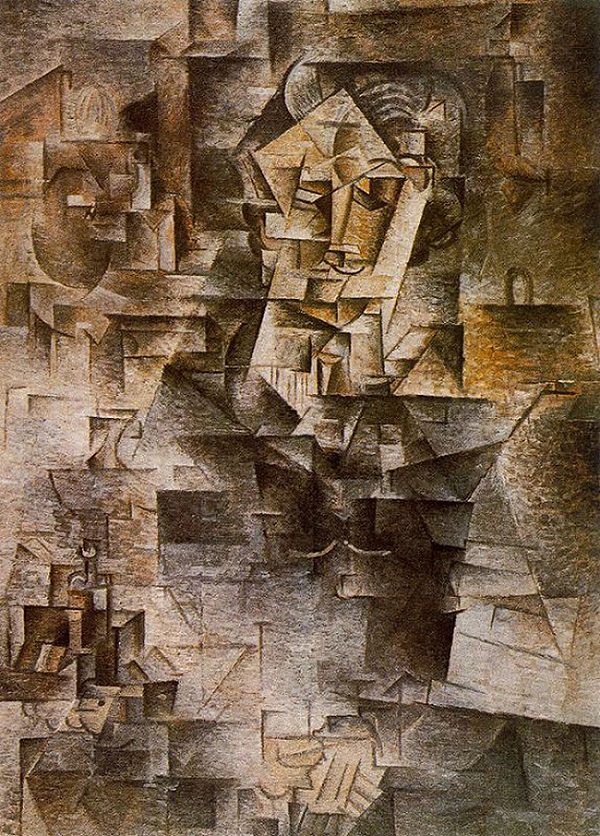
Source: https://www.pablopicasso.org/portrait-of-daniel-henry-kahnweiler.jsp, piece is Pablo Picasso’s Daniel-Henry Kahnweiler
“In most paintings of the past, the separation of object and background was easily seen, even if the selected areas merged visually. But several twentieth-century styles literally do away with the distinction. We can see that the subject matter of the painting,” Pablo Picasso’s Daniel-Henry Kahnweiler, “is a figure. Despite the cubist abstractions of natural forms into geometric planes, we can discern the theme. But it is difficult to determine just which areas are part of the figure and which are background. The artist, Picasso, also broke up the space in the same cubist manner. There is no clear delineation of the positive from the negative.” (Pentak & Lauer, pg.154-155). In Georges Seurat’s Silhouette of a Woman, the Black Bow and The Artist’s Mother (Woman Sewing), (late 1800s, not 20th century, not a Cubist) the positive and negative spaces meld so much as to confuse the mind as to which is which.
Some artists play with the reversal of positive and negative space to create complex illusions. The prints of M. C. Escher … often feature interlocking images that play with our perception of what is foreground and what is background. Other artists take these illusions of positive and negative images to even greater lengths, hiding images within images. Perception of form and shape are conditioned by our ingrained “instinct” to impute meaning and order to visual data. When we look at an image and initially form an impression, there is a tendency to latch on to that conclusion about its meaning, and then ignore other possible solutions. This may make it hard to see the other images. Training the eye to keep on looking beyond first impressions is a crucial step in developing true visual literacy.” (Art Design & Visual Thinking http://char.txa.cornell.edu/language/element/form/form.htm)
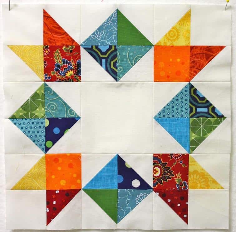
Source: Quilt. Knit. Share. via Jaye on Pinterest
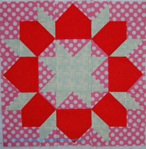
Above star is a great use of negative space. Flipping the negative space to positive. See below for homework on this block.
Notes:
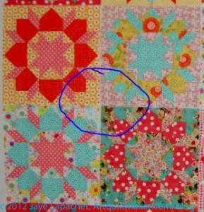
I have highlighted the part of my design that is the unintended secondary design. It is less prominent, because of the variety of backgrounds, but still marked enough to pay attention and make some definite decisions about.
Examples:
Homework:
Resources:
Art Design & Visual Thinking http://char.txa.cornell.edu/language/element/form/form.htm
Artinspired wiki, Positive & Negative Space page http://artinspired.pbworks.com/w/page/13819678/Positive%20and%20Negative%20Space
Artline Elements of Design: http://coolschool.k12.or.us/courses/115100/welcome/elements1.html
Favbulous: http://favbulous.com
A Fiber Artist’s Guide to Color and Design by Heather Thomas
Design Basics, 5th, c.1999, David A. Lauer, Stephen Pentak (has an excellent section on positive and negative space)
The Quilter’s Book of Design, 2d
Notan: the dark-light principle of design by Dorr Bothwell and Marlys Mayfield, 1968
Wayne Moir website: http://www.waynemoir.com/notebook/asides/negative-space-in-design/
Tutorial9: Enhancing your art with negative space: http://www.tutorial9.net/articles/design/enhancing-your-art-with-negative-space/
Bonnie Skaalid, Web Design for Instruction: Classic Graphic Design Theory: Elements of Design: Shape http://www.usask.ca/education/coursework/skaalid/theory/cgdt/shape.htm
As you may have seen in another post, I have been on a bit of a pillowcase making binge. It is hard not to binge as they are similar to potato chips. In the process of making donation pillowcases, I also made a couple of gifts.
The gift pillowcase for my 14 year old nephew was languishing. It started it a long time ago and never finished it. I don’t know why it was sitting around, but it was. I had seen it a week or so ago, so in the midst of the pillowcase making frenzy, I pulled it out to assess what needed to be done.
What needed to be done was pretty easy to fix. I hadn’t caught part of the seam in the stitch line, so I trimmed the bottom even and stitched it again, then made the French seam on the inside and it was done. Too bad I didn’t finish it for Christmas.

I also found more of the chocolate fabric I liked so much when I made the Chocolate/Sweet dreams pillowcase #2 earlier this year. I believe I bought the fabric in Pennsylvania or Maryland last year. I have to say, I could make pillowcases with this chocolate fabric until the cows come home and never get tired of it. This will go to my niece when she is back at college so she has sweet dreams.
You might also enjoy reading:
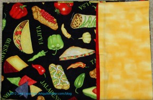
As mentioned in a recent post, there is a project to collect pillowcases for the kids at Sandy Hook Elementary in CT. Making pillowcases was on my radar, but I had to get through Christmas first, with lots of baking and cooking, family and friends. I wasn’t putting those in need behind my real life. I really wanted time to work with the pattern and make sure the pillowcases were well made and of good quality. The way Twiddletails shows the cutting doesn’t mesh with my thought processes, so I have to really think about it and focus if I don’t want to waste fabric.
I like that pattern, though, because once you get past the first stitch line, you have only two more stitching lines to complete the pillowcase. I also like it because there are no raw edges due to the French seams.
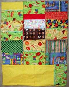
The Mexican food fabric (with beige and green backgrounds) had been languishing for quite awhile and it was time to use them. As you might remember, my intent was to make teenage boy/older boy friendly pillowcases. I know the kids at Sandy Hook are on the younger side, but perhaps there are 5th or 6th graders who are past cheerful trucks and dancing animals who will like them. I find it so easy to find fabric suitable for toddlers, but not so much suitable for teenaged boys.
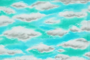
You might have noticed that some of the pillowcases have a green in them that is slightly off. I found this fabric in my green bin when I was looking for something to go with the Mexican food fabric. It yelled out “I am dream fabric and perfect for pillowcases” to me when I saw it. Sadly, I used most of it for something and barely had enough for half a pillowcase much less a whole. I decided to use it for the trim. Yes, the color is a bit off, but I want these pillowcases to induce sweet dreams and be infused with good energy, so I put a little bit in. The viewer can’t see the clouds in the finished pieces, but I know they are there. I really wish I had enough for whole pillowcases.
I pulled out a bin I had noticed when I was rearranging and cleaning up after a fabri-lanche recently. It had multi-color fabrics in it. I didn’t remember buying most of the fabrics and they are not fabrics I would buy now, but were very cheerful and GREAT for kids.
I was especially pleased to find this circus print, and enough of it to make a pillowcase and a cuff, as it demands to be left in large pieces rather than cut up. Notice that the cuff is a companion print. At one time I also had the star companion print, but couldn’t find it. I must have used it.
I sent the pillowcases off yesterday and the postage was $12.00+ for parcel post! I forgot how heavy fabric is. That is done and today I am on to something else. Stay tuned!
You might als0 be interested in the following posts:
help
International aid
government aid
Definition #1: to provide with what is useful or necessary in achieving an end.
financial aid
assist
Association for Individual Development
KitchenAid mixer
Rite Aid
California Student Aid Commission
World Teacher Aid
aid worker
Aid for Trade
Truth AID
World Bank Aid Effectiveness: Aid effectiveness is the impact that aid has in reducing poverty and inequality, increasing growth, building capacity, and accelerating achievement of the Millennium Development Goals set by the international community. Indicators here cover aid received as well as progress in reducing poverty and improving education, health, and other measures of human welfare.
Take 5 minutes to do any kind of artistic response: poem, doodle, quilt, pastel, pencil. ANYTHING counts. No rules; just do it!
Post the direct URL (link) where your drawing, doodle, artwork is posted (e.g. your blog, Flickr) in the comments area of this post. I would really like to keep all the artwork together and provide a way for others to see your work and/or your blog.
The Creative Prompt Project, also, has a Flickr group, which you can join to post your responses. I created this spot so those of you without blogs and websites would have a place to post your responses.
Definition #2: In international relations, aid (also known as international aid, overseas aid, or foreign aid) is – from the perspective of governments – a voluntary transfer of resources from one country to another, given at least partly with the objective of benefiting the recipient country.[1]
It may have other functions as well: it may be given as a signal of diplomatic approval, or to strengthen a military ally, to reward a government for behaviour desired by the donor, to extend the donor’s cultural influence, to provide infrastructure needed by the donor for resource extraction from the recipient country, or to gain other kinds of commercial access.[2] Humanitarianism and altruism are, nevertheless, significant motivations for the giving of aid.[3]
Aid may be given by gangs, private organizations, or governments. Standards delimiting exactly the kinds of transfers that count as aid vary. For example, aid figures may or may not include transfers for military use: to cite one instance, the United States included military assistance in its aid figure until 1957 but no longer does.<Fund (DLF) to provide concessional credits to developing countries world-wide (i.e. not, as in the past, just those in areas of potential conflict with Moscow) to promote their long-term growth.</ref> ref>Lancaster, p 67: “In 1957 the administration (with congressional support) separated economic from military assistance and created a Development Loan
The most widely measure of aid, “Official Development Assistance” (ODA) is such a figure. It is compiled by the Development Assistance Committee of the Organisation for Economic Co-operation and Development. The United Nations, the World Bank, and many scholars use the DAC’s ODA figure as their main aid figure because it is easily available and reasonably consistently calculated over time and between countries.[5] The DAC consists of 22 of the wealthiest Western industrialised countries plus the EU; it is a forum in which they coordinate their aid policies.
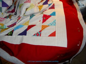
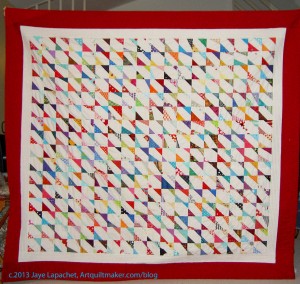
I spent several hours last week quilting the Corner Store.
Yes, she who does not normally quilt large pieces quilted a large quilt.
I went easy on myself, because my shoulder is acting up again and I didn’t want to be crippled when I had so much to do for the holiday. My pile of quilts to be quilted is getting ridiculous (7 that I can remember), though, and I wanted something to give to my BIL to provide some comfort while he goes through radiation treatment.
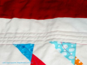
I used to be a good quilter (not like Colleen, but I could hold my own). I stopped quilting large pieces when I hurt my neck and am way out of practice. I wanted to go easy on myself and I didn’t want to try anything too ambitious, so I stuck with straight lines and gentle curves. I have to admit that my original idea for the first border (white) was to fill it with a line of large circles. I couldn’t fix the tension enough to make it look good, so I went with the straight lines. It kind of looks like a frame, if you squint.
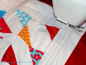
In the last photo (left), you can see some of the quilting in the center. I used a Valdani variegated thread that I bought in Chicago several years ago. I don’t really like variegated thread, but it works in certain circumstances.
You can also see how I used the walking foot to measure the space between the quilting lines. I kind of like doing that as it seems to be a consistent measurement.
The quilt won’t win any prizes, but if it provides some comfort, I will be happy.
You also might be interested in reading:
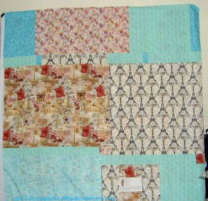
I wrote about my second Jelly Roll Race quilt a few days ago. I don’t remember if I hadn’t made the back yet, or, for some other reason, I just didn’t post about it. Probably the former, but that seems like an eternity ago, so I really can’t say.
I had a number of pieces of Paris related fabric that I bought specifically for the back of this quilt. Lil Sissy loves Paris, so it seemed appropriate.
I am actually kind of eager to quilt this. I need a basting fairy.