|
Tag: Color
Decorating with Dots
|
Indulgence / Retail Therapy
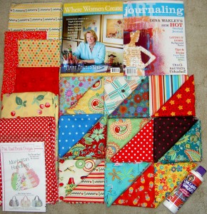
I spent last week in SoCal doing a little bit of Grama wrangling/triage with my mom. If it isn’t abundantly clear, I was away from my sewing machine. The only fiber work I did was work on a bit of the hand stitching of Beach Town. After thinking about it, I may pull out what I did and redo it. We’ll see.
I was able to visit two quilt shops and a Borders. I don’t usually buy the Where Women Create magazine, but I am a Mary Engelbreit sucker and love her stuff, so I couldn’t resist. The editor’s note in this issue is WONDERFUL! I am going to send a copy to some of my good friends. I think they will appreciate it. I also really liked the quotes included with each artists’ piece.
Usually I prefer to buy magazines at local shops, but Borders really does have the BEST selection I have seen lately. I was able to look through 5-7 quilt magazines there as well as a plethora of other art and craft related magazines. I wasn’t enamored with the current Quilts and More mag, sadly. Very dull colors and uninspiring projects.
I also found that the two quilt shops I visited no longer carried magazines. Both owners said magazines just weren’t selling there. Sad. I would like it if Amazon sold just issues of mags rather than subscriptions. I would buy an issue or two of various mags once in a while if it weren’t such a pain to do so. I am thinking I need a subscription to a house magazine. I really mis House and Garden. House Beautiful seems to have improved somewhat.
One of my favorite shops is called Treasure Hunt in Carpinteria. It is located at 919 Maple Ave in a little house. The decorations are fun, cheerful and adorable. They have fun and cheerful fabric, a nice staff and other craft related items, like Collage Pauge from Traci Bautista. They have a room full of yarn for you knitting types, kid craft items (more Crayola brand stuff than I have ever seen in my life!) and a room of supplies needed to finish your works like frames, etc.
The red dot fabric and the cherry fabric with the yellow background will be an Anna Maria Horner Multi-tasker tote. I plan to do a trial run with some Denyse Schmidt Flea Market Fancy fabric first, though. I want to see how the pattern works before I use my precious combo. If the pattern doesn’t work for me, I will make another one of the Eco Market totes. Stay tuned for that project.
Sorbet Blocks
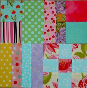
The above blocks are the blocks I made over the weekend. Except for the one in the lower left hand corner, which I made last week. I put it in to make the photo square and so you wouldn’t see my ugly carpet.
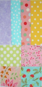
Last week I made two blocks for the Sorbet quilt (left). They sat on my design wall all week and as I looked at them a new idea formed in my head: a baby.
When I made these, I just wanted to make some of the quickest blocks to cut and sew. I wanted to get some endorphins going and some quick satisfaction.
What I didn’t realize was that these two could be merged to make yet another block. I didn’t need to make a pattern, which is part of the fun and joy of this quilt.
I can’t shake the idea that these two blocks got together and had a baby!
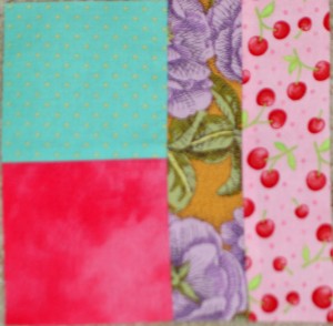
Silly, I know, but it is what it is.
The others I made were from the patterns I already designed in EQ6. I think this quilt will be one that I can longarm myself.
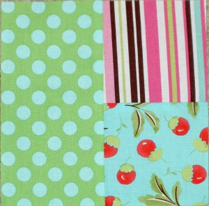
Not really sure why the above block is called Four Patch Corner. I didn’t make up the name, it was in EQ6.
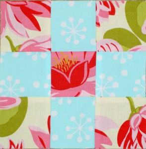
Regular old 9 Patch fits the size and shape requirements. Easy to make and I think it looks great.
Sorbet Color
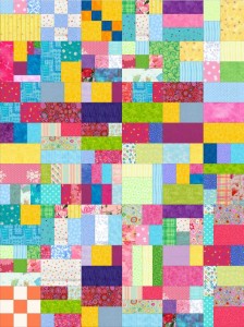
In a recent post, I posted a partially colored view of the patterns I had created in EQ6 for the Quilt Sorbet Quilt (not sure whether I will call it Sorbet or Quilt Sorbet or something else). Here is a fully colored rendering.
Some of the blocks are pretty obvious, but others kind of blend together.
My other thought was to create an EQ6 rendering where I color the blocks as I sew them. That might make my life too complicated, but we will see. It might, on the other hand, make it easy for me to keep track of blocks I have made.
K. S. Perino Pencil Roll
This pencil roll is one of the best that I have seen. First, it is gorgeous. Next it is even more useful because of the little zippered pouch that the artist added (note to self: learn to put in zippers!). Finally, the little details such as the fabulous machine quilting and the little charms on the ends of the ties really make the piece.
I am thinking that one of these would be great to replace the ziploc bag in which I carry my PITT pens around.
|
Quilt Sorbet Colors
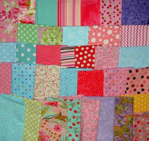
I haven’t had a chance to make anymore blocks since I first introduced this project last week. Some block making is on my agenda this weekend, but in the meantime, I have been looking at fabrics and adding them to the mix. The biggest addition is the purple batik (upper right hand corner). I also added a couple of medium-large scale flower prints to see how they work in the mix.
I noticed that there is a lot of pink in the fabric mix. I hope it won’t be too pink, but I am enjoying the pink.
Quilt Sorbet
Last year I found a quote in Judy Martin’s newsletter by a reader who talked about projects classified as mind sorbet, which I recounted in a post. After the Tarts Come to Tea, I really feel like I need some mind sorbet, something that I don’t have to think about much. The Tarts was a real design challenge: worth it, but a challenge. Now I need a break.
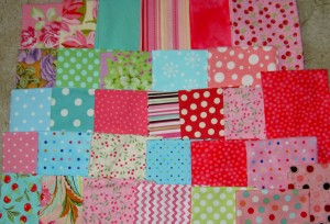
These are the fabrics I have been collecting for the past little while with the idea of making this quilt. There are an abundance of dots, but hopefully enough other designs and scale to make it interesting.
I scanned back over some of the posts showing fabrics that I bought with this project in mind. I don’t see them in the picture above, so I will need to look at them and see if they fit in with the idea I have in my mind.
This quilt was inspired by a pattern by Terri Atkinson called Yellow Brick Road, which I wrote about in a post called Avoidance Issues. The idea was further encouraged by a trip to Texas in April. For once I sat in a window seat and was able to look at the regular patterns created by lots and fences, etc. After that trip, I had a lot of ideas and went crazy putting my own designs “on paper”. EQ6 makes such an exercise really easy. The project is really all about the fabric, though.
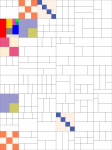
This image looks a little weird because it is exported from EQ6. I haven’t colored all of the blocks, but this should give you a bit of an idea of the next project.
I made two blocks today. They took me about 5 minutes each, which is exactly what I wanted.

In order to get the variation, I need to print the rotary cutting directions for the rest of the blocks. We’ll see what we get.
Tarts Progress Also
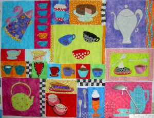
Yes, your eyes do not deceive you. All the bits and pieces that I have wanted to change are done and I can start sewing the whole piece together. I don’t really think that it is nearing completion, because I have lot of ideas for handwork and embellishment in my mind. I just have to figure out the order of the next steps.
After I determined that the 9K was behaving admirably yesterday, I didn’t listen to anyone’s 2 cents about this space and made the stack of cups the way I wanted. I am pretty pleased with how they came out, though I think the pink I chose is a little bit darker than the flying geese background. It works, so it is fine.

Confession time: After I put the stack of cups up next to the curly pot, I started not to like the yellow print cup very much. I started to think how nicely a slice of cake would work in that area. I even had a fleeting thought that a scone or chocolate chip cookie would work. (SherriD: stop laughing!)
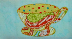
Really, I am trying to stop fiddling, but I may not be able to finish the piece with that cup on the front. I started to sew the sections together, but I have stayed away from this section until I can decide if I can live with this cup. The other issue is that I don’t have a replacement design in mind. I really want to get this top off the design wall in one piece and do something easy.
I am shocked to admit that quilting this myself actually entered my mind last night, as I worked on Beach Town. This piece is pretty large, so I’ll have to really think about that. Beach Town is small and I am still working on the last bits. The last quilt I tried to quilt was Seeing Red. I densly quilted about a 14″ square, then ripped all the quilting out and took it to my machine quilter. I don’t want a repeat of that.
Inspiration Thursday: Paint Chips
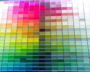
Remember Saturday when I talked about picking out paint? Here is a miniscule part of of one of the paint chip displays for two lines of paint. The perfect red, Red Statement is smack in the middle. Poppy and Rapture are on a different display, so no picture, sorry. There is now a second coat of paint on both test areas and Rapture looks like it is winning. At this point I am almost willing to go with anything that is not hideous. Did I tell you we bought some glaze to try out a steel-wool faux finishing technique in out bedroom?
DS Quilt Returns
Remember after Christmas when I started making the Hop, Skip & Jump pattern from the Denyse Schmidt book, then quickly abandoned it pretty quickly? Here is a stroller quilt by Erica Sage. I saw it on Flickr. This is a really nice version of the pattern. I still like the pattern; just don’t want to make it.
Inspiration Tuesday: Dots
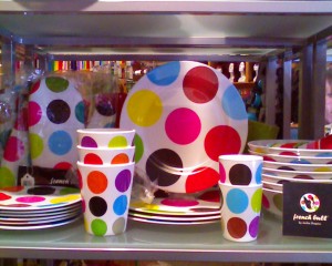
I saw these great dishes at Cliff’s Variety yesterday. I noticed they are by Jackie Shapiro. I don’t know if it is the same Jackie Shapiro that designed the Botanical Pop fabric by Baum Textiles/Windham Hill Fabrics. BTW, I still want some of that turquoise dot that was part of the collection! Anyone who finds 4-6 yards of this fabric will get, at least, a tote bag. Of course, I will pay your costs and shipping for the fabric as well.
I don’t want a whole set of these dishes, but some bowls might be nice.
Auxilliary Creativity
Yesterday, I went to CreateIt Studio for a glass fusing session. CreateIt is a place that does pottery painting, but you can also create mosaics and fused glass pieces. They won’t be doing the mosaics in their new location, so go now if you want to make one. I am sorely tempted, let me tell you. I have wanted to make a mosaic for years.
I have been to the pottery painting places and they are really fun. When I saw the glass fusing that Bonnie, the granddaughter of one of the CQFAers, did, I HAD to try it. A group of us from CQFA went and tried it, thanks to Dolores who pinned me down for a date. Thanks, Dolores!
True to form, I didn’t hem and haw, just got down to work. I really did the project quickly and simply, so I was done way before anyone else.
The fused glass technique is really easy. Basically, you place bits of colored glass down on another piece of glass in a pleasing manner and are done. I think part of the reason I was done so fast is because I already had an idea in mind. The others didn’t and had to play around a bit. I think I feel more comfortable and successful if I have an idea in mind when trying something new. I think I might loosen up a bit if I tried this more than once.
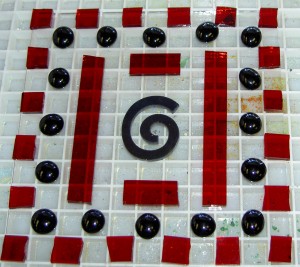
My first job was in a stained glass store, where I learned to make leaded glass windows. As a result I am not afraid of glass, but have a healthy respect for the sharp edges. As with quiltmaking, the glass cutting tools have GREATLY improved, so I just nipped and cut quickly and was done. The gluing down of the pieces, which was done to keep them in place until the firing process, was the most time consuming.
After finishing the trivet, I wasn’t really ready to leave. I decided to add to my casual serveware collection by painting a piece of pottery as well. You might remember the pieces I made in January at Color Me Mine.
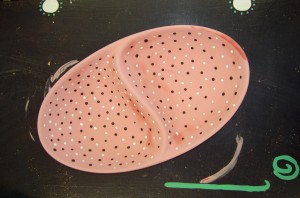
I am thinking salsa and guacamole would work well in this piece.
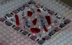
I wanted those long, red, roundish pieces but Dolores took them all. I am not bitter, don’t worry. There weren’t enough of them anyway. I love the small bits that Dolores put in between the squares on the border.
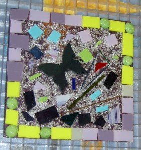
Reva was the first one to use the cut outs. I followed her lead when I found the spiral and it was the right color.
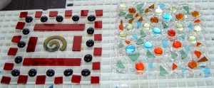
Diane’s piece looks like her silk paintings.
Another Catch Up Saturday
My brain is full, so this is going to be another catch up kind of post.
1. Bonnie McCaffrey – Bonnie did an vidcast interview with Paula Nadelstern around Paula’s exhibit at the American Folk Art Museum in New York City. The devil part of my brain is plotting ways to get to see that exhibit before it closes on September 13. A visit doesn’t seem likely from where I am sitting, though you never know and hopes springs eternal, but there is a catalog, Paula Nadelstern’s Kaleidoscope Quilts, which is a must have on my list. I like Paula’s two previous books. They spoke to the smart quiltmaker in me.
2. Kelly Rae Roberts – Kelly Rae Roberts wrote a book called Taking Flight, which I reserved at the Library, but hasn’t come in yet. You can read about the book on her website in the book section. She is more of a painter and collage artist than quiltmaker. I took some time with her site this week (minutes here and there) and love the fresh feeling. I am trying to find the right look/feeling for ArtQuiltmaker.com so looking at the colors and embellishments on blogs is a continuing task. One of the things I like about her blog is the house tour. She shows all the nooks and crannies of her Seattle home. My mind boggles at the cleaning that must have gone on beforehand!
3. Picking out Paint – I am famous for picking out the most expensive and hardest to get item in any category regardless of how much I know about the topic or category. We have been trying to find the right shade of red for our dining room. Currently we have Lowe’s Valspar Cherry Divine, and Tibetan Red from Lowe’s Waverly Collection. The Cherry Divine is ok, but very pink and the Tibetan Red was absolutely a deal breaker, because it was much too brown. My friend Jessica talks about the ‘taupefication of America.’ My general principles of advocating cheerfulness, and Jessica’s comments make me refuse to participate in anything smacking of brown in my house. This place in the process meant a trip to Benjamin Moore yesterday where we found the perfect red, Red Statement from Pratt & Lambert. Perfect. Absolutely the right red and $60 a gallon AND it comes in only one product. No samples and you have to order the gallon from the Benjamin Moore store in the sky or somewhere and no returns. Sigh. My knack strikes, and burns, again. We checked out several other reds, most of which were in the same category as the Red Statement. We finally ended up with B.M.’s Poppy and Rapture. We’ll see. You never know, we may end up with paint that costs $60/gallon on one corner of our dining room. Doubtful, but it could happen.
4. Beefing up the CPP – I really want more people to participate in the Creative Prompt Project (CPP). I love the artwork that comes every week from the current participants, but I want more!!! I thought that some people may not have a place to post their work, so I created a Flickr group where members of the group can upload their drawings. I hope you will take the time to join and upload your photos. I have also heard that publishers troll Flickr for emerging artists.
5. Good News on the Tarts – Finally some progress on the last bit of the Tarts. As you know, I have been toying with replacing the Flying Geese with something. I have drawing some larger cups, a stack of small cups, tried some mini-cupcakes, a whole variety of things. Nothing was quite right. I felt stumped.
I lean my rulers up against the wall and rest them in the hinged area of my sewing table. This isn’t a great location when I am sewing something that pushes against them. They tend to fall behind the sewing cabinet, which means I have to haul the thing away from the wall and hope that I haven’t broken a ruler. When I was working on the latest tote bag, I had moved them to prevent this situation.
This plus the 9K being on vacation allowed me to have a virtually unobstructed view of the lower right hand corner of the Tarts.
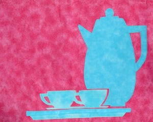
Those cups jumped out at me. I pulled the block off the wall and traced the cup. The pattern is long gone. I also flipped it so the handle will be pointing right instead of left. After a bit of fiddling with lines, I put the preliminary drawing up on the wall. Perfect. It is perfect in tracing paper, so I will need to audition some fabrics. I finally feel like I am back in business with this piece.
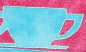
6. Vicki Welsh’s Field Trips in Fiber – I made her latest FFiF list again with the latest tote bag! What a thrill. The great thing about Vicki’s list is that it is a great pointer to other fabulous quilts and fiber projects. It showcases a lot of work that I might not otherwise see. Thanks, Vicki.
7. Glass Fusing – I am a big fan of those pottery places where you can paint the cup or plate of your choice. You might remember that such an outing was what I did for my birthday. A visitor at the recent CQFA meeting talked about a place, Create It where you could not only paint pottery, but also fuse glass. A small group of us are going there tomorrow to try it out.
Opposite Tote
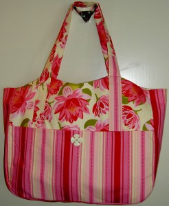
You might think that this is the same tote I posted last week. It is, however, the opposite of the one I posted last week. I used the stripe for the main part of the fabric as opposed to the flower fabric, which I used for the accents this time.
I think that this may be the best tote that I have ever made. I don’t think that I made any mistakes (knock wood). One thing I did with this tote was sew on the button before I sewed all the pieces together. It was a lot easier!
I guess it is time to move on to another pattern. We’ll see.


