Color Change

Art Gallery Emerald with crosses

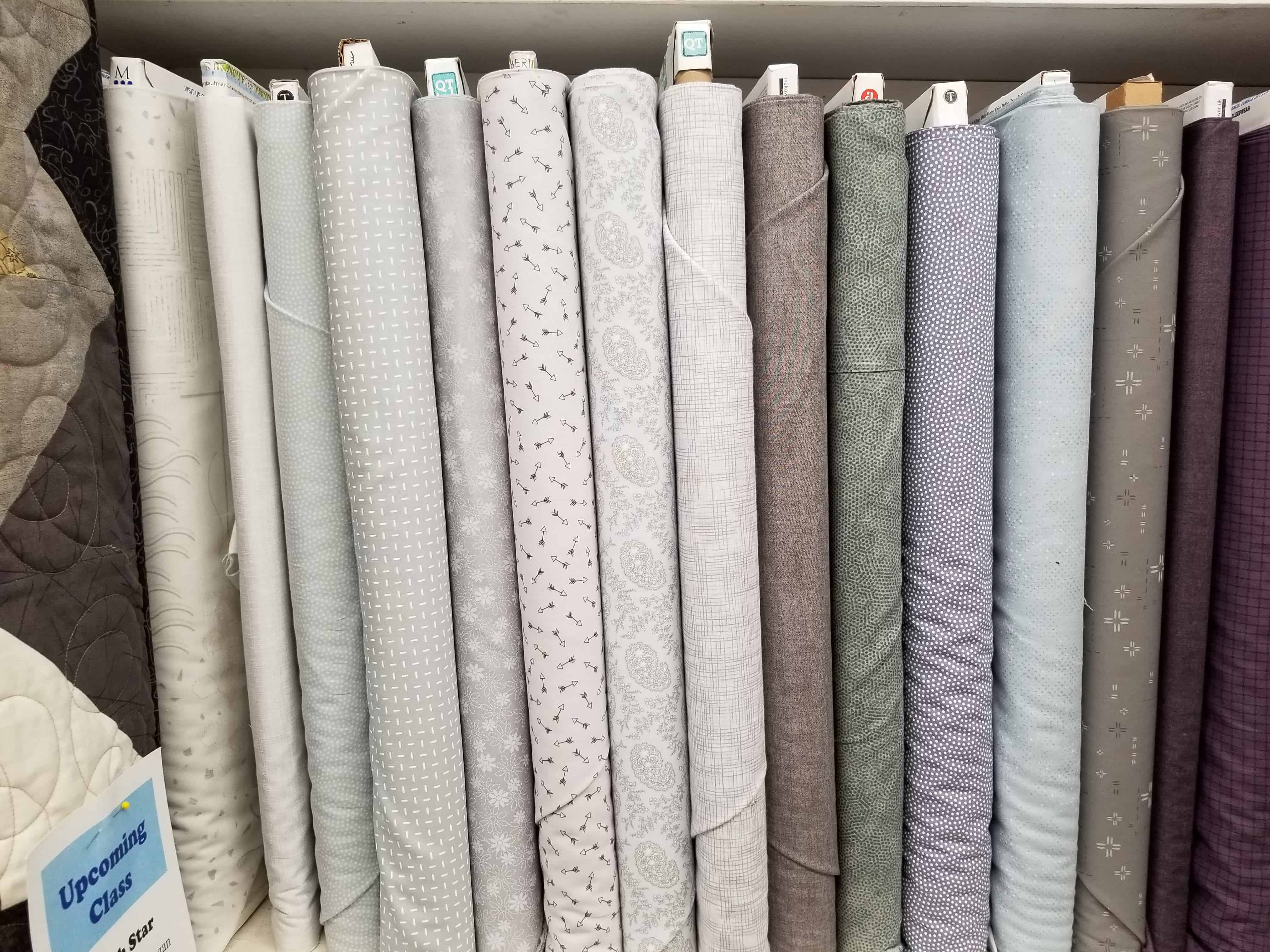
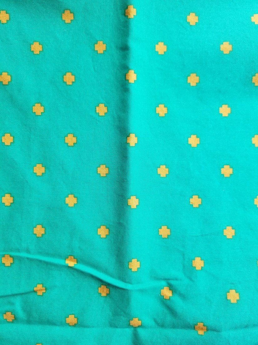
The other day I talked about changing out one of the colors. The fabric I will use is show here.

I was pleased that I was able to find it as soon as I went looking for it. I could do without the crosses, but I don’t sincerely dislike them. For a green, I really like the color.

Green fight: AGF vs. Free Spirit

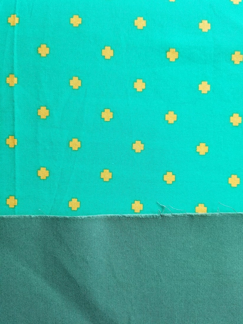
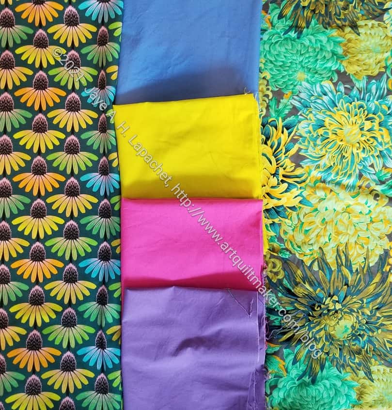
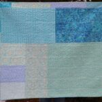
Before I absolutely decided to use it, I compared it with some of the other fabrics. First, I wanted to see how close it was to the green solid Pink Door sent.

Look at them together, even with the issues of color on screens, you can see that they are not at all alike. The AGF is a lot brighter and clearer. NO brown undertones (sorry, Marty!). It is also not so busy that it would act differently in the La Pass pieces.

Greens get along: AGF vs. Free Spirit

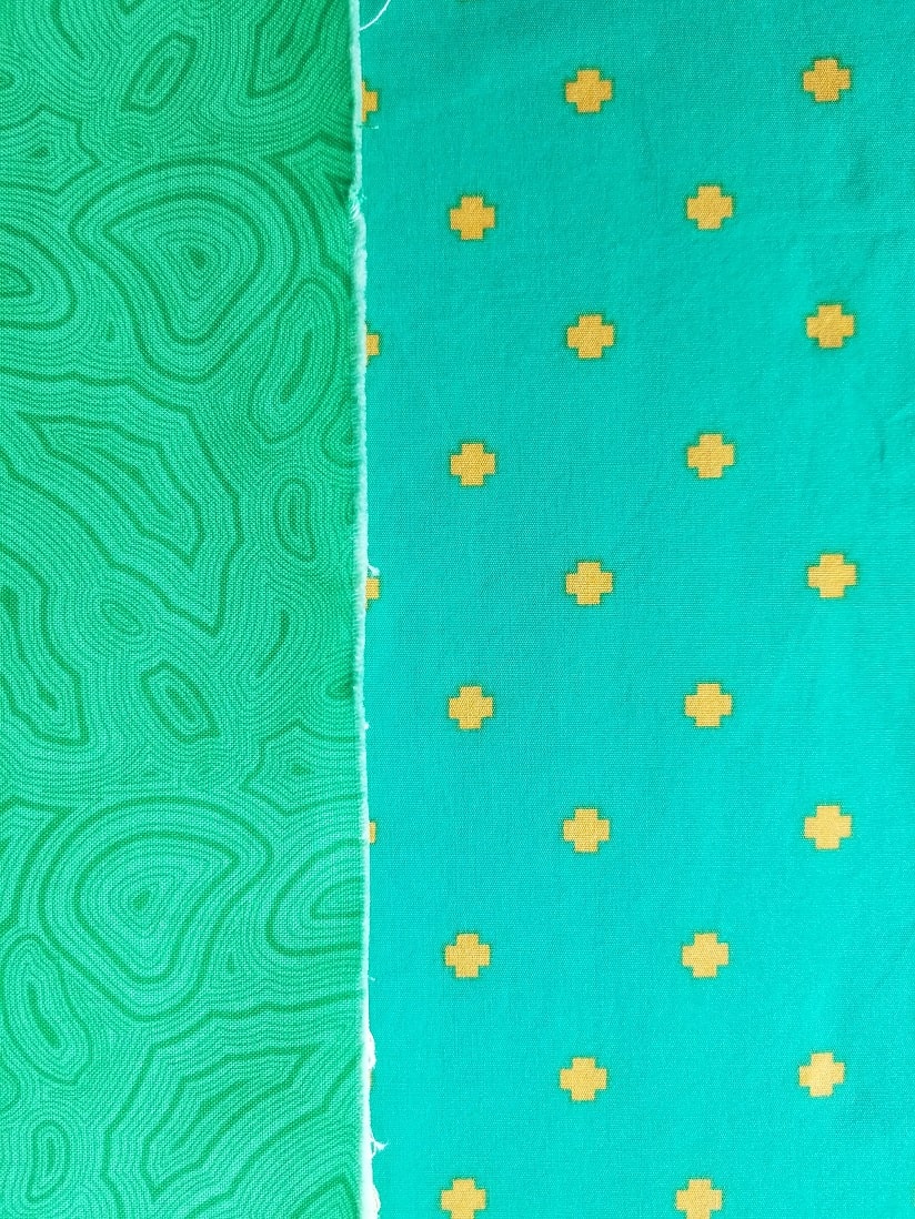
After I saw it with the solid, I wanted to see it with the green mineral fabric to make sure it wasn’t too close to that one either.

I think they are both in the emerald family, but the mineral print has a touch more yellow while the AGF has a touch more blue.

What do you think?

More Color Ideas

Another Color Idea
Another Color Idea

I mentioned the other day that I folded up some fabric and put it in boxes temporarily. As I was doing that, I came across another group of fabrics that I think I want to make into a quilt.

I had been looking at the Kaffe violet urns and the Philip Jacobs Chrysanthemums for awhile. I wasn’t sure what to put with them, but I think the group of fabric I put together and photographed will make a good quilt.

The two mentioned fabrics will definitely go together. I like the darkest blue (middle right), but I don’t know that it really goes with this group. I also think that bottom green has to go.

I am not sure what I will make, though I think it will be something with an Irish Chain kind of look. I also want to fussy cut the urns so the motif is highlighted.

Color Ideas

As I have said, my workroom is also my office and yoga studio. When I am laying on the floor at the end of my yoga session, I sometimes see my fabric in a different way, which is what happened the other day.

Fabric Combination
Fabric Combination

I had pressed some fabric in anticipation of cutting it up when I saw a combination I hadn’t considered before. The prints go really well together even if they clash when put right next to each other. I think the solids (some solids I bought at QuiltCon, I think.

This isn’t the final number of fabric. The group definitely needs some turquoise and I have a solid turquoise I can use as well as a lot of print turquoises. I like the combination of the two prints, especially the slight differences.

I also have no idea what I am going to make with the group.

Starting Gelato

Gelato Jelly Roll
Gelato Jelly Roll

A long time ago, in this galaxy, Friend Julie gave me a jelly roll. I don’t usually like jelly rolls, but I like this one.

One reason I like it is that the serrated edge isn’t deeply serrated, so the width is actually pretty close to 2.5 inches. Also, the strips seem to be pretty much cut on grain.

Molly's Jelly Roll Top - June 2021
Molly’s Jelly Roll Top – June 2021

At Sew Day, Molly was working on a jelly roll quilt. She also didn’t want to cut up the jelly roll into squares so she was using the strips almost as is. She made a cut in the middle where the color really started to change and inserted a KFC fabric.

Molly’s quilt got stuck in my mind and I couldn’t get it or the jelly roll in my workroom off my mind. I tried to stay focused on Scrap Dash, but the jelly roll kept creeping in.

One good thing about Sew Day is that I get to be inspired by projects on which other people are working. It is also a good thing about the guild.

Gelato Start - June 2021
Gelato Start – June 2021

Almost as soon as Scrap Dash was ready to be quilted, I opened the Jelly Roll and started putting strips on the wall. I want to add the background to the outside of the strips.

I didn’t realize the fabrics were ombre! This makes the project much more interesting. Just putting them on the wall is exciting.

Gelato Jelly Roll Open

I am starting out keeping the strips in order. I may move them around later after I see what I have. I am also planning to use the Art Gallery fabric I used as a background for Scrap Dash as a background for this quilt.

Thinking about Brown

Brown has come up recently and so I have been thinking about it. A friend said she thinks  of me when she uses brown. WTH?? I always claim not to use brown. For the most part, that is true.

DH Face Masks - May 2021
DH Face Masks – May 2021

Recently, however, I made some masks from brown. You probably noticed that they were brown when I posted about them the first time. DH actually looks good in brown. All three of the browns in the photo have been in my fabric closet for YEARS. It was a good time to use them and I didn’t cut carefully.

Sweet Dreams Pillowcase

Sometime ago, I made a pillowcase for my mom that is actually brown, though I always call it chocolate. Calling it chocolate makes it easier for me to take. It is a rich color and I enjoyed making it. I really like the chocolate box fabric as well as the combinations of fabric I chose to coordinate.

Calm quilt
Calm quilt

My sister also likes the turquoise and brown combination. I made a quilt for her with some brown. If I made it again, I would add a LOT more turquoise, but it is ok and Lil Sissy loves the quilt.

Mostly, I don’t use brown because it is depressing. The pillowcase above is not depressing and the brown accents in the quilt are just accents, which is nice.

It seems that I have also made some things for the guild using brown. The three above are a bit depressing. I didn’t choose the fabric for the cat bed and the blocks are made from scraps.

I guess I use all the colors, even brown now and then. I don’t feel like I have to buy more brown fabric, though I did consider buying a brown hot chocolate print similar to the chocolate box fabric above at Calico Creations the other day.

Ends n.9 Quilted

Ends n.9 quilted
Ends n.9 quilted

Alison also quilted Ends n.9. It is an appropriate quilt to post on Valentine’s Day because of the colors.

Like Blue Strips n.2, this will be donated to the Project Linus project near where Alison lives.

I forgot about this one even though it was the last one that I made. It makes me think that I need to look and see if I have some more ends that need making into a quilt.

Blue Strips #2

Blue Strips #2
Blue Strips #2

Alison sent me some photos of Blue Strips #2 after she finished quilting it. Since Alison is in Oregon now and the guild doesn’t want to incur the costs of shipping the quilts back for donation. Alison found a good Project Linus group who is getting the quilts she quilts. I am pretty pleased that she was able to quilt this one. I’d like it to be used as soon as possible. She was kind enough to send a bunch of detail shots as well.

FOTY 2019

FOTY 2019 - Late October n.2
FOTY 2019 – Late October n.2

I finally had a good amount of time to work on Fabric of the Year 2019. I had to redo the math. I spent a lot of time on Saturday sticking squares up on the wall, adding rows and trying not to fall of a stool.

This was really the first time I had gotten on a stool since my foot injury. I have a very stable step stool, which made things easier.

As soon as I got going, I really made a lot of progress and I am happy about that. I still have to rearrange some of the squares, but all of the squares are on the design wall so I am much closer to sewing than I was. Perhaps later this week?

FOTY 2019 Finally

FOTY 2019 - late October 2020
FOTY 2019 – late October 2020

It has been a little while since I worked on this, but I finally got back to it. I had to do the math, which I was trying to avoid. Finally, I just did it.

That gave me a structure, so I started putting all the squares up. I had to redo the bottom left hand corner to add some greys that were hiding. I had to remove some duplicates. I still have to rearrange a bit to add more pink and a bunch of purples that came out of hiding as well. Still, I am making progress and will soon be able to put this piece together. YAY!

Blue Strip #2 Donation Blocks

Blue Color Strip #2 Donation Blocks

By piecing FOTY 2018 together I was able to get the blocks for my next blue color strip donation quilt finished.

I know I have used a large portion of blue scraps, but I still have a full blue scrap drawer.  A lot of them are small or not strips, so I will be making a blue improv version next, though I still have to sash this one. I used yellow for the last one, which was unique. I am thinking about white, but that might be too conventional or too boring. I haven’t started cutting sashing, because I don’t know what to use.

BAM Challenge

BAM Color Challenge November 2019

The guild did a color challenge recently where people were supposed to make something they like from a color swatch they picked out of a bag.

It was a small, but mighty group. There were people who participated for the first time and also those who don’t have a lot of spare time. I was really thrilled to see some new folks participating Everyone did a wonderful job.

FOTY 2019 – More Squares

FOTY 2019 - early September
FOTY 2019 – early September

I have been working on cutting up the fabric on my ironing board. It was getting pretty fat and hard to use as an actual ironing board for piecing. As a result, I got a full design wall of squares.

There is a lot of orange because I have been working on the Orange Improv donation top, but other new fabrics as well.

Inspiration Blue & Orange

Blue & Orange Bowls, Houston

In 2014 Friend Julie, my mom and I went to Houston for Quilt Festival. I remembered a photo I took and went looking for it. Blue and Orange has been on my mind lately, so something in my subconscious must have nudged me. I assume that it has been on my mind because of my recent donation top finish.

Finished: Wonky 9 Patch

I didn’t just want to show you a picture of bowls, but I wanted to show you how something like this photo can influence your quiltmaking. I don’t know if finishing the Wonky 9 Patch made me see these colors or not, but clearly, the bowls are similar as is the arrangement of colors.

The recent Orange Strip Donation top finish is in the same colors and I do feel strongly that I am not done with this combination.

The Problem with Grey

Bolts of Grey
Bolts of Grey

I went to The Granary the other day and Friend Julie pointed out a row of greys. She called it the “problem with greys.” I thought the photo explained the ‘problem’ beautifully.

The colors in the photo look different from when I saw them with my eyes, but it doesn’t matter, because you, dear Reader, can still see the difference.

None of the colors would be called anything but grey. The bolt on the far right looks black but was a charcoal (you’ll have to trust me). The shelf sports a wide variety.

Background detail - Flying Around
Background detail – Flying Around

I like using a variety of greys as background on my quilts and it is a happy chore to find the right ones. You can see the variety in Flying Around. Mostly I like to use greys that are very close in tone to each other so there is no grey that obviously stands out. Also, I don’t like the taupe based greys. I am sure I have said that before.

In the photo of the Flying Around background, I have more variety. It might be because I want the eye to move around the background as well as the foreground or it might be laziness. Not sure or not admitting to anything. 😉

This is an example of why my rule of ‘make visual decisions visually’ is so important. It is impossible to match any color, perhaps particularly greys, without putting the bolts or pieces next to each other.

Red Scrap Journal Cover

Red made fabric pieces

As mentioned, I have been working with red scraps. As I dived into the drawer, I found several pieces of fabric that had already been made from scraps.

Since I have a few Miquelrius journals that need covers, I decided to use some of the scraps to make a journal cover. It was fun to look at all of the made fabric and decide which pieces to use. I felt like I was picking out commercial fabric. It was nice to have a choice.

Red journal cover closed - May 2019
Red journal cover closed – May 2019

Because I had already done the hard work of making the fabric, I just had to make the piece large enough to fit the journal. (Sizing info can be found in the journal covers tutorial). It went really quick, which was great, because I was in need of a quick finish. I am pleased with the chair print on the front as well as the disbursement of dot fabrics.

Red journal cover front open - May 2019
Red journal cover front open – May 2019

I use flannel instead of batting for the center of the journal covers. It gives the cover a little bit of body, but doesn’t make it bulky. I’d like to just use ShapeFlex, but it doesn’t stick very well to made fabric because of all the seams. If I am using a favorite commercial fabric and there aren’t a lot of seams, then I will use ShapeFlex.

Red journal cover back open - May 2019
Red journal cover back open – May 2019

I always cover the batting the another cotton fabric, but I forgot to do that this time, so the flannel serves as batting and backing. It is on the inside and doesn’t show much, so I think it will be ok. I haven’t been carting my journals around as much as I have in the past, so I think the flannel will stay clean. I am glad, however, this is just for me. I think I will need to read the tutorial again before I make the next one.