I came across a post I wrote in 2005 about the qualities teachers should exhibit. Since I have been teaching quiltmaking recently, the post made me think about whether or not I am practicing what I preach. I thought I would revisit the post in this new light and see if everything I said then still stands.
Know your subject: Yes, I don’t think you should teach if you do not know the subject. However, there are sub-sections of classes where you may not be an expert so just brush up and stay ahead of the class. We can’t be experts on every single aspect of a topic. Case in point is me and how I wouldn’t try to each free motion quilting since I am not good at it. I do quilt sometimes, as you know, so when I taught my class I taught what I do when I quilt and gave resources on other types of quilting and the names of teachers I thought were good.
Be well prepared: yes, absolutely.
State your goals at the beginning of the class and let students know your timing. I think this gives people an idea of what to shoot for and also reduces stress. If I know there will be a break at 10am, I can plan around it.
Have handouts (with pictures, if appropriate) : I have taken a couple of classes recently where the teachers have provide handouts after the class. They do this so you will pay attention to them. I understand that, but I also like handouts. I’d rather have a handout with brief descriptions so I can take notes on it than getting it later when I have to consolidate my notes with the handout.
Don’t assume that since you can quilt you can also teach : I still believe this. Teaching takes skill and not everyone has it. Practice your presentation or your class before you teach.
Manage students : I have been in a number of classes where one student dominated. It was frustrating for me, because I felt like the teacher was getting distracted by the person who was demanding attention. This is the hardest part of teaching, but you have to do it.
Don’t assume that people are there to hear your opinion : I am not sure I believe this. I think people take classes now to learn what specific teachers have to teach. I recently took the Latifah Saafir class and didn’t expect to learn how Jen Carlton Bailly sews curves. I was there to learn specifically what Latifah had to teach.
Acknowledge that people cannot absorb information for 8 hours: I made some really good points in this section. People need a variety of activities during a class: listening, doing, undoing, working with the teacher, etc. Change up your class so everyone can be successful.
Be professional : definitely act like a professional, which is possible even when being friendly.
Make sure your handouts are well organized or track your lecture : this point assumes you have handouts (see above #4). I prefer that handouts track the class, but I also understand that isn’t always possible. Point your students to the correct section in the handout if your lectures doesn’t track the handouts.
Consider whether you need a helper : I think every class with more than 5 students is improved with a helper. You don’t want the teacher to have to run off to make photocopies or get more of their product to sell. Helpers can also fiddle with machines and troubleshoot so the class can stay on schedule.
Walk around : I think 1-on-1 time with students is important. Students benefit from a discussion with the teacher.
In point 1, I also mentioned books an other resources in a bibliography. This should have been a separate point. I do think it is important to provide additional resources as you won’t be with your students all the time and they may need reference material. or they may want to look at additional resources. I also LOVE reference material. ?
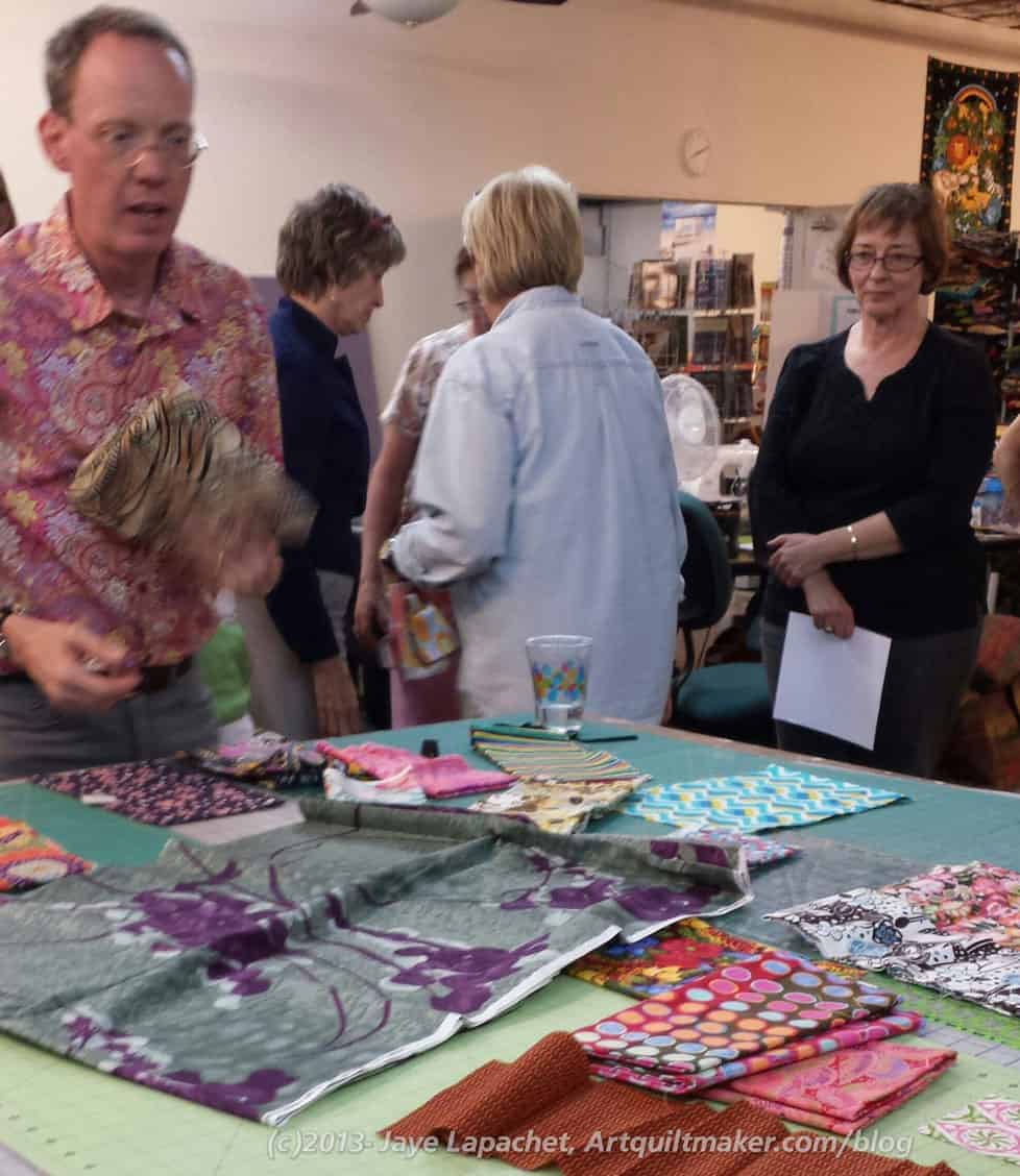
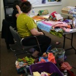
Remember I wrote a really long post about the Bill Kerr Workshop? Well, that was only the talking part of the workshop. The Fabric Smackdown was the working part of the workshop. I moaned when I heard what he wanted us to do, but once I was into it, I loved it!
This is the best, most exciting way to make fabric selections for a quilt!!! At least until tomorrow when I find a new way to choose fabric. 😉
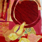
My fabric choice
He asked us to each to pick a fabric that gave us trouble from the fabrics we brought.
Hhmmm. Difficult. I didn’t want to pick anything too hideous as I suspected we would have to do something with the fabric. I thought about brown, which is really a challenge for me, but decided to stick with some color.
I chose this green and pink. Despite pink and green being compliments on the color wheel, this fabric is so strong that it is a challenge to work with. I still wonder why I bought it. Perhaps someone gave it to me or it was part of a pack. I haven’t been able to find anymore of it so I used it for something. How quickly we forget.
Bill Choosing Fabrics
Yes, we did have to use the fabric for something.
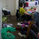
Bill picked two fabrics, mostly, gave the two fabrics to their owners and then the owners had to make a fabric palette that got the fabrics from one to other.
There were two groups with three people. I was in one of them with Jennifer (of the photographing the meetings fame) and Lynette (of the A-B-C Challenge fame).
We used our fabric and our group shared, so Jennifer pawed through my scraps bags while I looked through Lynette’s neatly folded FQs. The criteria we were supposed to use in addition to hue were:
scale
figure/ground
illustration style
pattern
value
saturation
Large scale prints-isolate or integrate
Think about fabrics as a conversation.
etc
The thing to remember is that this type of exercise takes practice. And more practice and even more practice. He told us that we would not be able to speak very well about what we were putting up, but that we had to try. The more we tried, the better we would get at it.
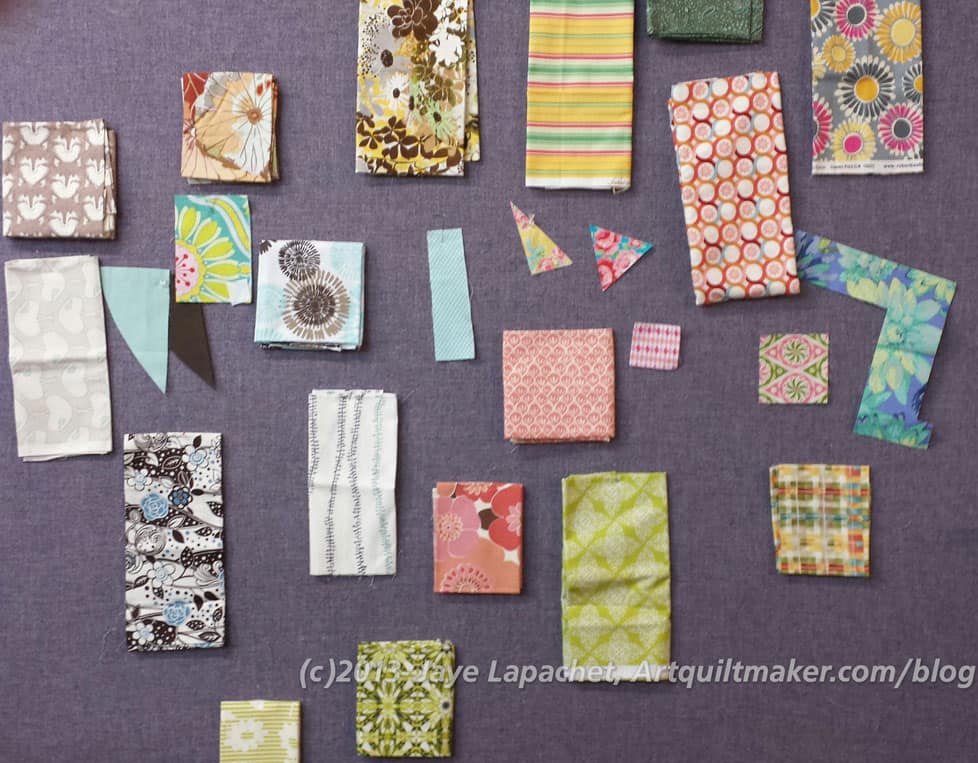
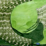
Interim fabric palette
We had an interesting group of fabric and our interim attempt at selecting fabrics was pretty interesting.
You can see my little green and pink piece in the middle right. I don’t remember what the other two starter fabrics were, but I think the blue, white and brown floral and the yellow, brown and green floral at the top. I am not 100% positive.
Now, the rule is to “Love it for 10 Minutes.” Remember the homework we did around the topic of ‘Encourage’? At first you might think “YECH!” What were they thinking.
Final Fabric Patlette
We thought that, too, trust me. This selection was way out of our comfort zone, but we kept looking and fiddling with choices and, in the end, I think we all really liked it.
I would love to have all these pieces and make a quilt.
Definitely, there are two palettes into which this grouping could be divided. If you look and think about it, the fabrics can be used successfully together. I wouldn’t put equal amounts of all of the fabrics in. I might put a touch of the yellow and more of the salmon and blues. I don’t know.
I just know that I thought this would be impossible (though what teacher,in their right mind, would give an exercise that couldn’t be done? It would be all over the Internet in 2 seconds signaling they should hang up their rotary cutter) and now I am trying to figure out how to do it at home by myself. I am looking at the starter fabrics for the Jelly Roll I want to make and wondering… I think the exercise was very successful.
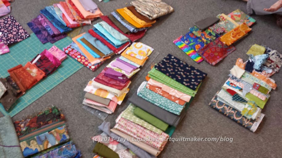
Variety of Fabric Groupings
The groups of fabric are unusual, but not crazy. When you look at where people started (their fabrics) and how they got from fabric A to fabric B, the grouping make sense and are excitingly different. Enlarge the picture and see what you can.
What makes these groupings work, aside from hue, is the variety. The variety of pattern, scale, motifs and the inclusion of some drabs. And so much more.
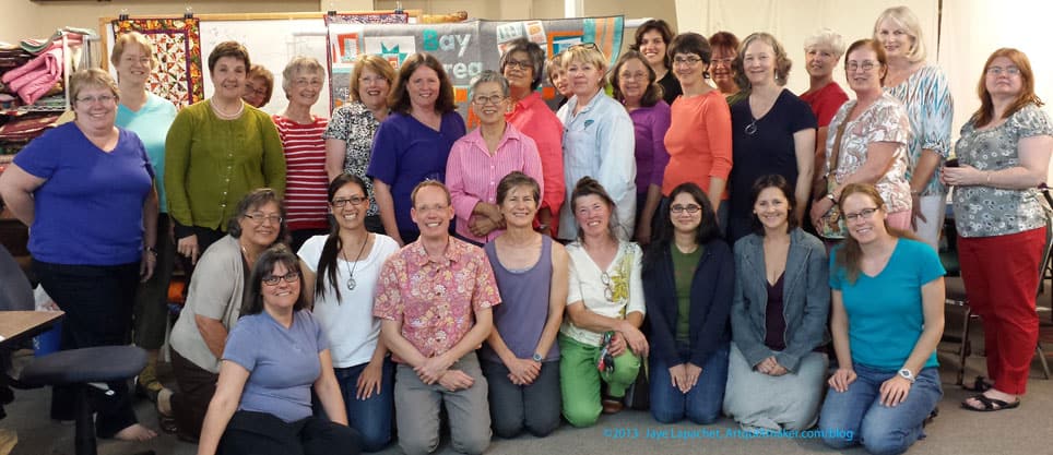
Workshop Group
And, by the end, we were all tired, but we look happy. I was happy I know that.
This Pièce de résistance for the Photoshop Elements class I took yesterday. It is not that useful for quiltmaking, but I am pleased that it came out well and is pleasing to the eye. I also learned a lot in that class and this piece shows a lot of what I learned.
I am so glad that people came out and took the class. I was nervous up until earlier this week when Lynn sent me a note saying 12 people had signed up. I wasn’t sure the class would go forward, but it did. I think everyone learned a lot. I think that Lynn put in the right amount of information.
Lynn Koolish teaches a variety of different classes, but they all seem to relate to printing on fabric, fabric dying and other fabric manipulation techniques. Lynn works at C&T Publishing as an editor. She contributes to the C&T Blog and teaches as well.
One of the things I wanted to learn was how to put multiple images into one space. I don’t always want to load 37 images that you, my dear reader, would also have to load, especially if I really want you to get the flavor of what I am discussing. I learned how to do that and the example above has that technique. In that case, I used the same image and put it into one file multiple times.
I also learned how to deal with layers, which was very confusing to me until yesterday. In the photo above, I was able to flip each image, because they were in different layers.
Breakfast of Champions
The reason the above is called Breakfaast of Champions is because the image started out as a picture of my breakfast. First we talked about various things you could do with color such as replacing color. I changed the colors using saturation and hue, etc so that my breakfast turned lovely shades of purple and blue. We also talked about different filters and effects, which is how I ended up with the spiky kind of image above. It is tempting to think of making it into a quilt, but I don’t know if I have it in me to do the colorwork required. Nice thought, though.
I also learned about adding text to an image. I don’t know why it seemed so scary before, but it isn’t scary.
Denver Flower Mashup 2
By the end of the class, I felt pretty confident. I am not expert, of course, but I have some confidence, so I changed the frame (from above photo) to see what the difference in look would be.
Christine Barnes spoke at a guild meeting last Tuesday. I got the notice and decided I would attend. My mom is still moving, so she couldn’t go with me. I have long admired Ms. Barnes work. I really enjoyed some work on luminosity done by her students, which I saw at the Monterey Quilt Guild Show. I’d like to sign up for that class. Barnes was teaching it at the Peninsula Quilt Guild last week, but work was crazy, so I couldn’t take off and had to miss it.
At the meeting, while waiting for the lecture to start, I went up to peruse her patterns, displays and other materials. I was impressed with her color work, but also with Ms. Barnes as a person. She came right up to me and started talking to me like a normal person. She came across as very real and not at all egotistical. She wore violet jeans! 😉 We talked about the magazine articles she had written or which had been written about her. One article had a picture of her kitchen, which is white and chartreuse! It was gorgeous. She also showed me a magazine I had never seen before: Fabrications. It is a UK publication and I will have to check it out.
Speaking and Showing
Christine has degrees in Costume Design, Textiles and Journalism. She lived in Palo Alto for years and was an editor at both Sunset Books and Martingale. She has taught and lectured about quiltmaking for more than 10 years, including 7 or 8 years at Empty Spools / Asilomar. She has a new book coming out with C&T called The Quilter’s Club. During her entire lecture, I got the impression that she LOVES fabric, loves making quilts, really enjoys working on her projects and just has fun. I loved that!
She calls the color wheel a magical tool for quilters, because it helps a quiltmaker go past using the focus fabric to add color to quilts. In her travels, she has found that many of the preeminent quiltmakers use a color wheel so often that they have one posted on their studio wall.
“Magic fabric” is a concept that Ms. Barnes talked about and uses in her work. A magic fabric is a fabric that makes blocks glow. They are shot with light, often gradated, create ethereal effects, have vitality and life to them. Often hand-dyes and batiks fit into this category. Chaos can reign if one includes too many magic fabrics in a block or quilt. They are side dishes in your projects, a place for your eyes to rest. She uses magic fabrics as backgrounds pretty often in her quilts.
Elin Noble, of Massachusetts, daughter of Maurine Noble, creates beautiful hand-dyes, which Ms. Barnes mentioned frequently. I had no idea, so I’ll have to go check out her work. We were warned that Noble’s fabrics are not cheap.
She talked about luminosity, transparency and depth as effects. She also gave examples of her use of those effects. Value was something she gave a simple definition for: value is about light, medium and dark fabrics; how light or dark a fabric is. Christine Barnes said that value creates the pattern in a quilt and creates a sense of depth. I have heard value described in different ways. I kind of like this definition, but need to think about it and look at some quilts with this idea in mind. Some other information she uses:
temperature: how warm or cool a color is – red, orange, yellow are all warm and come forward. Cool colors recede and include blue, green and violet.
intensity: saturated, pure, clear. Not about color.
proportion has an effect on the impact of the quilt.
Ms. Barnes thinks a lot about how light hits color when she is choosing fabrics.
Wash of Color
She had some other things to say about fabric, which I thought were interesting:
stripes with gradations (especially batiks) can organize a design especially when there are a lot of curves in your block or quilt.
woven plaids can be luminous
bringing a little color into a neutral quilt can create success;
in general, brining in little bits of other colors will make a quilt/project sing
when in doubt, throw in some black and white (her friend, Velda Newman says 90% black, 10% white)
Christine Barnes obviously loves fabric. She knew designers and fabric lines. She appreciates hand-dyes, but also uses commercial fabrics. She also knows her way around a sewing machine. She spoke about using partial seams like it was a no problem technique. YAY!
One thing I LOVED about Christine’s lecture was her concept of cheap thrills. One cheap thrill is mitering a striped border so that the corners end up with a chevron kind of look in the corners of your quilt. Another one of her cheap thrills is making large simple blocks and then cutting them up into quarters and put different parts back together in different ways.
Most of the quilts she showed were geometric, but Barnes showed us one quilt which was an abstract depiction of Kilauea volcano. It looked to me like a quilt showing cloud cities. I liked seeing that she was not stuck in her ways and was stretching herself in other ways besides just color.
Her color wheel was made from P&B Basics fabric and has 12 segments. You can buy one from her website.
Speaking and Showing Quilts
I am really glad I could go to this lecture. I really enjoyed myself.
I signed up for the SFQG emails. These emails notify me of upcoming speakers to the local guild. My mom and I went to one towards the end of the year last year to see Mike McNamara. For $5, I can hear really great lectures and see wonderful slides. A recent email notified me that Jane Sassaman would be coming to lecture. My mom is gone and I almost didn’t go, but I committed to myself to go and went.
I am not much into the whole guild thing right at the moment. I do belong to two different guilds, which suit my needs very well: workshops and like minded people. It might be interesting to be a member of the SF Guild again, but I don’t want to volunteer for stuff. I just want to sit in my workroom and make stuff. Selfish, I know.
Still I couldn’t resist the lure of Jane Sassaman. I have admired her quilts for awhile and love her name. She has designed a rug (I don’t know if it is still in her shop) that I would love for my dining room. Boy am I glad I went! The lecture was wonderful! I usually feel so inspired when I hear someone like Jane Sassaman speak.
When I arrived at the meeting the greeter asked me if I wanted a hostess or chaperone. I didn’t so I said so and I was rather proud of myself for saying so. I was tired and didn’t feel like talking to people. They have a lot going on and the hall was crowded. The only seats apparently available were int he front row. I thought they might be saved for the officers, but I went and sat in one and nobody kicked me out.
Simple Shapes Complex Fabric
Ms. Sassaman called her lecture A Fabric Romance. She talked a lot about the fabric she has designed, about which she is very enthusiastic. She said that she has spent a lot of time working with the fabric she designed. Ms. Sassaman said that she has filled her whole hose with the fabric. She showed pictures of duvets, pillowcases, throw pillows, upholstery, seat covers and even a tree skirt for the holidays. I was enamoured with all the fabric that she used and it made me think that these types of simple home decor accessories would be a wonderful, and relatively easy, way to cheer up my house. It would also be a wonderful way to use up precious fabric in large amounts so as not to worry about cutting it.
I love it when I go to a lecture and learn something. Jane’s fabric is pretty busy or complicated. She said she designed it that way to make the work of quilting easier for people like us. The one tip she repeated over and over in various ways was:
Simple Patches, Complex Fabric.
With larger designs, fussy cut and cut larger patches. What I think she meant by that is displayed in the quilt to the left = “complex fabric with big motifs makes simple piecing look sophisticated.” There is no applique’ in that piece. She has fussy cut the fabric motifs and carefully placed them to make the piece look complex. She showed several examples in her slide show and had a few examples in person as well.
I have to say that after listening to her talk, I am looking at fabrics, especially the large prints that we love and are so popular right now, a little differently.
Blue ButterflyBlue Butterfly-detail
Some things I noticed were that her stitching is a real design element. The stitches are large and fill in some outlines where there would otherwise be blank space.
I rarely think of thread that way and would like to try and learn to do that, because, at least, in the butterfly, it is very effective. I did do a bit of this type of stitching to accent the angles and folds in the Pie block in the Tarts Come to Tea.
I am not sure if it is the design and if that type of stitching would translate well to other shapes, but it is definitely worth thinking about and trying to incorporate more of into my pieces.
In general I think thread still has a lot more to add to my pieces that I am currently doing. TFQ and I have said that threadwork has become much more noticeable in recent years. Jane’s work is another example.
She learns, “like other visual people” (her words), by looking at other artists’ work. She is heavily influenced by William Morris, the English designer. From him she learned “if you have an empty space, put a dot in it.” Right up my alley! I never much liked Morris’ work, but think I may have gained a new appreciation for him after listening to Ms. Sassaman speak about how he influenced her. She opened my eyes to some of his other work besides that one sees at Liberty of London.
She also enjoys the work of Christopher Dresser. He was a contemporary of William Morris and was trained as a botanist. His work is quirky in that he gives extreme discipline to natural objects. She showed a beetle box/jar which illustrates this concept. The beetles, which would probably rarely stand still, are stopped and in order in this piece.
Rennie Mackintosh is another designer to whom Jane looks for inspiration. She particularly showed the stylized roses. I used to make small leaded glass panels and one I made used a pattern which included these roses. I don’t know if I have a photo of it, but if I do, I will post it sometime.
Viennese Succession is a movement that she loves. I may not have completely understood what she said, but I think she said she likes this era, because of the decorative arts elements. Manufacturers put restrictions on the artists designing hte decorative arts (e.g. design for this box, which will be 4×4″ square) and then the artists put further restrictions on themselves within the first set of constraints. Dagobert Pesch was an Austrian artist from this era. She enjoys the scary elements that he puts in his work (e.g. the spiky leaves here and the pointy bits on this tiara). I am sure someone who knows more about him could talk more intelligently about his work.
Josef Frank was another Austrian artist who moved to Sweden, whose work Ms. Sassaman enjoys. He loved to put everything he possibly could on a piece.
Jane has an interesting sense of the macabre. She likes the spiky, spooky elements. She said that she always puts something scary in her work. They are not scary, but they are not sweetness and light either. Spikes and thorns can be seen regularly in her work. She walked us through her design process via slide and showed some of the designs she had considered that didn’t make it into the final collections.
It takes her about 4 months to complete a collection of fabric. Included in the process is lots of “noodling” around at which time she tries to make the pieces work together. She starts with line drawings in black and white. She figures out how they will repeat and how the different designs (on each bolt) will work together. She makes her colorways “talk” to each other so they be used together. Her collections involve about 10 prints in 3 colorways – 30 total for each collection. She calls her fabric designs “William Morris on antidepressants.” That got a big laugh.
She starts with 3 contrasting shapes when she gets to work on a quilt and then adds in a collage style. She will often have layered shapes, which are made up of three layers using shapes that mimic each other.
She is heavily influenced by the decorative arts and uses lots of decorative elements in her work. Her quilt, Willow, was influenced by English embroideries of the 1600s. You have to look at her quilts side to side, as is the case with many historic embroideries, to see the “conversation” going on. The side motifs are similar on each side, but not the same. I think I learned something about looking while at that lecture.
Busy Shop
She brought quite a few things to sell. Before the lecture, the shop was busy. After the lecture, it was completely mobbed with people grabbing things right and left. She has a couple of lines that I think are very good marketing ideas. One is called Simple Silhouettes, which are patterns for ~1 foot square quilts using piecing and applique’. They look to have very few pieces. She also has created a line of sewn accessories she calls Home Dec pint sized patterns. These are specifically designed for newer quiltmakers, young parents and people who are just starting out and don’t have a lot of time. All of these patterns and her fabrics can be purchased from her shop.
Deluxe Seasonal Patterns - Winter
A few other photos:
Pink Butterfly with GrassPink Butterfly with Grass - full
Have you seen Judy Martin’s newish Free Block (quilt?) of the Moment? It is a nice updated version of a rail fence. It would make a nice FOTY project.
Jinny Beyer also has a free block she calls Block-a-Week. Every Friday she posts a new block. I wrote about her block of the week before. Have you tried it? Come here and do the CPP, then hop over to Jinny Beyer’s site and get the block of the week. You’ll really get your creative juices going!
Block Party has a fun Friendship Star variation that reminds of the Corner Store quilt that I liked from Pretty Little Mini Quilts. It also reminds me of Gwen Marston’s Liberated Piecing techniques. I must really like this star, because I also talked about it on December 9, 2009! Did you try it out? Nothing has been going on this blog since February. There is a note that says she has a book coming out, so perhaps she is focusing on that project?
I am reading Jinny Beyer’s Quilter’s Album of Patchwork Patterns (you can buy it via the AQ Bookstore) and so I must have blocks on my mind. That book is HUGE!! I need to get out of bed, heave it with two hands off the floor and be careful not injure myself or anyone else. This is not an 80 page paperback. You need this book.
I was listening to a Pat Sloan podcast (from 4/12/2010) with Linda Franz the other day. Linda Franz is the creator of InkLingo. InkLingo is a method of printing templates on to fabric using your ink jet printer. I don’t know if other printers work. They made it very clear that black ink does not work. At first, I thought the idea sounded like another step to add to the quilting process. As I listened, though, I thought it might be worth trying. She offers a free sheet of patterns and the thing that I thought was interesting was that she is creating pattern sheets for blocks that have become too complicated to piece in our quick piecing culture. I took a quick look at her site and will go back for more. I think it is worth a look.
Have you heard about Knitting Graffiti? Deputy Dog chronicles the different installations of knitting and crocheting graffiti. I have been thinking lately that the local train garage where I park in the morning is a hideously ugly concrete blackmark on a large corner lot of my town. I have been trying to think of ways to prettify it. Kaffe Fasset is always good inspiration, but perhaps this knitting graffiti would be quicker? It would, however, also be more ephemeral.
This site, Lives of the Artists, has some food for thought.
Have you seen this blog? Rachel Draws a Lot is just what the title says – a kid drawing and posting to a blog. I love the whimsical nature of the drawings. If you can do what she does, you can create a creative prompt response. Channel your inner 4YO!
I think a number of other blogs have talked about 365 Days of Free Motion Quilting Filler Designs. I finally went to look at it and was amazed and thrilled. First, it is a treasure trove of quilting designs. Second, there are videos so you can see how the creator makes the design. This site would be a great way to practice your free motion quilting skills. You could decide to do a certain number a week and then just follow along or pick the ones you like.
Nina Johansson has a new website. She is the artist who did the wonderful coffee sketch I found in February of last year. I really like the details in her work. She posts about “rolling the dice” to find a good color combination. This might be a great way of selecting colors for your next quilt. I suppose the die could be created using solid fabrics instead of painting as well.
I am a pretty big fan of most fiber arts. I like to see what my weaving, stitching, blackwork and crocheting colleagues are doing. I can often find some inspiration or ideas from other crafts. This story about a woven spider, yes spider, silk tapestry takes the cake. I cannot even imagine mining spiders for their silk. I can imagine undertaking a project so challenging there was a good chance the maker would fail. I think everyone should do that. Failure is the best lesson ever and success breeds success.
I wish I could be there to see the opening, but a visit to Grand Rapids is not in my future at this time. The video they posted is GREAT. My apron doesn’t have a starring role, but there is a glimpse of it on the video. My apron didn’t win any prizes. I have to admit I was disappointed, but the aprons that won had more meaning for the organization than mine did. I wanted to make something fun and cute. I think I succeeded, so I am satisfied. Also, I feel that by supporting this cause in a small way all women win.
Why did I do this? I once call a local domestic violence shelter for a friend whose husband was beating her. I had worked to collect gifts and canned food at Christmas time for that organization as part of my charity work with a local Alumnae Panhellenic. My heart still aches when I think of that whole experience and how wonderful the volunteer was who answered the phone. It is one small thing I was able to do.
Fabric
Anina over at Twiddletails got some fabric from Spoonflower, which she posted about in her blog. Sigh. I am so tempted. I have an idea for fabric that is my own design that I could make available to others. I just have to sit down and do the design.
Need some stripes? Check out the stripes the Quilting Loft has available. Oh! By the way, they also have an online store!
Walker Bags
I found a pattern that I liked at CareWear Volunteers.
A friend also mentioned that a book came out with patterns for various walker caddies, wheelchair backpacks and the like. I am waiting to hear back from about any tips and tricks she has. I am also waiting for sizes from the physical therapist.
To Do List
I have some things I need and want to do:
Make a bag for the Square ‘n Blocker. It is obvious that it will get really dirty really quickly if I just leave it laying around. I think I can make a bag, like the Eco Market Tote, that will also hold some other supplies like rulers and a cutting mat.
I want to make more circles like I learned to do in the Dale Fleming class. Look for my discussion of that AWESOME class.
I need to fix Lil Sissy’s bag.
I want to make a couple of pencil rolls.
I want to make a couple of journal covers.
Need to catch up on my CPP responses.
I feel like I have so many quilt/creativity and sewing related things I want to get done that I am running around like a chicken getting nothing done. Sigh! I made a lot of progress over the weekend, but never as much as I would like.
Blocks on my Mind
Teacher Pillow time is coming, so I have blocks on my mind. During this project the book Around the Block is a dear friend. I also like the Dear Jane blocks. Recently I saw the progress Twiddletails was making on her DJ project and it made me think that the authors, Judy and Brenda, of the two books should get together and do the same concept with the DJ blocks. Yes, I know there is an EQ program for Dear Jane, but it is not the same as the Around the Block book. I am not sure if it is possible to rotary cut all of those DJ patterns.
I took the Dale Fleming circles class through EBHQ last weekend. Short Answer: AWESOME.
I was a little skeptical when I saw the supply list and began trying to gather the items required for the class. I talked about this class a few times in various posts in the last few months. The supplies required me to get out of my comfort zone, which is good, but never welcome.
Freezer paper for BackgroundFreezer paper on BackgroundBackground trimmed around Freezer paper
The effort was totally worth it. There was nothing on the list that was a waste. This class used A LOT of freezer paper. The above circle steps use two layers of freezer paper and, apparently, I can only use the freezer paper template once, because of something to do with the amount of glue stick glue required for the process. I didn’t really ask, because it was so early in the process I was still floundering a bit. I’ll have to try using the templates over and see if there is a problem. If I were going to make a circle quilt, as I had planned, I would use TV time to make the freezer paper templates.
JL Second Circle
Ms. Fleming was an excellent teacher. I found out later that she has magnificently minded (LD) children so she was very cognizant of the different learning styles a teacher has to teach. She had detailed step outs for each part of the process, to which we could refer. She also explained the process and then showed us the process.
I didn’t find Ms. Fleming to be a prima donna. She was generous in allowing us photograph her quilts, step outs and her demos.
JL Second Circle
I feel really confident, after the class, that I can piece a perfect circle. The circle + background above is my second circle and I think it looks great! I used a pairing of fabric that you may be wondering about. I wanted to use fabrics that were really different that I could see well. No, they don’t really go together, but the above block will stay in my class file and not become part of a quilt. Perhaps that circle quilt that has been on my mind for a few months will come to fruition?
If you don’t want to take a class with Dale, or there is not one happening in your area, you can buy her book: Pieced Curves So Simple. If you don’t like that either, check out Becky’s blog where she talks about creating and using a circle stitcher.
JL Waves
Dale taught us a variety of techniques, including hearts (tips and cleavage!), layered circles (see photo below) and waves. There just wasn’t enough time for me to focus on learning all of them. 6 hours was definitely not enough time with her and I really could have spent at least a whole additional day just working on really getting the technique in my mind. I suggested that she have a work day for students who had taken a workshop. She said she had never thought of that, but would contact me if she decided to do it.
One that I tried was the waves. Her version is a lot easier than the version that I learned in 1989 when I was taking my second quilt class at the adult school. It took a lot of freezer paper, but I finally found a use for the freezer paper roll I have had for a long time. Also, it is possible to make the strips on your piece really thin. Borders are rolling around in my head, especially for the Original Bullseye.
Dale said that after making 5 circles, you can make them on your own without notes. I got up to three during the class and in the few days thereafter. I haven’t gotten back to it.
Circle Making Alone
I really like technique workshops rather than project workshops. I like to be able to put a technique into my arsenal and then pull it out when I need it. I think I will be a lot less reluctant to think about adding circles to my quilts now that I have taken this class.
To date, I haven’t gotten back to circle making. The circle above is hanging, all alone, on my design wall. As I mentioned, my original thought in taking this class was to make a circle quilt. I think the above fabrics don’t express the idea in my mind, but I am also thinking that, perhaps I don’t really want to make a circle quilt. I haven’t decided. I think I need to make a few more test blocks just to see. I definitely want to try making a really small circle and see if I can do it.
An unexpected bonus of this class is that I am now not reluctant to change feet.Changing the snapoff feet is not an issue, but changing fee that required the foot holder to be removed somehow stopped me. After putting on and taking off the zipper foot 37 times, I have no reason to worry about changing feet.
Gallery of Dale Fleming Quilts
Butterfly by Dale FlemingButterfly Quilt by Dale Fleming (detail)Waves by Dale FlemingIt's all about the Fabric style by Dale FlemingIt's all about the Fabric style by Dale Fleming (detail)
Notice the slightly wonky sashing.
Circles by Dale Fleming
This was probably my favorite quilt. She did this using a different method than we learned. I tried to understand it, but my brain was very full.
Circles by Dale Fleming (detail)Circle Quilt by Dale Fleming
This quilt was made using the method we learned. After putting on the first circle, the maker uses that piece (circle and background) as the background.
Flower Petals by Dale Fleming
These look like flowers. I really like how the quilts show she is exploring the technique a lot of different ways. I think that shows mastery.
Flower Petals by Dale Fleming (detail)Straight Flower Petals by Dale Fleming Four Patch Circles by Dale Fleming
Summary: I highly recommend her as a teacher! Get her book! Take her class! Make some circles!
N.b. I think my camera is acting up, so I apologize for any bleary photos!
Last week, I posted an Odds and Ends post that included some information about a new Judy Martin video. Hope you watched it.
After I watched it I had the following question:
“I was just wondering if I cut the black line off before I stick the template on to the ruler or if I cut on the black line? Or do I leave the entire black line on the template?”
Judy got back to me with the following answer:
“That’s a good question. Do not cut off the black line. Cut on the outside edge of the black line. Technically, the center of the black line is the perfect size. However, including all of the black line in the template will compensate for the take-up due to seam allowances upon stitching. Judy Martin”
I just read the following on Mark’s blog, which is wonderful news IMO. I have a whole bunch of notices to watch the QOL videos in my email and I just wasn’t enthusiastic about watching them without him. I will, of course, just not sure when. Better get on that, huh?
Go to his blog and leave a comment there if you are so inclined.
Yesterday I drove to Monterey to attend a Kaffe Fassett lecture. It was put on by Back Porch Fabrics, a local Pacific Grove/Monterey quilt shop. I have written about that shop a couple of times, most recently on November 4, 2009 after my late October visit.
During my last visit, I saw that they were selling tickets to a lecture by KF. I decided to buy 2 tickets and just go. I knew it would be after a 2 or 3 day holiday extravaganza, but I decided the opportunity was too good to pass up and that I would worry about who to take later.
Signed Books
I left in time to arrive before 2pm, which is when the book signing started. I got about 6 of his books signed and he didn’t mind. He said that I was supporting him and he was glad to sign. 😉 I don’t know why getting books signed thrills me so much, but it does.
Quilt Road Signed
My SIL went with me and she was pleased to see and shop at Back Porch Fabrics. She bought a few fabrics for another Infinity block project she is working on. I bought a few of the Lonni Rossi fabrics so I could make another bag. I bought some FQs there in October and used them all up on Marilyn’s Multi-tasker.
The lecture wasn’t until 7pm, so we had time to hang around Pacific Grove a little bit. We spent a fair amount of time in the shop, partially because it was REALLY crowded and the lines were long. One thing I love about my SIL is that she makes me slow down in quilt shops. She really looks at things, which is a good reminder for me to do the same. Not much else in PG was open, so we went out to eat and then to Home Depot to find some paint colors for MIL, and to Borders to look at books.
After some technical difficulties with the projector and the Powerpoint, the lecture got started at about 7:30. Things I didn’t know about Kaffe Fassett:
He found the name Kaffe in a children’s book about an Egyptian boy he thought looked like him. He took it to replace his boring given name, which he is trying to forget. He refused to tell us the boring given name. I imagine it is Joe or Rod.
He was born in San Francisco, grew up in Big Sur and is now living near the Camden and West Hampton (Hampshire??) sections of London in Kilburn.
He went to a museum studies program in Boston
He learned to knit and purl in 20 minutes on a train, which was followed, later, by another 20 minute lesson from his cleaning lady on weaving in the ends and casting off.
He feels that color is in instinctive, that people have to work hard at conquering their fear of color and to learn to listen to their instincts. He enjoys going to places where there is intense color such as South Africa, India and Guatemala. He feels that color is life enhancing; it can make something elegant. He finds color to be a gift that people can give to themselves every day for a very low cost.
He thinks that there is a lot of visual pollution in the US, such as concrete parking garages, and hideous buildings. He thinks that the buildings in the US are very drab. Every morning I go to a horrifyingly ugly concrete parking garage and wish that someone would add some color to it or embellish it with tiles or mosaics or something, so I have to agree with him. He finds developing countries o be filled with intense color, which he calls visual poetry. He showed a number of slides of buildings in various countries, which were painted and embellished in a different ways.
As you may know, Kaffe started as a knitter. He said that knitters are never bored, are happy in their own company and make things that are very personal. He also said that anyone who says they can’t do what he does hasn’t tried. This is the point where he said he learned to knit in 20 minutes on a train. His point was that people certainly cannot make what he makes if they sit and whine. People have to go to their knitting needles or sewing machine and try, then try again. He said that he makes simple things and spices them up with glorious color. I am not sure his needlepoints are simple, but I get his point, which echoes one that TFQ says:
Go to Your Studio and Make Stuff!
InKaffe’s career trajectory, he moved on to needlepoint after knitting. Some of the chair covers and cushions are just wonderful. I love his vegetable cushion and chair covers. He also create rugs and does quite a bit of needlepoint commission work.
He finds knitting and needlepoint to be slow, so was amazed when he discovered patchwork and saw how fast quiltmakers can cut up fabric and put a piece together. He loves teaching quiltmakers and commented several times on how he loves seeing how people put his fabrics together in new ways.
His adjectives of choice were ”thrilling and ‘exciting’. He uses those two terms a lot when he talked about fabric. He said that making books and fabric allowed him to give part of his creative mind to others and he commented again on how thrilling it is for him to see how people put his fabrics together.
For him, the different media are all about manipulating color and the knitting, needlepoint, fabric design and patchwork all are ways that he can work with color. He said that he painted white on white still lives for a long time, because he was also afraid of color. He continues to be fascinated by neutrals. He talked about how he enjoys putting colors and textures together so they almost merge (you can see what he is talking about in some of his vegetable needlepoint works, in the shading, especially the Lichen Auriculas at Ehrman Tapestry, which is part of the needlepoint slide show). He showed the Vegetable Rug Border Pack in the rug form and also made into cushions. He makes me want to take up needlepoint!
He got around to talking about stripes as well. He said that he is thrilled by stripes and finds that lots of ordinary stripes put together become extraordinary.
He talked about hanging an exhibit of his quilts in France, where he was thrilled to find that the quilt stands had shocking pink background drapes/curtains. He was thrilled and said that he would never find such an occurrence in the US. He finds mostly black and, the most ghastly color against which to hang quilts, white in the US. “Ghastly” was his description and I immediately thought of TFQ.
Philip Jacobs and Kaffe Fassett are now working together. Apparently, Philip Jacobs does large realistic paintings, which Kaffe then recolors in different colorways. One of the recent collections includes some very large sea shells.
Someone asked about creative waxing and waning. He said that life serves up the rhythm and since he travels quite a bit he gets quite hungry to get back to his studio and work, especially when he has been surrounded by inspiring views. He often will see something and go to his studio and make something from the inspiration. This is a piece of advice that I also like.
He hangs up projects which have gotten stale and works on something else. Leaving the stale project around so he can see it affords him the opportunity to be reinspired.
He doesn’t usually plan his projects from beginning to end, but makes the color combination up as he goes along. He also keeps looking at it from different views and angles to see what the piece needs.
Kaffe’s theory about fabric design is that he is working with a palette of color and continually works with those ranges so that newer fabrics work with some of his older fabrics. He is also working on keeping fabrics in print for longer by recoloring them and adding older designs to new collections. He doesn’t want to create a line that is in today and “so yesterday” tomorrow. I completely appreciate this and whish more fabric companies would take this advice. He seems to be going for more of a classic look/feel. I am not sure if that is the right description, because I am not sure I would characterize his fabrics as having a classic look. Perhaps they are the ‘new’ classic?
He said that he is basically a shallow person who likes pretty things. He claims not to have much depth. I think he was saying that we should make things that we like, things with which we want to surround ourselves and I think that is wonderful advice. He encouraged people to just start playing and put something into repeat to see how it looks. He also reminded us to work with simple shapes.
Kaffe finds inspiration everywhere and said that in England the gardens are where the passion is hidden. Aside from this, I think the best advice he gave was that ‘manifesting’ was vitally important and that having the confidence to make the statment [with your work] and enough energy to make the thing in the first place are the most important parts of the battle. Finally, he said it is important to surround myself with other positive people. This advice is stuck in my head and I think the confidence part is particularly pertinent.
His next book will be out in the spring of 2010 and will be called Simple Shapes, Spectacular Quilts.
It was 2 hours each way and I didn’t get home until 11:30 pm, but it was totally worth it and I am glad I went. I am now very interested in taking a class from him.
I realized that when I am in a class with Pamela, I do think outside of my own quiltmaking box. I also realized that if I just listen and do what she says I succeed. I also feel a bit freer in my work. I really have a strong feeling that I need to make a much larger piece in Pamela’s style.
Pamela gave us tips and I interpreted them as:
make lots of art because not all of it will be good; small is good
your first idea will be crap, so don’t cling to it
put the big shapes down first
move things around; try a new view
if you are bored by your piece everyone else will be as well
We talked a lot about art quilts at our dinner out together. I feel strongly that all quilts need to have a good design. Block type quilts have a basic structure which helps with good design. Most art quilts do not have a basic, inherent structure and some go astray because the quiltmaker doesn’t care, doesn’t know how to initiate and then evaluate a design or doesn’t have the technique foundation. I think it is easy to find out about these things. There are a lot of good principles of design type books, such as Pentak and Lauer’s Design Basics. The basic thing concerning technique in art quilts is that they don’t fall apart upon hanging. Pamela doesn’t have the classic quilt background that many quiltmakers have, but she has learned what she needs to keep the quilts structurally sound and then applied her art and design training. This is the best of both worlds and this is where I really want to be.
You can see from the gallery above how she inspires great and different work. Diane is a wonderful silk painter. She normally paints a whole cloth piece on silk and then quilts it. Her blue trees piece is really different from her normal style and really, truly wonderful. Kristen is very busy with her family and doesn’t have tons of time to sew, but made some fantastic pieces that her children would enjoy. I love that space alien monster! Kristen’s pieces are also cheerful and imaginative and wonderfully creative. Mrs. K’s sauguaro cactus/Suspicion Mountains piece has a calmness to I that I love. I hope she finishes it and hangs it somewhere where it can inspire other people. Everyone really did fantastic work and I am sorry I didn’t take more photos.
Creative Mess #2Creative Mess #1
We made a creative mess. Mess is the wrong word; we had supplies and we needed to use them. When you only have 15 minutes to make a piece of art, the fabric will be flying and it was. I brought my scraps which kept ending up on the floor. People would stop by, pick up some bit of fabric and ask to whom it belonged. It became quite hilarious. We really couldn’t have done the workshop without Mrs. K. She brought tubs of fabric which allowed us to actually have backs and batting and such things. I seemed to conveniently forget those supplies when I go to Pamela’s workshops! DUH!
I have been in class for the past two days with Pamela Allen. Pamela is much more than a quilt teacher. She is truly an art teacher who works and encourages work in fabric. I had THE Aha moment in her class today and it really thrilled me. I could feel the difference in my work after that moment.
As you may have read, or noticed, I felt crappy all week. Barely any blogging got done even though I have a pile of sticky notes with reminders of things to tell you. My house is a wreck and my to-do list is still long. A cold was really beating me down and I was doing everything I could to conserve energy so I could go to class. A good move on my part was to take Thursday off of work rather than working straight through and then going directly to class.
I have taken several classes with Pamela. The first one I took was in Richmond, Virginia at Quilting Adventures. I actually took two different classes in one weekend. The first was a self portrait class and the second was on composition. I started one piece in each class.
Self PortraitGarden
Pamela also came to California in 2008 to teach at EBHQ. I took her class there as well. I don’t think I ever wrote a blog post about that one, but Julie wrote one, which is probably what I would have written anyway. 😉
The quiltlet, House and Garden, that I did at EBHQ has been worked on more since the class and I am almost finished with it. Maureen sent me a link to facing directions from Jeri Riggs site and I plan to use them to make a faced edging as soon as I finish the beading.
House and Garden
I brought all three of these pieces to the workshop with the intention of working on them and not starting anything new.
The first exercise was a monochromatic exercise. I didn’t do it. Don’t worry! I warned Pamela that I was planning to bring projects from previous classes. I did enjoy the pieces that others in the class made.
I worked and made progress on the Garden. I am actually ready to handstitch on it, though I do still have a bit of piecing to add. I am really pleased with the work I did on the Garden. I think it looks very different from what it was when I started. I also think it looks a lot better.
Garden (after)
I am really pleased with the petals that I added. I wanted to create a little more interest in the space where the blue petals are now.
Garden (detail 1)Garden (detail 2)
In the bottom part of the piece, the flowers were all middle ground. Pamela helped me create a foreground by putting some darker blue behind the red flower with the petals. I also created a little bit of a different foreground with the flower in the bottom right hand corner. I was thinking of it as kind of a coneflower, but some people said that it also looked like the petals had dropped off. I have a little work to do on the bottom. During the critique, Pamela and the other students suggested that I extend some of the stems to the bottom of the piece and make the bottom of the piece longer as well. They also like the brown border. That brown is currently the back, but I will cut it off and add it to the new front, but only on a couple of sides.
I didn’t succeed in doing my own thing. Pamela is such an engaging teacher that it just wasn’t possible for me to ignore her completely. She did help me with the projects I was trying to work on, though.
After a quick litle quiltlet exercise (15 min), she gave us a piece of fabric and we had to make something with it. My piece was brown. No other colors. None of my colors. Bleah!
The exercise was about accentuating or extending existing lines in the fabric she gave us. I liked the idea of the exercise.
Line Exercise
This is the piece that came out of it. The colors aren’t me, and you can see that I injected quite a lot of blue into the surface.
Today, we worked on critiques and one piece using stripes and prints to create movement.
Final piece, stripes and prints
This piece brought the AHA moment for me. The AHA moment was a point where I finally got all that I have been learning from Pamela. I finally understood about the background and how to put stripes and prints on the piece in different ways in order to achieve movement and the illusion of something. I am really pleased with this piece and think it is very strong.
I can see how some of what I learned today will help me with the Tarts. I am going to use some of the techniques and thoughts to get that piece finished.
Linda M. Poole, appliquer extraordinaire has posted a tutorial for making perfect circles on her blog (http://www.lmpoole.blogspot.com). Take a look. The lightweight fusible, I think is the secret. I have seen similar techniques, but not using the lightweight fusible.
The title is paraphrased and re-imagined from a phrase that DebR uses on her blog, Red Shoe Rambling. I have a lot of little bits to pass on and thought this would be a good time to do it.
More on Gabrielle Swain
I forgot my camera on the second day of class. Karen, a fellow student in the Gabrielle Swain class, was kind enough to share her photos with me. We had a little session on features of her camera, which was fun and then we took some pictures. Karen let me look over her shoulder while she took photos.
In the above piece, you can see the color placement issue that I described in Gabrielle Swain Class, Day 2. The leaf is made up of separate pieces. If you can see how the veins divide the leaf, know that each of those sections is a separate piece of fabric. In placing the fabric, Swain explained to us how to fussy cut the fabric (using the light box) so that there are no huge breaks in the color of the leaf. I think the above leaf has more color breaks than I would expect there to be in a piece, but since GS did it, there must be a reason.
You can also see the quilting pretty well in the above photo. All of this quilting is done by hand.
I liked this quilt, because of the way she breaks up the leaves and the branches. I also think the few letters add a lot of interest.
My favorite quilt of Ms. Swain’s was called Even Change (not above, click the link). I think the one on her website might be different than the one she brought to class. Still, I like the idea of temperature that she used in this quilt. The idea was that if she used a cool tone on the background, Swain appliqued a leaf (piece of fabric) in a warm tone on top of that background, then she used a cool tone for the veins. Very successful.
Thinking about Proportion
Periodically, some technique that has been rumbling around in my mind as I try and understand it, clicks into place. What is rumbling around in my mind lately is proportion. TFQ and I saw this class sample at Black Cat Quilts when she was visiting in April. It is from the Weeks Ringle and Bill Kerr book, Quiltmaker’s Color Workshop: the FunQuilts’ Guide to Understanding Color and Choosing Fabrics. Gretchen was out of the book so I had to buy it from somewhere else. That meant that we couldn’t look at the book or the directions for the quilt.The pattern is pretty easy, so it doesn’t really require a class or a pattern.
I was shocked when I did buy the book, because 1) the colors were a shockingly ugly combination (TO ME). I have little to no appreciation for the colors in quilts made from reproduction fabrics; 2) they put that ugly quilt on the cover; and 3) how small the blocks actually were in the pattern in the book. The above picture shows blocks that are approximately 8″x4″. It was high up on the wall and there wasn’t a ladder available for me to climb and measure the blocks. Also, I forgot my tape measure. Anyway, in the book the pattern directions tell you to create blocks that are about 3″x5″ (the size of an index card). Huh???
Well, obviously, the maker of the class sample was perfectly able to enlarge the pattern. This where I started to think about proportion. I find that the proportion of the blocks in the picture above to be good. I haven’t made one of the smaller blocks, so I can’t say whether I would like that size.*
My thoughts about proportion, which started with this book/class sample encounter, have to do with how to figure out how to find the right proportions (without a lot of complicated math, thanks) of a block. It is easy to say “ok, the pattern says to make this block 3×5, so it would be easy to blow the block up to 6×10”, but what about if I want the block to be 8x something. I have a little fraction to decimal cheatsheet and I want a proportion cheatsheet as well. Let me know if you know of one.
I do have EQ6 and will probably work on it there.
Note we did get permission to take the photo.
*Aside: the smaller blocks might be a good FOTY project.
Prismacolors
At work and personally, I am doing a lot of self examination. In the course of this, we were talking about Myers-Briggs types and how some types don’t like opening gifts in front of people. That brought up a discussion of gifts and how I would really like a super large set of Prismacolors. Gabrielle Swain suggested getting the large set so that I would have every color I ever needed. I have been using a set of colored pencils that were part of my school supplies list when I lived in Austria. They are a few years old, but they have great names like hellgruen and dunkelblau and they do the job. The friend subsequently mentioned that Aaron Bros was having a monster sale and I could get a set for half off. I went to Aaron Bros last night while I was running an errand at Target and looked.
First, I was shocked at how few art supplies Aaron Bros actually has now. Their whole upper floor was filled with framing services and ready made frames. I had no idea frames were such good business.
Anyway, I didn’t buy any Prismacolors, because the 40% off sale was over. Dick Blick has the set of 132 pencils (list $190.00+) for $89. That seems like a good deal.
Swain also mentioned the Prismacolor Art stix. She made them sound like they were some special/new kind of pencil. I looked at them at Aaron Bros and they looked more like pastels to me. I am not into messy, so I don’t know if they are for me. I think I bought a couple last week and will try them out.
I am also interested in the Derwent Inktense pencils. I suppose I should learn some techniques for colored pencils, so I can really test the various pencils in an informed manner.
Making Many Bags
I figured out why it is a GREAT idea to have multiple tote bags hanging around. To date, I have made 6 bags and have 2 or 3 cut out and the fabric ready for at least one more. I have been thinking, and discussing with TFQ, the point of making many bags. The obvious answer is that it is fun to make bags. It is great fun to use large pieces of different fabrics than I wouldn’t normally use for quilts. It is also fun to buy fabrics, such as the cupcake fabric for a purpose. I came across the true answer last Friday, as I prepared to go on a trip.
The true answer is that you need extra bags so you don’t have to clear out the other bag you haven’t unloaded!
Yes, life has been crazy and I haven’t unloaded the dot/flower bag, so when I went to pack for the trip to the lake, my choices were to unload the bag or do something else. I was, as usual, in a rush and late, so I just grabbed the Alexander Henry bag, filled it up and left. Right now, I have two bags laying on the floor of the workroom full of various activities. I guess I am already packed for another trip!
The dot/flower bag also needs to be fixed. I didn’t catch all of the hem when I hemmed the top, so I need to resew that. I started to unsew it and resew it, but haven’t finished.
The second day of the Gabrielle Swain class was about the technical steps of putting the blocks together. Swain does all of her applique’ by hand and all of her piecing by machine. She wanted us to follow her through her process, but didn’t care, ultimately, whether we used her process to put the leaves together.
I thought this was an important lesson for me. I often go to class skeptical and with preconceived notions, mostly because I have had teachers who put stupid useless supplies on their list or don’t know how to teach. I am not saying that I am better than them; I am saying that you can’t be a teacher just because you say you are. I have high expectations for teachers. Anyway, when I heard that we were going to do needleturn applique, I groaned inwardly. I was too exhausted to fight and just went with the flow. As the class unfolded, I could see why she makes her quilts the way she does. She has a point and, while I may never make a whole quilt the way she taught us, I am glad I know about it so I have another technique in my arsenal and can choose it among others in the future.
In the first part of the class, GS talked about placing the fabric in such a way take advantage of the shifts in color of the hand dyed fabric. She was basically talking about fussy cutting. You end up with Swiss chees fabric, but she wanted us to understand that by paying attention to the color you could expose light and shadow to make a more interesting quilt. She also wanted us to ensure that we didn’t have big breaks in the colors, that the colors flowed together in a way that looked natural.
Swain also talked about the properties of color. She said:
Value: light, medium and dark
Temperature: warm (reds and oranges), cool (blues and greens)
Intensity: how true or saturated the color is; how much grey is in the mix of the color
Hue: more color you get in a quilt the less value
I need to do more research on intensity and hue. I have never really taken a serious color class and cannot vouch for what she said about color and hue.
The other color tip GS provided was not to use equal amounts of opposite colors. I think the ratio she mentioned was 60/40, but it could have been 80/20. Another thing for me to look up. You comments on the color theory aspect are most welcome.
Before we started the applique’, I was thinking that hand applique’ would be too much work. I took an Elly Sienkiewicz class a long time ago and really hand a hard time with the needleturn applique’. I made two blocks in the ES class. One was some kind of flower block and the other was a folded snowflake. I did finish them, but decided that my dream of a full, needleturn applique’ BAQ would never happen in my lifetime. Those two blocks will eventually go into my miscellaneous blocks quilt – a quilt I intend to make from trial, test and class blocks… someday. If I find the ES class blocks, I will post them here.
In order to transfer our pattern to the fabric, we had to ink over the lines of the pattern. I used a Sharpie, which worked very well. I taped the pattern to the lightbox and traced over the pattern straight on to the fabric with a Pilot Scuf pen. GS recommended a Pigma Micron pen, but somehow, I didn’t have the right one with me. The Pilot Scuf worked fine, but you have to make sure that the point is not squished otherwise you will get a very thick line. You have to turn the black line under, so you want it to be as fine as possible.
Before you actually start the applique’, you need to decide which way the seam lines will go once you applique’ them. You start with the piece that will be on the very bottom and build on top of the pieces on the bottom. For the applique’, the supplies recommended are:
Mettler 50w thread
Thread Heaven thread conditioner (instead of wax)
#11 sharp needles (I used a between and it worked fine. I bought some sharps later and will try them outthe next time I work on this quilt)
GS cuts her thread at an angle and threads the cut, angled piece through the eye of the needle. I have never understood this tip and am thrilled that I do now.
She also showed us a much easier way of doing needleturn applique’. After basting the pieces together with junk thread (who really has junk thread???), you hold the pieces in your left hand and scrape the needle above the raw edge you want to hide, towards the unsewn part of the seam, with your right hand. You hold the piece below where you have already sewn with your left thumb. This allows the appliqued edge to be smoother. It also sends the give towards the unsewn area, which prevents ripples, I think. I found it to be much easier and much faster than the way ES taught. I am not saying that the Queen of Applique’ is wrong. There are many ways of doing things and not every way works for every person. It is important to find the way that works for you and if your results are good, then you should continue to work in the method that suits you.
It was readily apparent how you have much more control when you do this work by hand. However, I can also see how, with care, this work could be done by machine.
Gabrielle Swain does a lot of colored pencil and ink work on her quilts. She showed us that as well. You can see my colored pencil work in the purple accent above.
Great class. Take her class if you have the opportunity. This post is a good description, but the real thing is well worth the money.


")


")

")


")


")
")


