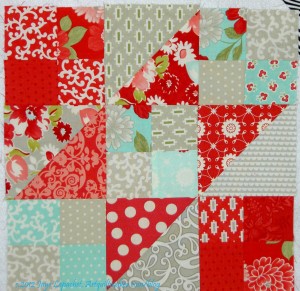
I am really not starting this quilt, but it is firmly in the hunting and gathering stage. I have wanted to do another Stepping Stones quilts since I made the first one now that I know the color placement.
I thought this would be a good quilt design on which to use the various Bonnie & Camille lines I have (Bliss, Ruby, some Vintage Modern).
The idea has been on my mind and this week, I just got a bug in my ear to try out the colors. Not sure I like the great. It is kind of dark. I like the tone of the grey in the middle patch on the right, but I am not sure about the other greys. I have another block underway and will see when I put the two blocks together.
What do you think of the overall look?
You’re not sure you like the great? Explanation, please…
I like the color scheme, but I think you’re going to have to work hard to have enough contrast to actually see the subunits like 4-patches and HSTs. In this block, I find that the prints in the 4-patches in the corner read almost as a single red square, and the HST on the left is bleeding into the 4 patch unit above it. Could be a function of the color on my monitor, of course….
Thanks, yes, the red mixed with the grey print is a problem. I am not so concerned about the red four patches, because they join with other red four patches, once the block is put together to be a big red blob. i was thinking of adding in some of the pink prints that come with the Ruby, Bliss, etc lines, but am not sure I want a pink patch to stick out from the big red blob.