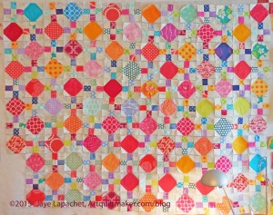
I was anxious to get the Octagon 9 Patch back up on the wall. There it sat for a few weeks and now I have taken it off the wall again. I couldn’t get all the blocks up on the wall anyway and I wanted to use the design wall for the Carpenter’s Wheel.
The exercise wasn’t completely useless, because I got to look at the pieces for awhile. I really have a lot of warm colors in this piece. I like that it makes the quilt feel warm, but I wonder if I need more cools. Also, as Julie said at one point, the solids do look a bit like holes. I think I can mitigate that by having Colleen quilt in each one.
Also, in realizing I couldn’t put all the blocks up, I figure out that I needed to count the blocks and decide on the layout. Sounds stupid, I know, but I always think the piece will just come together. It would if I had an infinite design wall, but I don’t so I have to count.
I had a brilliant idea after deciding to count, but not wanting to count only to have to count again in a week because I forgot the number. I pinned the blocks together in groups of 10. Yay! or DUH! depending on how daft I feel at the moment.
Snowball blocks: 110
9Patch blocks: 111
Without really trying, I have a very similar amount for both types of blocks. Perhaps I counted before?
Now comes the math. I have to figure out how to lay out the blocks – basically starting with a nine patch or an octagon is mostly what I need to figure out.
The other thing I was wondering is if I need to put another row between each row.
I don’t think it necessarily needs more cool colors – unless it is a design goal of yours to have a balance between warm and cool. Not every project needs to be balanced that way. I like the way this is warm in a fresh juicy way and don’t think the piece would be necessarily be improved by diluting that.
I do think the few more intense cool blocks that you have – the two aquas that are on the left in the top row, the purple-y blue on the third row on the right and the bright blue on row nine on the right – draw attention to themselves because they are outliers. If this were my project I would add one more intense cool color snowball so there are five of them, and then scatter them around strategically so they move your eye around the quilt instead of dragging your eye to the edges the way they do now.