I had to buck up and get on with choosing extra colors for the Russian Rubix and my Super Secret Project #4.
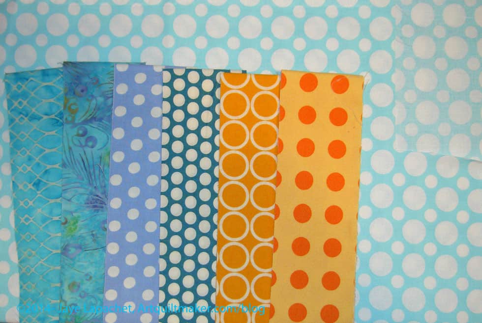
I came across this light blue (tending towards aqua) dot and thought it would be good for the project. It does have the same qualities as the aqua ring print – it looks like it will blend in with the background. Still, I like it.
The fabrics shown on top of the blue are fabrics I have already chosen. The oranges look more gold in the photo than they are in real life.
I am still thinking that a Joel Dewberry Notting Hill print in cool colors would be a good addition. I haven’t put it up with the other fabrics to take a look. Stay tuned for that.
Russian Rubix posts:
- Saturday December 7, 2013: Russian Rubix Center Square Test
- Monday October 28, 2013: Russian Rubix Color Choices
- Wednesday October 9, 2013: Russian Rubix Test Blocks
- Tuesday October 8, 2013: More Background Drama
- Saturday October 5, 2013: Russian Rubix Backgrounds
- Saturday September 28, 2013: In a Clear Space You Can See Across the Room
- Wednesday September 11, 2013: Chosen Colors
- Thursday August 26, 2013: Russian Rubix Templates
- Tuesday August 20, 2013: Continuing to Choose Colors
- Susan: Tuesday August 20, 2013: History Quilter Podcast Episode 39
- Monday July, 22, 2013: Russian Rubix